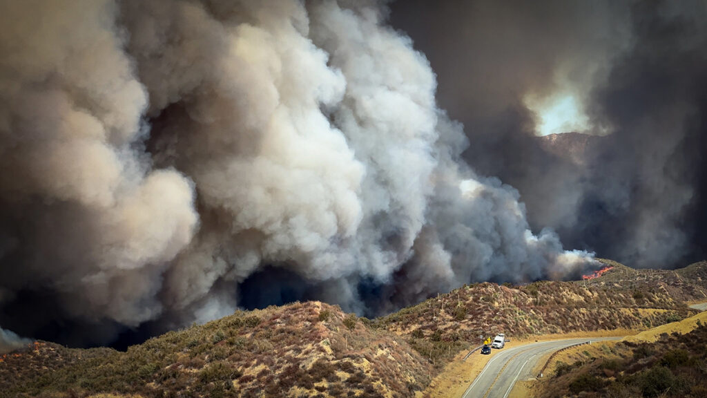
Urbanization, climate change, and fire suppression practices are contributing to increased wildfire risk at the densely populated wildland-urban interface. These factors make fires more unpredictable and harder to manage. In January 2025, this was made devastatingly clear in Los Angeles, when massive wildfires engulfed entire hillsides and canyons, destroying neighborhoods and damaging surrounding ecosystems.
The Mediterranean climate region of California, which stretches up most of the state’s coastline, is a naturally fire-prone landscape because its dry conditions support vegetation growth and also allow for fire to spread easily. As wildfires become more intense, better modeling and understanding of their drivers is crucial in efforts to predict risk.
Ward-Baranyay et al. looked at three of the January 2025 Los Angeles wildfires by analyzing preburn conditions, such as fuel characteristics, topography (including elevation and slope), and wind speed. Satellite observations gathered from the Ecosystem Spaceborne Thermal Radiometer Experiment on Space Station (ECOSTRESS) and the Earth Surface Mineral Dust Source Investigation (EMIT)—precursors to a recently announced NASA mission, the Explorer for Artemis Geology Lunar and Earth (EAGLE)—provided detailed information about the vegetation’s condition before the fires began. The researchers then built a random forest regression model to predict burn severity based on these conditions, ultimately demonstrating that prefire fuel conditions were a key driver of the destructive wildfires’ immediate effects on wildlands.
The model used in the study was able to accurately capture about 60% of the patterns in burn severity. It was most accurate for the Palisades and Hughes fires, but less accurate for the Eaton Fire. This discrepancy could be because the area burned by the Eaton Fire was more topographically variable, meaning its burn severity drivers may not have been fully captured by the model, the researchers suggest. Vegetation type was also a strong performance indicator: Terrain with shrub or scrub cover, the dominant vegetation type, offered the most accurate predictions for burn severity. The burn patterns of forests and other landscape types were less accurately captured.
Fuel conditions emerged as the dominant driver of burn severity, more so than topography or weather. In particular, how abundant, wet, dry, or stressed vegetation is can hint at how severe future fires may be. Tracking and monitoring these fuel conditions, researchers suggest, may be a way to monitor wildfire hazard in California and other fire-prone regions. (AGU Advances, https://doi.org/10.1029/2025AV002179, 2026)
Citation: Owen, R. (2026), Want to predict wildfire severity? Look to the state of vegetation, Eos, 107, https://doi.org/10.1029/2026EO260130. Published on 4 May 2026.
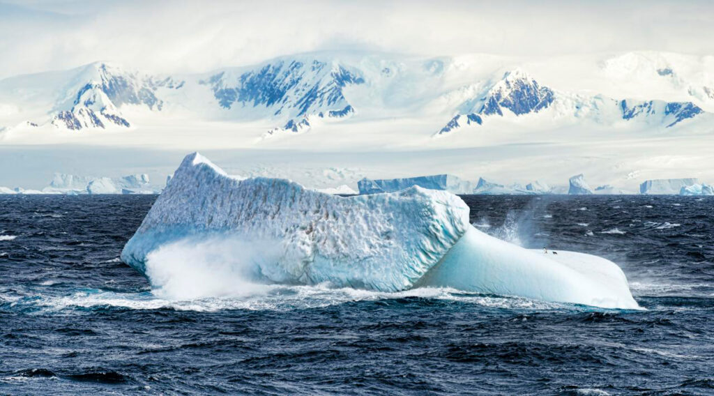
Per- and polyfluoroalkyl substances (or PFAS) have been widely used in thousands of common nonstick, waterproof, or stain-resistant products since the 1950s. These “forever chemicals” do not break down easily: PFAS make their way into the air, soil, and water, as well as into human and animal bloodstreams and to some of Earth’s most pristine environments. They have been detected even in Antarctica, despite its reputation as a relatively untouched landscape far from the types of products—fast-food wrappers, firefighting foam, nonstick cookware—that contain PFAS.
Research into how PFAS arrive in Antarctica is limited, and most tends to focus on the continent’s coasts, rather than its interior. A new study published in Science Advances aimed to fill some of these gaps by examining PFAS accumulation across a 1,200-kilometer stretch of Antarctica, from the snow pits of Zhongshan Station in East Antarctica to the 4,093-meter peak of Dome A. By examining layers of snow collected from the coast to the interior, researchers sought to better track and understand how PFAS levels vary by location and how these forever chemicals have been able to travel long distances through the upper atmosphere to be deposited in remote regions.
“For substances to get there, they have to be able to transport long distances,” said Ian Cousins, a chemist at Stockholm University and one of the study’s authors. “We know PFAS are very persistent, so that helps. By looking at the patterns of the PFAS contamination in the samples, it gives us clues as to how they’re transported.”
PFAS Arrive by Air and by Sea
Along the 1,200-kilometer route, researchers from the Chinese Academy of Sciences collected 39 snow samples at 30-kilometer intervals, scraping the first few centimeters of snow from the surface to analyze for traces of PFAS.
Zhongshan Station sits near Prydz Bay, and there, researchers collected snow from a 1-meter-deep pit, with samples taken every 5 centimeters. At Dome A, the summit of the East Antarctic Ice Sheet, samples were collected at 10-centimeter intervals from another snow pit; this one was 3 meters deep, providing information about the past several decades of PFAS use.
“It’s quite interesting that we see the historical production record of PFAS in this pit on the top of this mountain in Antarctica,” said Cousins.
PFAS pollution arrives in Antarctica in two ways: via upper atmospheric transport and sea spray. Some PFAS are formed in the atmosphere when volatile precursor chemicals like fluorotelomer alcohols used in textile and paper products break down through reactions with sunlight and oxidants into more stable compounds. The resulting PFAS are later deposited into the snow and ice through precipitation.
Storm winds near the coast create sea spray. “When you have waves, it makes bubbles in the ocean. When the bubbles burst, these sea spray aerosols can be super enriched with PFAS. This has been shown to be a very important transport route,” Cousins said.
To distinguish between sources, researchers measured sodium in the snow to trace the ocean’s salty influence. Sodium levels decreased farther inland, reflecting the fading influence of sea spray toward the interior of the continent. But surprisingly, PFAS concentrations actually increased moving from the coast into the interior.
“That was kind of a bit counterintuitive to me,” explained Cousins, who said he expected PFAS levels to be highest near the coast. “You see the opposite, actually.”
The inland increase is likely explained by higher snowfall totals in the coastal regions, which lead to PFAS concentrations becoming diluted. Inland, where snowfall is lower, even small amounts of PFAS can result in relatively higher concentrations within snow samples.
Additional factors shape PFAS distribution. PFAS levels are higher at the onset of precipitation events when they are rapidly removed from the air. Temperature inversions, too, can trap chemicals. In coastal areas, PFAS are more influenced by sea spray in the winter, whereas stronger sunlight drives the degradation of atmospheric precursors into PFAS in the summer months.
PFAS Presence at Both Poles
This new study also offers implications for the way that PFAS circulate globally. Though industrial activity in the Northern Hemisphere contributes most heavily to PFAS emissions, large-scale atmospheric circulation allows these compounds to reach polar regions. Rapid transport in the upper troposphere may act as an efficient pathway to shuttle PFAS across both hemispheres before they are deposited in the cold, remote regions at both ends of Earth.
“This completes the global picture with agreeing measurements at both poles, solidifying our understanding of the global distribution and drivers of PFAS contamination.”
Even though PFAS levels are higher in the Arctic, both polar regions show similar trends in PFAS concentrations since the 1990s. “It really matches decades of the same records that have been reported from the Arctic,” said Cora Young, an atmospheric chemist at York University, who was not involved in the new study.
“This completes the global picture with agreeing measurements at both poles, solidifying our understanding of the global distribution and drivers of PFAS contamination. The role of CFC [chlorofluorocarbon] replacements, changes in regulation, all of these things are important in the Northern Hemisphere and also the Southern Hemisphere,” said Young.
Heat, air pollution, and flooding can affect a city and the health of city residents. Yet few cities have a comprehensive network of weather stations providing accurate measurements of rainfall, humidity, and air temperature across different neighborhoods. Some of this information can be filled in by community members’ personal weather stations, like those connected through Weather Underground. But because of a lack of sensors and inconsistencies in data collection, these types of community networks are often not reliable on their own. Furthermore, most personal weather stations are located in higher-income neighborhoods, with very few in lower-income, underserved neighborhoods.
The same is true in Baltimore, where personal weather stations are more prevalent in higher-income, majority-white neighborhoods around and stretching north from the Inner Harbor but are lacking in lower-income and majority-Black neighborhoods to the west and east. Furthermore, only one National Weather Service sensor is present in the city itself, in the Inner Harbor, and another sensor is located about 12 kilometers (8 miles) away at Baltimore/Washington International Airport.
Waugh et al. describe a partnership between universities, state agencies, and Baltimore residents to build the Baltimore Community Weather Network (BCWN) that addresses the missing data coverage around the city. Unlike the patchwork of personal weather stations, community members participating in the BCWN are from underserved areas in the city and are actively involved in data collection and interpretation.
Weather stations are placed in open spaces to avoid obstacles like buildings or trees affecting measurements of temperature, rainfall, or wind. This careful placement is designed to ensure that the data collected are as close as possible to the conditions experienced by actual residents.
BCWN sites are carefully monitored and managed by community members. Baltimore residents are actively involved in data collection, weather station management, and decisionmaking with scientists and local organizations to help promote engagement, education, and community empowerment.
Because Baltimore is not the only U.S. city that has historically lacked accurate weather data coverage, the BCWN system could be applied to other locations—or even used to monitor other environmental exposures, such as air pollution, the authors say. (Community Science, https://doi.org/10.1029/2025CSJ000154, 2026)
Citation: Owen, R. (2026), Fixing Baltimore’s unequal weather data coverage, Eos, 107, https://doi.org/10.1029/2026EO260108. Published on 13 April 2026.