The self-taught animator on collage, control and why fingers, hair and breasts are the most expressive things to draw and make move.
Most of us spend a lifetime trying to feel at home in our own skin. Sara Priorelli would rather pull it apart, stretch it and twist it to see how far it goes. Somewhere along the way, she finds comedy gold in what it means to be human.
The fifth of seven children, Sara grew up in a house surrounded by chaos
The self-taught animator on collage, control and why fingers, hair and breasts are the most expressive things to draw and make move.
Most of us spend a lifetime trying to feel at home in our own skin. Sara Priorelli would rather pull it apart, stretch it and twist it to see how far it goes. Somewhere along the way, she finds comedy gold in what it means to be human.
The fifth of seven children, Sara grew up in a house surrounded by chaos and fun, along with an entire family of Basset Hounds. You can see all of that joy and madness in her animation work, where bodies distort, sag and bend into weird shapes – all with cartoonish glee. There's no storyboard or script behind her ideas; it's all built from memory and a constant stream of notes scribbled down – a handy archive that Sara says has never let her down.
Her route in wasn't through animation at all, but collage. A teenage obsession with Hannah Höch's photomontages and Terry Gilliam's cut-out sequences led her to turn mismatched body parts into little monsters and try to make them move. That was way before she had the software or the skills to do it properly. She taught herself the rest – and it shows in the loose way she works.
The fascination with bodies, she says, is one she can't fully explain. What she can trace is the discomfort underneath it. "Behind my obsession with playing around with the human body lies a certain discomfort of having one, and distorting and twisting it feels like a way of laughing off the awkwardness of being stuck in the same body for so long."
There's real pleasure in it, too. "It's still incredibly fun to take control of a body and move it around as much as possible," she says, and she has her favourite parts to draw: "Fingers, hair and breasts, because they are so expressive and fluid and constantly changing shape." Even the Basset Hounds left their mark. "They carry way too much skin, and that makes their movement very expressive. I'm pretty sure their disproportion and cartoon-like appearance have unconsciously shaped my work."
Having fun is far more important than efficiency.
Being self-taught shapes how she works as much as what she draws. "I never learned how to do it properly, and my files are always a mess," she laughs. "Even in my longer projects, I rarely work with a storyboard, or a proper script, or a character design – which is probably why my characters look different in every frame."
In her work, Sara constantly switches between digital animation, the light box and short comics. "Every medium has its limits, and changing those limits keeps my work challenging. If I get used to a certain approach, then I try another tool and it feels like starting from scratch."
The light box, in particular, takes away her safety net. "I have to accept that there are no tricks like Ctrl+Z, and I like forcing myself to keep things simple and trust my hand a bit more." Comics, on the other hand, ask something different again: "I like the challenge of making a static drawing dynamic, and a silent image loud."
A piece rarely begins with a grand idea – more often, it's a single detail that inspires her next artwork. "It usually starts with a very quick sketch of a detail, sometimes a shoe or just a funny posture, and that makes me think of a story or a particular movement."
Place feeds the work as well. After the Academy of Fine Arts in Urbino, Sara took a master's in Budapest, a move that left its mark on the tone of her storytelling. "I come from a small town, and I had dreamed of living in a big city for so long that, once there, I felt disappointed because my expectations had been so high." That dissonance found its way onto the page. "The sense of being out of place, mixed with the excitement of the change, led me to push the bittersweet side of my stories even more." A "sketchy" neighbourhood and a few surreal encounters supplied the cast. "I'm sure that shaped the kinds of characters I ended up using."
Whatever tool she reaches for, Sara always draws frame by frame – even though it's a lengthy process. "Having fun is far more important than efficiency. There's something really satisfying about drawing every frame by hand, and of course, it gives me total control over the movement." The imperfections are a feature, not a flaw. "I always try to bring a sense of irony to my work, and I feel that those technical imperfections add to the comedy of the movement."
A working day is gentler than you might expect. "I spend my mornings sketching on paper while drinking coffee, then I go for a walk," she says. "I come back home, scan the drawings, digitise them and start adding frames." Music is non-negotiable, and she works with her notes and reference pictures close at hand.
What's next is a return to playing. "I never really gave myself the time to experiment and explore more techniques, so I feel like I need to go back to that phase and take more breaks from my laptop." One medium has her especially curious. "I'm super fascinated by paint-on-glass animation, so hopefully I'll start sharing more of my experimental work in the next few months."
As for who she returns to for inspiration, the answer is pretty specific. Her early hero was the Italian comics artist Altan: "His graphic novels had such a big impact on me that I still regularly go back and browse through his pages. I love the combination of nastiness and sensuality in his work." And two classics stay on permanent rotation – Yellow Submarine and Bruno Bozzetto's Allegro non troppo.
We're big fans of Sara's approach, and look forward to following her work. As for the awkwardness of having a body, it turns out it's a lot more bearable when you're the one pulling it out of shape.
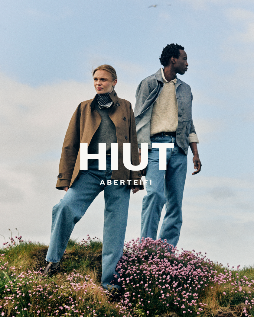
The new identity leans into the contrasts that make Hiut what it is: industry alongside nature, utility alongside craft... right down to a typeface drawn from the makers' own signatures.
There's a lovely bit of stubbornness at the heart of Hiut, and the brand's new look finally does it justice. Pentagram partner Hugh Miller has designed the visual identity and art direction for the premium denim label, which crafts its jeans from a fam
The new identity leans into the contrasts that make Hiut what it is: industry alongside nature, utility alongside craft... right down to a typeface drawn from the makers' own signatures.
There's a lovely bit of stubbornness at the heart of Hiut, and the brand's new look finally does it justice. Pentagram partner Hugh Miller has designed the visual identity and art direction for the premium denim label, which crafts its jeans from a family-run factory in Aberteifi on the Welsh coast.
The town – also known as Cardigan – has denim in its bones. In the 1960s, the first jeans factory employed more than 400 local people and turned out over 35,000 pairs a week, until production moved offshore in 2002, taking the work, though not the know-how, with it. Decades of accumulated skill were simply left sitting there. Hiut was founded in 2011 to bring it back home, put those hands to work again, and train the next generation of makers.
As such, this was never going to be a label that chased trends. Hiut takes its cue from factory life, the skill of its makers and the rugged landscape around it, so Miller's brief was less about reinvention and more about telling that story well. Working closely with the Hiut team, he built the identity around the brand's values, celebrating the factory, its people and its setting, while embracing the contrasts that define it.
The result balances industry with nature, and utility with craft. At its heart sits a redrawn wordmark that nods to the factory's industrial heart, all craft and resilience, with "Aberteifi" added underneath to root the brand firmly to its location, heritage, and mother tongue. Alongside it is a bolder, rounder and altogether more huggable version of Hiut's much-loved owl mascot.
The easy move would have been to reach for navy and the usual heritage-brand polish. Instead, type does some of the heavy lifting. The functional, utilitarian Founders Grotesk handles the day job, joined by 'The Makers Font', an expressive handwritten face drawn from the real signatures the makers scribe into every pair of jeans before they leave the building at night. The colour palette pulls together the muted hues of the local landscape and the raw, functional character of the factory, layered through contrasting textures and tones.
Art direction does the rest. Jess Ellis on stills and Cat Garcia on motion were invited to capture moments of "everyday beauty" from both the surrounding landscape and the factory floor – shot in black and white and colour, leaning into texture and the unexpected details that reveal a brand's human character. From here, the launch campaign and ongoing art direction are led by Hiut's own teams and collaborators, working with photographers, illustrators, videographers, and printers whose approaches genuinely align with the heritage brand.
It's certainly a more elevated and curated expression of Hiut, thanks to Hugh Miller at Pentagram and all involved. It shows the brand hasn't forgotten where it comes from or how it's tied to the people, place and processes that make the jeans so special.
After more than twenty illustrated books, the New York-based artist has stepped back from publishing to chase something more personal: the way light holds a room, a station or a street corner in the seconds either side of an event.
There's a beautiful stillness to Hannah Li's latest work. A train station empties. Light falls across an armchair in an empty room. A city corner waits in anticipation. Nothing dramatic is happening, and that's rather the point. "I'm drawn to moments that feel suspended in time," Hannah tells Creative Boom, "places where something has just happened, or is about to happen."
Hannah is a Chinese illustrator based in New York City, and light has always been the centre of everything she sees. Through interiors, city corners, train stations, and everyday scenes, she explores how light shapes our memories and changes our emotional relationship with space. It is a happy obsession that gives her images their gentle charm: you arrive a little too early, or a little too late, and you feel the difference.
Her practice runs through fine art. Hannah studied oil painting in China before moving to the United States in 2013 for an MFA in illustration at SCAD, and that grounding in paint still shows in the way she handles colour and atmosphere. Since graduating, she has built a substantial editorial and publishing career, with work for The New York Times, The Washington Post, and Harper's Bazaar Germany, as well as more than 20 non-fiction books for publishers including Penguin, Macmillan, and Usborne.
That publishing run was, by her own account, a serious education. Working closely with authors, editors and art directors taught her visual problem-solving, long-form storytelling and the benefit of collaboration. "It taught me how to communicate complex ideas clearly," she says, "while adapting my visual language across a wide range of subjects." For a few years, non-fiction was the centre of her practice.
Then something changed. After what she describes as a series of personal and life transitions, Hannah felt the pull back towards her own voice. She began stepping away from long-term book commissions and rebuilding her art around observation, curiosity and presence – making for herself again, rather than to another brief.
The result is an ongoing personal series called The Way Back. Rather than documenting specific events, it traces her relationship with the world after she, as she puts it, "returns to herself". The illustrations are less interested in narrative than in perception: the feeling of standing between movement and stillness, familiarity and distance, belonging and solitude. They ask you to notice the in-between rather than the big headline.
Much of the series began on the move. The pieces draw on things Hannah noticed while travelling through Paris, Rome, New York and other cities over the past two years. "Through colour, atmosphere and carefully observed details," she says, "I try to capture small moments where light, space and memory quietly intersect."
It's work that celebrates the art of slowing down, which feels like something she needed for herself after such a busy career in publishing. Beyond books and editorial work, The Way Back asks her only to look, and to trust that a reader will recognise the feeling without being told what it actually is.
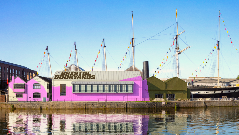
The studio behind the rebrand has expanded the SS Great Britain into a full cultural destination, with a defiantly un-nautical pink lifted straight from Totterdown's terraces.
Some ships are worth knowing about. Brunel's SS Great Britain launched in 1843 as the first of her kind, and in the years since, she has lived more lives than most of us could ever imagine. Ocean liner, cargo ship, coal hulk, stranded castaway off the Falklands –
The studio behind the rebrand has expanded the SS Great Britain into a full cultural destination, with a defiantly un-nautical pink lifted straight from Totterdown's terraces.
Some ships are worth knowing about. Brunel's SS Great Britain launched in 1843 as the first of her kind, and in the years since, she has lived more lives than most of us could ever imagine. Ocean liner, cargo ship, coal hulk, stranded castaway off the Falklands – she has carried 33,000 passengers around the world, supported war efforts, hauled actual gold, and inspired a few hundred tall tales along the way. Now she is getting her next chapter, and it's a good one.
How&How has come aboard to create the experience and identity for the Bristol Dockyards, an all-new cultural destination built around the centuries-old ship and, fittingly, pitched at the heart of Britain's most radical city.
What problem did the rebrand need to solve? Since her triumphant return to Bristol in 1970, the SS Great Britain has been a treasured centrepiece of the city, but treasured isn't the same as visited. Ticket sales had slipped, the audience was ageing, and not enough people could find a reason to justify the 20-minute walk down the quayside to see her. All the care going into preserving this stretch of history simply wasn't, well, landing.
So How&How decided that playing it safe was never going to cut it. The SS Great Britain isn't like any other ship, Brunel isn't like any other engineer, and Bristol – as anyone who has spent a weekend there will tell you – isn't like any other city. The studio built something defiantly different instead, channelling two centuries of innovation and global wandering into a destination that once again wants to spark ideas that change the world.
That began with a complete refresh of brand architecture and a broader name above the gates. The Bristol Dockyards now reflects the full scope of a day out rather than a single vessel, giving three central experiences – the Being Brunel museum, the Brunel Institute's maritime archive, and the ship herself – the room to finally sell themselves.
Holding it all together is a central collage system that tells the story of 200 years of history without letting any of it gather dust. And no, it's not about pretty pictures – more about texture, as it merges timelines, typography and Dockyard odds and ends into something tactile, immersive and unmistakable from across the river.
Then there's the colour, which does a lot of the heavy lifting. A pink borrowed from Totterdown's famous terraces cheerfully defies every black-and-blue nautical brand going, backed up by bright yellows, greens and oranges that feel right at home in a city likely still drum n' bassing by opening time.
The tone of voice follows suit, speaking up for itself the way Bristol always has. Deeper, vaster, braver – it channels the city's attitude rather than imitating its accent, delivering an iron-willed message through iron-clad typography that flits between classic serif and semi-bold sans, from A-boards to the About page.
The Dockyards have always been a place of radical thinking. Now the brand matches. And How&How can't wait to see people once again lining the banks of the Avon, craning for a glimpse of one of the UK's most enduring icons.
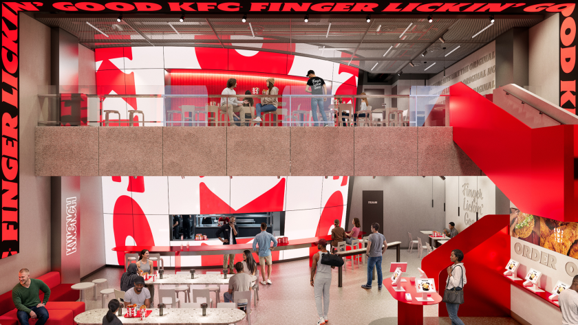
Jones Knowles Ritchie reworks every touchpoint, from a 3D logo and custom typefaces to a refreshed Colonel, as KFC's biggest brand evolution begins rolling out across more than 150 countries.
Chicken is having a moment. I only realised this recently at a Spanish airport, when I spotted a new Popeyes branch past security. On further investigation, it appears the brand is rapidly expanding its global footprint as it seeks to dominate the
Jones Knowles Ritchie reworks every touchpoint, from a 3D logo and custom typefaces to a refreshed Colonel, as KFC's biggest brand evolution begins rolling out across more than 150 countries.
Chicken is having a moment. I only realised this recently at a Spanish airport, when I spotted a new Popeyes branch past security. On further investigation, it appears the brand is rapidly expanding its global footprint as it seeks to dominate the category. It's why an email from Jones Knowles Ritchie (JKR) made me smile this morning. It's just helped KFC evolve its entire identity, reminding us that few fast-food brands carry a kit of parts as distinctive as its own. The bucket, the stripes, the Colonel, and its strapline "Finger Lickin' Good" – each one is instantly recognisable, even out of context. Perhaps KFC wants to remind us that there is only one place to enjoy chicken.
That, in a nutshell, was the mission. JKR, the global branding agency behind the work, was not asked to start KFC over but to take it into what the brand calls its next chapter. It wanted to evolve, confidently, without losing brand loyalty.
The result is a full 360-degree evolution that runs from the design system and brand assets through to restaurant environments, packaging, digital platforms and tone of voice. JKR describes it not as a refreshed logo but as a "single, connected world" – one built entirely around KFC's most famous asset: the bucket.
"Our role was to help it evolve for the next chapter, in a way that only KFC could," says Sean Thomas, global executive creative director at JKR. The studio set about "building a world and experience that consumers could step into. We call it the Bucketverse."
The bucket is the unlock
The bucket sits at the heart of everything. But JKR has redefined it as a central brand device, standardising its distinctive shape for a consistent global rollout and treating it as both a framing system and a storytelling one – an extension of the logo that can hold food, culture, energy, and just about anything in a single frame.
From there, the system spreads out. The logo becomes a three-dimensional asset rather than a flat mark; the lettermark is stripped back to a cleaner, more legible shorthand; and the stripes, once only a background texture, are reworked into an expressive, type-based asset that does much more of the storytelling. The core red, white and black palette, meanwhile, stays put for instant recognition. And it's joined by a secondary system called Herbs and Spices – a nod to the original recipe – for moments that need a bit more oomph.
Typography-wise, KFC now has its own custom-built type system, Kentucky Fried Serif (well, they had to call it that) and Kentucky Fried Sans. Genius. It's drawn from the lettermark and developed in partnership with StudioDRAMA. 'Finger Lickin' Good', meanwhile, is reframed from a tagline into what JKR calls "a standard of behaviour" – a global brand asset rather than a sign-off. Lettering artist Tobias Hall crafted the mark itself.
A gentler Colonel
Then there's the famous Colonel. Looking at the 'before' and 'after' icon, you can spot the difference, but it's incredibly subtle. Not surprising, given that it's the brand's most sacred asset and therefore needs to be handled with care. It's enough to keep any designer awake at night, worrying about getting it wrong.
JKR smashed it, though. The Colonel takes on a clearer, more purposeful role in the new 3D logo and has – dare I say it – a more welcoming expression, along with grounding elements. Despite the tweaks, the agency has preserved his character and legacy. And a new system of stamps carries his spirit throughout, leaning into the brand's heritage and craft.
Accompanying illustration and photography help KFC to feel human and global. The illustration system was built with a roster of international artists – Bernardo Henning in Buenos Aires, Eva Cremers in Amsterdam, UV-朱 in Xiamen, Belén Díaz Guerra in Lima and Boomrangg in Mumbai. While lifestyle photography came from Reece James Morrison, and food photography from Frankie Turner. Film music was created with Antfood.
From QSR to 'QXR'
The bigger ambition is experiential. And this is where the new identity gets exciting. The bucket becomes a giant fixture in restaurants, pop-ups, and other retail spaces. It literally swamps each space. JKR frames the work as a category shift – from quick-service restaurants to what it calls 'QXR', or quick experience restaurants. "Nothing hits like KFC, and that sentiment doesn't stop at the chicken," says Matt Michaluk, executive creative director for experience at JKR. He describes it as "a disruptive category shift" and "a brand turning experience-led distinctiveness up to 11".
For Tosh Hall, JKR's global chief creative officer, it comes back to category leadership. "Every category has its leader. When you close your eyes and think about that category, you think of one, maybe two brands," he says. "When you think chicken, you should think KFC. Our job was to make sure the leader of the category was showing up like one."
The rollout has already begun. It starts this month in the UK and Ireland. Expect new Tenders, nine new sauces and refreshed branding across communications and digital touchpoints. It will then expand to Australia and the US in the coming weeks, with more markets following through 2026.
The new-look restaurants arrive from the summer, led by an open-concept space in McKinney, Texas, expected in late summer, and a two-storey, fully immersive restaurant in Dubai opening in the autumn.
Whether the wider world warms to the 'Bucketverse' and 'QXR' language remains to be seen. But as a piece of brand thinking, it's a confident, carefully judged evolution of one of the most recognisable identities on the high street, and a reminder of how much mileage there still is in a really good bucket.
Malika Favre and George Wu's curated bazaar, I Can't Afford This But Maybe She Can, is full of brilliant, creative things. Here are five of our favourites for bringing a bit of character, and the odd touch of glorious colour, to your space.
I'm going to level with you here. I'm a sucker for a beautiful accessory for my home or studio – even if it serves no function whatsoever, other than to brighten a corner or make me smile. I'm talki
Malika Favre and George Wu's curated bazaar, I Can't Afford This But Maybe She Can, is full of brilliant, creative things. Here are five of our favourites for bringing a bit of character, and the odd touch of glorious colour, to your space.
I'm going to level with you here. I'm a sucker for a beautiful accessory for my home or studio – even if it serves no function whatsoever, other than to brighten a corner or make me smile. I'm talking an unusual lamp that stands out. Maybe a ceramic piece that swells your heart. It's what being a creative person is all about. You want to be surrounded by gorgeous things made by artists and designers you admire and want to support.
It's a sentiment I know illustrator Malika Favre and creative George Wu will understand only too well, as they run their own curated marketplace, I Can't Afford This But Maybe She Can. But beware: money will be spent. Oh yes. How do I know this? It's the whole point of the duo's side venture, which began in 2020 as an Instagram account and has since become a respected catalogue of the most delightful things the design world has to offer.
It now features more than 500 handpicked objects we can't resist – from over 125 indie brands and makers around the world. Everything from homeware, tableware and lighting to art, fashion and the occasional glorious oddity. Everything is chosen with their impeccable taste, humour and a healthy disregard for boring.
For the creative who loves a well-made thing but hasn't got the hours to go hunting for it, this part of the Internet is a gift. Here are five we can't stop thinking about – equal parts useful, beautiful and faintly (dare we say it) absurd.
If you're thinking of updating a room to make it stand out, one safe bet is to decorate your walls with something special. With Alice Guillier's series of tapestries, you'll definitely feel like you have something no one else has.
Made through her studio Safareig, each piece takes a simple geometric framework and gives you a composition that offers plenty of interest to your home or studio. Hang one above a desk, and you'll smile every time you look up at it.
There's something really clever about this work. It reads as bold and minimal from across the room, then rewards you the closer you look. Magic.
Who doesn't love candles? They add atmosphere. A certain cosy charm. They're perfect for summer evenings, and they help add ritual to the darker, colder nights. If you're looking for a centrepiece for your dining table or living room sideboard, Atelier Toit offers stunning candleholders made from solid wooden blocks on asymmetrical pedestals, all in a happy array of bright colours. It's playful function at its best.
As you'd expect from such an art form, each one is made to order in the studio's Amsterdam atelier, and no two come out quite the same, so that yours will be entirely unique. But let's be honest, who needs a candle when the holder itself alone is so nice to look at?
Here's a surprising bit of softness from an industrial material, but a whole load of satisfying colour for your home. Brussels studio Tilt builds this oversized pendant from translucent 3D-printed mesh, so it seems to hover in mid-air, catching the light and throwing delicate, lattice-like shadows across walls and ceilings.
Better still, it shifts as the day goes on, its colour and transparency moving with the light so the lamp never looks quite the same twice. Light as texture, rather than just illumination. This is a design piece guests won't be able to stop admiring.
Yes, they're shelves shaped like hands. Your eyes do not deceive you. And no, you don't need a reason. Tadashi Studio moulded this surreal little pair from the exact measurements of the designer's own hands, landing somewhere between sculpture and storage. Ready to cup your keys, your rings, your phone or whatever you like to keep close while you work.
They're sold as a pair because one hand on its own would look a touch lonely. Equal parts useful and slightly uncanny, in the best possible way.
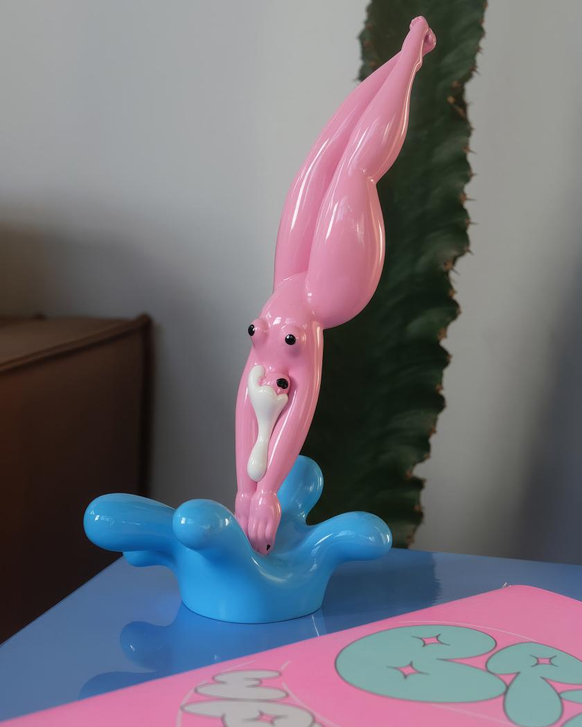
Having bumped into Marylou Faure at Pictoplasma in Berlin, I want this figurine even more. It's a small celebration of curves in object form. Crafted by the French illustrator known for her bold, colour-saturated work and her joyful, unapologetic take on the female form. She's translated her signature style into a glossy, sensual figurine, released in a limited edition of just 100.
One to proudly place on a mantelpiece, giving a whole room some personality. Collectable, characterful and very much a "she can" rather than an "I can't". Marylou, if you're reading this, I'll be purchasing this next.
Image licensed via Adobe Stock
The free routes that used to bring creatives their next commission are closing one by one. It's been happening for some time. And now AI is pretty much destroying the web as we know it. Here's how to keep being found – and, increasingly, recommended – without a marketing budget.
For many happy years, getting found was something any creative freelancer or studio could do on the strength of work alone. A we
The free routes that used to bring creatives their next commission are closing one by one. It's been happening for some time. And now AI is pretty much destroying the web as we know it. Here's how to keep being found – and, increasingly, recommended – without a marketing budget.
For many happy years, getting found was something any creative freelancer or studio could do on the strength of work alone. A website that ranked for your craft. A post that travelled far and wide and carried your name back to your profile. A share that turned a random person into a client. None of it really cost anything except for a bit of time and effort. And all of it was the pipeline to paid work.
Oh, how things change. Organic search has fallen off a cliff. Social media rewards quantity over quality. And the latest? Conversational, agentic AI is now pulling all the shots.
And with today's big news that Pinterest is shifting away from traditional search, it's clear that none of us can out-optimise this on our own. The good news is that the shift rewards a handful of things independent creatives can still build: a direct audience, a distinctive name, and a reputation the new systems can read and recognise as important. Exhausted? Yes, so are we. But here's where to put your energy.
1. Build an audience you actually own
I've been saying it for over a decade – since Meta ruined Facebook for publishers in 2016 – build your own audience. That's because every follower you have is rented. Platforms like Instagram and Pinterest get to decide who sees your work, and the goalposts can change overnight.
An email list is the one audience you get to control. It's a list of people who chose you, and you can reach them directly, whenever you want. So start a simple newsletter, even a short monthly one, and make signing up the clearest call to action on your website. (Our guide to creating a newsletter people actually want is a good place to begin.) A few hundred people who want to hear from you is worth more than ten thousand followers a feed decides to throttle, and it's how plenty of creatives are winning work after quitting social media altogether.
2. Become a "category of one"
Don't roll your eyes, but AI discovery rewards a "good enough" match to a brief, which flattens everyone into interchangeable options. The defence is to be "uninterchangeable". So sharpen the one thing you do that nobody else does in quite the same way. That could be a material, a subject, a voice. You want to be known by name rather than retrieved by attribute. The creatives who survive this current massive shift are the ones a client specifically asks for, because a specific name is the one thing an algorithm can't substitute.
3. Get cited, named and talked about
As someone who worked in PR for two decades, this next tip warms my heart. Because I know public relations is having a golden hour moment. That's because if you still want to be found, recommendation engines lean on signals they can read: who's mentioned in other people's work, who turns up on lists, in interviews, in the press, and in collaborations.
It means that being talked about is more valuable than being optimised. Forget staying in your comfort zone. Say yes to the guest piece, the podcast... even the scary panel on stage that you've been avoiding. Pitch yourself for round-ups in your niche. Every place your name appears alongside your craft is a breadcrumb the systems – and the people – can follow back to you.
4. Make your site easy for a machine to understand
If an AI is going to represent you, it has to be able to read you correctly. That means not blocking AI crawlers on your site. And it means spelling out, in plain language, what you do, who you do it for and what makes your work yours. Don't just have images and a one-word 'work' tab. Name your projects, your clients and your disciplines in actual words. Add alt text to every image. You're not gaming anything here; you're making sure that when a system describes you, it gets you right rather than second-guessing.
5. Show the process and the person
A generative answer can summarise a style, but it can't reproduce the human genius behind it. That's your advantage. In which case, share the process: the sketches, the dead ends, the "why" behind every decision, and the story of a commission. Content about process, along with a real point of view, builds the kind of trust that turns a browsing visitor into a client, and it's exactly the material an AI can't copy from pages that already exist.
6. Make referrals easy to give
Word of mouth is, and always will be, the most powerful marketing channel. And it's still how most independents get their best work. Don't leave it to chance. Tell happy clients you'd welcome an introduction. Keep a tidy one-line description of what you do that someone can paste into a message without having to think. Stay in touch with people you've worked with so you're the name that comes up when they're asked, "Do you know anyone good who can…?"
7. Turn up in real rooms
"In real life" is back, baby. Events, meet-ups, talks and communities – they're all back on the table after those weird post-pandemic years. Like word of mouth, networking is hugely powerful. A conversation at a portfolio night or a face remembered from a meet-up leads to commissions that no number of impressions or page views can match. You don't need a stage, but turning up consistently where your peers and potential clients gather will eventually deliver results.
Just remember to enjoy yourself and make friends, first and foremost. Don't go in with the hard sell, as there is nothing more off-putting.
8. Don't rent your whole presence from one place
Remember the old saying, Don't put your eggs in one basket? It applies here. If a single platform is your entire shop window, one change to its rules can harm you enormously. Spread your presence across things you own and things you earn – your website and newsletter list, plus a couple of channels and the press and communities you show up in. The aim isn't to be everywhere all at once; it's to make sure no one switch, algorithm tweak or new AI layer can take away every route to your door at once.
In summary
None of the above is a quick fix. But don't panic. The creatives who stay discoverable through this enormous revolution won't be the ones who chased the algorithm the hardest; they'll be the ones who built something that's truly their own... a name worth knowing, a direct line to the people who love your work, and a great reputation that travels on its own accord.
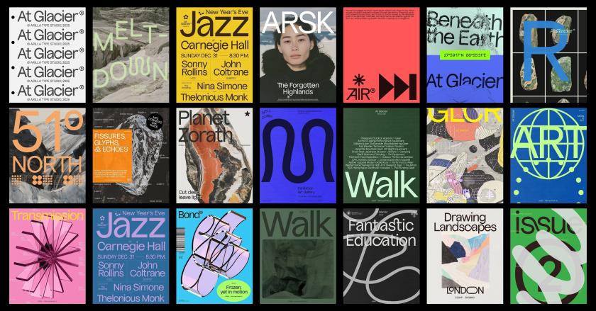
At Glacier by Omar Careaga
For all you graphic designers out there, we've rounded up the latest big releases from foundries across the planet. From display fonts to classic serifs and a family inspired by Iceland's wild landscape, June's offering is so good that some might end up in your current projects.
There's something about midsummer that seems to bring out the best in type foundries and designers. Maybe it's the long days. Maybe
For all you graphic designers out there, we've rounded up the latest big releases from foundries across the planet. From display fonts to classic serifs and a family inspired by Iceland's wild landscape, June's offering is so good that some might end up in your current projects.
There's something about midsummer that seems to bring out the best in type foundries and designers. Maybe it's the long days. Maybe it's a rush of projects finally being signed off on. Whatever it is, June has an unusually rich crop: revivals lovingly reworked, stencils that break their own rules, and display faces with enough presence to fill a poster that could be seen from space. Well, perhaps not. But you get the picture.
What I love about this month's haul is the sheer range. This is creativity at its finest. There are monospaced workhorses built for important data, dashboards and tidy code. We have warm wedge serifs that nod to mid-century America. There's even a display face carved straight out of Iceland's volcanic landscape.
Whether you're after something quiet and dependable or loud and unapologetic this June, Creative Boom has you covered. So grab a brew, settle in, and see which of the following typefaces make their way into your next project.
Sticks is a monospaced typeface built from rectangular shapes with rounded inner corners, reminiscent of reinforced joints in precision-cut metal components. Its strict, rigid appearance follows the same visual language of construction, technology, and industrial machinery. Perfect for any branding projects in that field.
Originally released in 2019 and discontinued a few years later, the typeface was fully reworked, expanded, and re-released this month as a family of individual styles and a variable font. Nicely done, Nguyen Gobber.
Introducing Sahila Stencil, the latest release from Arcane Type Foundry and an expansion of its existing typeface Sahlia, from a single weight to a 10-style family with true italics and a variable font that covers all styles.
Sahlia is a stencil typeface that breaks all the rules. Where most stencils slice away parts of the letters, Sahlia's extreme contrast dissolves the thin parts entirely, as though worn away over time. The result feels both structured and organic: sharp, high-contrast serifs softened by delicate forms.
In the lighter weights, Sahlia has a graceful presence, while at its heaviest, it becomes more dramatic, yet it keeps its luxurious tone.
Designed for projects that want to make an elegant statement but with a little edge, Sahlia performs in editorial layouts, on luxury packaging, and across lifestyle content. Think candles, self-care, and slow living... that sort of thing.
SLTF Curo is a super-heavy display sans-serif typeface designed for brands that want some serious presence. Built around a single extreme weight, Curo comes in five distinct corner-style variants: Sharp, Crisp, Regular, Soft, and Rounded, giving designers a complete tonal range within a single typeface family.
Each variant carries the same bold, unapologetic mass but shifts in character. From the hard-edged tension of Curo Sharp to the warm, voluminous fullness of Curo Rounded, the result is a complete design system of five fonts available with a single purchase.
Curo's large x-height and tight counters make it exceptionally impactful at display sizes. A distinctive lowercase 'g', expressive curves, and an alternate single-story 'a' give it a personality that is both retro and unmistakably contemporary. Built for headlines, packaging, logos, posters, and anywhere a brand needs to take up space with total confidence.
Another bold statement for our June round-up is Unifora by Yep! – a massive sans-serif uniwidth superfamily with an industrial edge and architectural feel. "Unifora starts where DIN leaves off, taking the constructed logic of technical lettering and pushing it to meet the demands of modern screens, without softening the edges," explains the foundry.
It comes with five widths, nine weights, and matching italic and roman styles with slants up to 18 degrees. The variable font spans all three axes: weight, width, and slant—in both directions. What's more, the superfamily is available as five standalone sub-families, each built around the uniwidth principle... that is, within any given width, every glyph holds its advance width across all weights and styles. In practice, that means text never reflows when the weight shifts.
Unifora Condensed works for data-dense interfaces like dashboards, table columns and tight mobile layouts. Meanwhile, Unifora Narrow handles compact body copy and sidebars. Unifora Standard is the default width – comfortable with everything from small UI labels to large display. Then there's Unifora SemiExpanded for display, signage and wide-format applications where letterforms need space to breathe. If all that sounds complicated, there's a user manual to help you decide which is best for you.
Halvar Mono expands the Halvar universe by taking the next logical step: re-engineering Halvar's "constructed forms, raw charm and machine precision" into a monospaced typeface.
With Halvar Mono, every character in each of its nine weights occupies the same width. Built on Halvar's balanced, medium-weight, monospaced typeface, this version is practical and precise across data, tables, and technical systems; steady and dependable in demanding pixel- and print-based applications.
It has an industrial charm and mechanical design for those who value the structure and elegance of monospaced fonts. It includes extended Latin, Greek and Cyrillic and supports more than 190 languages.
Ana Laydner has released a new typeface that joins Fabio Haag Type's exclusive library with a raw, real aesthetic. Letters might "overlap in a hug or collide in a mosh pit" – something that's been compared to the happy chaos of real life. Figures.
With 14 weights of expressive goodness, Drika has strokes that aren't overly polished and are inspired by the earliest sans serifs of the 19th century. Some diagonals end at an unexpected angle, while others have straight forms.
Emojis of all kinds are sprinkled in along with arrows, and that character comes with every weight of the family. In the heaviest weights, some letters might overlap, and that's ok. It's a sans "unafraid of being", according to Ana. She adds: "Drika is a typeface about presence, about occupying spaces without apology". For those of you feeling rebellious this month, we think you'll love how this one breaks all the rules.
Beth caught our eye this month, as it draws on early-twentieth-century English shopfront lettering: a tradition built to stop people in their tracks. Its uppercase draws on Neoclassical type with humanist terminals and convex strokes inspired by hand-painted signage, giving each capital a brightness and precision that feel both nostalgic and modern.
The lowercase follows the calligraphic model of Edward Johnston's Foundational Hand: curves that modulate close to 45 degrees, a single-story 'a' with no traditional terminal, and an 's' that, in the designer's own words, is a poem.
The drawing carries the weight of engraving, particularly the work of Gustave Doré and William Blake. Their influence lives in Beth's fine strokes and the richness of its contrast: a typeface that, according to its maker, holds light and shadow the way a copper plate does – "dark where it counts. Bright where it matters".
A pop gothic serif, if we ever saw one, Beth comes with seven weights, from light to black – each with a standard and alternate character set, plus 594 glyphs and discretionary ligatures.
La Mericana is a vintage-yet-modern type family inspired by Richard Isbell's Americana, originally designed in 1965 for American Type Founders. It builds on the same qualities that made it a distinctive voice in mid-century American typography : warmth, wedge serifs, and generous x-height – and reimagines them for contemporary use.
Nostalgic of classic signage and retro branding, it features a new italic with calligraphic details, adding movement and elegance without losing the family's confident, approachable tone.
La Mericana's large x-height and open proportions keep it legible in tightly set lines. The condensed version preserves the original's distinctive look while making it ideal for branding, editorial, packaging, and compact digital formats, such as Instagram posts, reels, and stories... basically anywhere that needs impact in a small space.
At Glacier is a display typeface inspired by Iceland's raw landscapes. Bold yet refined, it combines sharp structure with flowing forms to create a distinctive and expressive typographic voice. Those famous volcanoes and wild rock formations have clearly made their mark here.
As Arillatype Studio puts it: "Ice-cold elegance with glacial flow" and "a natural grotty, carved by instinct". You could say this typeface is untamed with its unexpected twists and turns. But you'll be glad to know, it's entirely legible and probably our favourite of the bunch this month.
The family includes over 1,000 glyphs, featuring extensive alternates, ligatures, numerals, symbols, arrows, dingbats, and advanced OpenType features. Brought to you by uber-talented graphic designer and printer Omar Careaga.
One of the smartest releases this month is Reel, a condensed headline typeface from Jamie Clarke that asks a deceptively easy question: can a headline grab you without shouting? We all know the usual answer. Condensed ALL CAPS is everywhere, from film titles and posters to tabloid splashes. Sure, it commands attention and locks nicely into a rectangle. But as Clarke points out, it can also feel cold and a touch confrontational, which is why politicians and brands reach for it. Shudder.
His solution is something he calls "Flexi-case": a system that gives lowercase letters the same height and presence as capitals, so you can soften the tone without stray ascenders and descenders breaking that clean rectangular block. It isn't uni-case or anything. Reel keeps the familiar distinctions between upper and lower. It simply lets them share the same space as equals.
Clarke looked to nineteenth-century wood type as inspiration, letting straight strokes bulge gently and curves fill out, especially in the lowercase. "Uppercase is a bit like a poker face," he says. "It projects authority and urgency, but keeps you at a distance. Lowercase carries more personality and humanity because it developed from handwriting."
The upshot is a face built for all the familiar headline territory – film titles, TV graphics, book covers, posters – that still has room to shift tone. Or, as Clarke neatly puts it, a typeface that's "expressive, not oppressive". A fitting typeface to round things off this month.
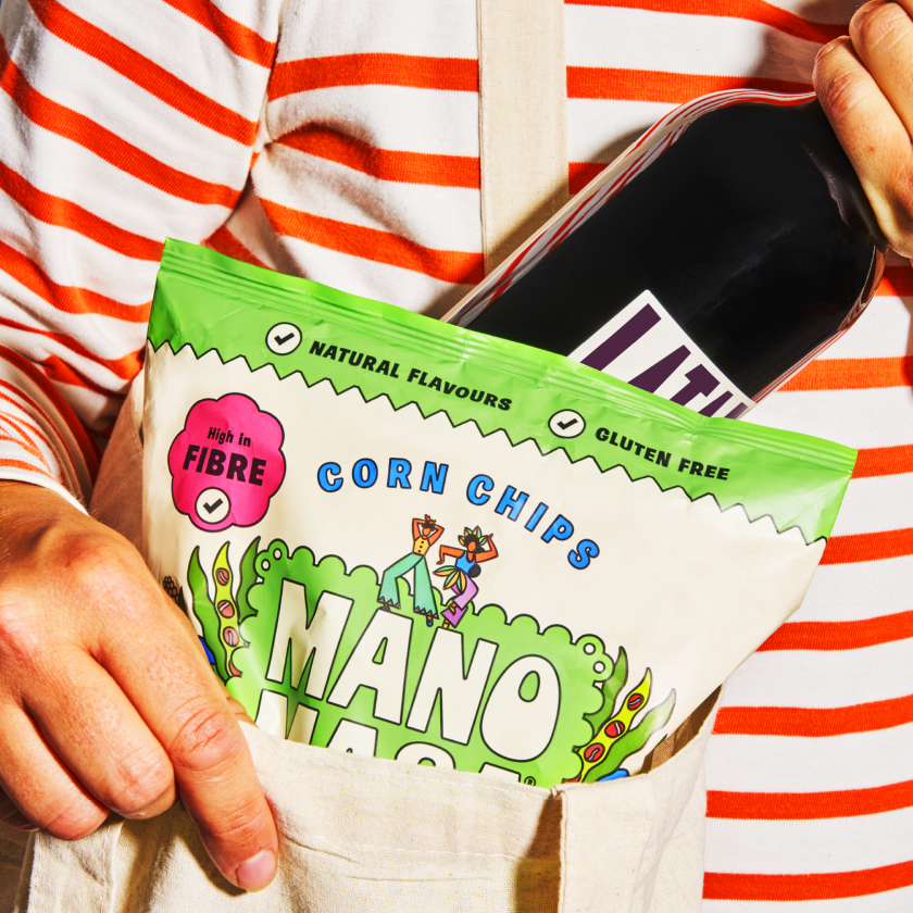
The London studio drags the premium tortilla brand out of the farm-shop aisle with a vibrant new palette, dancing mascots and packaging that tastes as good as it looks.
You know those tasty snack-treats called Manomasa? The ones saved for special occasions or BBQs with friends, and only available from the "posher" supermarkets? It's probably because of the premium offering and rather serious packaging – not to mention the muted tones a
The London studio drags the premium tortilla brand out of the farm-shop aisle with a vibrant new palette, dancing mascots and packaging that tastes as good as it looks.
You know those tasty snack-treats called Manomasa? The ones saved for special occasions or BBQs with friends, and only available from the "posher" supermarkets? It's probably because of the premium offering and rather serious packaging – not to mention the muted tones and grown-up illustrations that describe exactly what high-end flavours might be waiting inside.
Despite all this, the popular tortillas have just undergone a big brand refresh, thanks to Derek&Eric, the London-based design agency founded by Alex Stewart, Adam Swan, and Jon Gibbs. It's only when you see the new identity and packaging that you realise just how much an update was needed.
Since its launch, Manomasa ("Mano" is Spanish for hand, and "Masa" is the maise dough used to make traditional tortilla chips) might have built a small but devoted following (myself included), but it has struggled to shake off its reputation as a wholesome, "farm shop-esque" snack brand found only in premium retailers. Its parent company, Valeo Foods UK, wanted to break out of this niche and fling itself into the mainstream. How it achieved that began with a review of its strategy.
Derek&Eric went back to basics, focusing on what inspired the product in the first place: making the brand's look match how it tastes, while also drawing on influences from Latin America – its energy, passion, colour and warmth. It kept the existing layout of the packaging, with the logo front and centre, as well as the colourful display of ingredients and the cream background, but gave it all a lively Latin American feel.
What that means is a glow-up founded on the tagline "Snacks With Spirit". The palette, as you'd expect, is now satisfyingly vibrant, with splashes of teal, hot pink, bright orange, acid green, and happy yellow that instantly point out the different flavours. Yellow is pineapple and habanero chilli, by the way. We're not sure how that lands, but we're eager to try it.
Derek&Eric also added a new icon featuring two dancers. Caught mid-dance, they convey a sense of rhythm that adds life and movement across all platforms. Accompanying materials for social media, recipe books, packaging, and delivery boxes with branded tape complete the refresh – all with their own happy drama. There are even vinyl records and poster designs, which are hopefully up for grabs. (Derek & Eric, if you're reading this... tell us how to get our hands on them!)
But, aside from the product packaging itself, it's the delivery trucks that are the best of all. Against a beautiful blue backdrop, illustrations decorate the surface… the two dancing mascots appear alongside the new logo in handwritten type. On the truck's rear doors sits a menu, as though it were something out of Jon Favreau's 2014 film Chef. I can almost hear the Latin vibes.
It seems we're not the only ones to appreciate this overhaul: the project won Gold at the FAB Awards. Congratulations to all involved. I'm off to Waitrose to find that pineapple flavour.
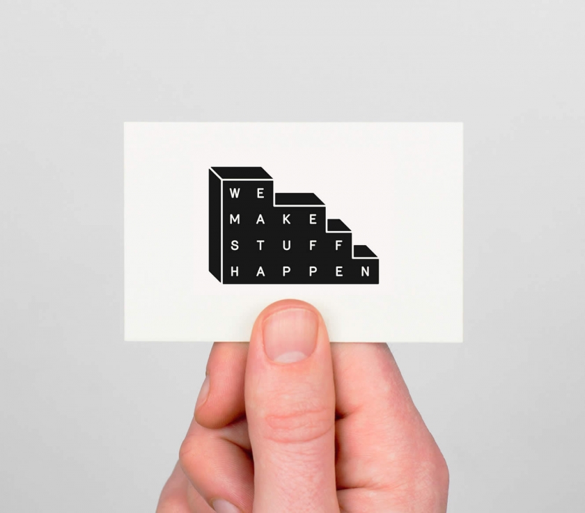
We Make Stuff Happen by Maddison Graphic
Business cards were once deemed dead. Not anymore. They're back in a big way. If you're looking to design your own, here are some great examples to inspire.
Haven't you heard? Business cards are making a comeback. Yes, really. The global pandemic, not that we like to mention it, put a stop to all in-person events. But now they're back, and increasingly so, people are out networking again. Myself
Business cards were once deemed dead. Not anymore. They're back in a big way. If you're looking to design your own, here are some great examples to inspire.
Haven't you heard? Business cards are making a comeback. Yes, really. The global pandemic, not that we like to mention it, put a stop to all in-person events. But now they're back, and increasingly so, people are out networking again. Myself included.
The one thing I keep hearing from all the recent conferences, festivals, and talks I've been to is how nice it is to hand something real to the people we meet. A little card of information, beautifully designed and printed on the kind of material that makes designers let out a happy sigh (Laura Boast, I'm talking to you).
I came back with dozens of gorgeous business cards from Pictoplasma in Berlin and OFFF in Barcelona. And it got me thinking, perhaps it's time we pulled together a fresh list of excellent business card designs to inspire you to create your own. The following are either classics from the archive or fresh offerings that caught our eye.
For Momofuku's all-day LA restaurant Super Peach, Matt Willey's team at Pentagram built an identity around contrast – a whole family of hand-drawn, off-kilter wordmarks (with illustrator Pol Montserrat) that stretch, squash and jitter, set against a strict black-and-white palette.
The business card and letterhead keep it gloriously restrained: brown paper and off-white stock letting the wonky lettering do the talking. As the studio explains, the "hand-drawn wordmarks [can be]... used interchangeably throughout the system, creating a dynamic identity that complements the restaurant's energy."
We especially love the accompanying invites and the simple, black-and-white packaging for takeaway food. Not to mention the gorgeous postcards, featuring Pol Montserrat's beautiful work, front and centre.
One from Lotta Nieminen's archive, this business card design is for Bec Brittain, a New York-based lighting and product designer who is "driven by luxurious materials, intuitive forms and forward-thinking technology".
According to Nieminen, the studio explores and experiments with new techniques and materials, "pushing the boundaries of American-made, centrepiece lighting design". As such, the designer opted for luxurious vintage green hues and a gold/bronze foil featuring the uppercase logo, which comprises two different typefaces to highlight her client's name.
Product photography is by Lauren Coleman. Check out Nieminen's website to see the full project in effect.
Probably the most colourful example in the bunch, these business cards are for Pino by Bond, a Helsinki-based design studio that is doing some brilliant things in the design world right now.
The work is for the interiors shop Pino, a Finnish word meaning 'stack' or 'pile'. This name inspired the whole store and brand concept, from the logo to the shop fixtures – all crafted by Bond when it was called upon to develop its new identity.
"The interior design, with its subtle colour and material palette, works as a neutral background for the playful, colourful visual identity and products," Bond explained. Photography is by Paavo Lehtonen.
Stockholm's award-winning studio BVD crafted this minimalist design for Mattias Jersild, known locally as "Sweden's best copywriter".
Restrained and beautifully laid out, this business card might not look like much, but to the designer's eye, it's perfect. We're surprised it's no longer on BVD's portfolio. But to be honest, it's a pretty old project. We just had to include the work, as it's such a perfect demonstration of turning something so simple into an elegant piece of art.
Estampaciones Fuerte is one of the world's leading metal stamping companies and has been around for over 45 years. In 2015, it approached Barcelona-based design studio Hey to create a new, modern identity for its established brand.
"The main objective was to design a new, modern identity for this metal stamping company," said Hey. "Their industrial experience and professionalism are very important to the company and their clients. The identity needed to reflect these values straightforwardly while also showing the technical side of the business."
The resulting logo consists of three metallic strips that hint at the 'E' and the 'F', while the new brand palette evokes the company's industrial heritage: all orange, grey, black and white. For the business cards, Hey played with those three strips on a simple grey background. Elegant yet on point. Photography by Roc Canals.
Sydney café Story is built around one idea: storytelling. And so when For The People was appointed to handle its brand identity, it ran this premise through every touchpoint, from cups and packaging to the business and loyalty cards.
The accompanying business cards have a lovely old-library-card charm, set in DM Mono, Blaze Type's Surt and Cooper, in a moreish palette of deep blue, millennial pink, chocolate brown and pale yellow. We especially love the chance to collect stamps on one side that feature the new brand mascot: a monstrous figure with big eyes and horns, yet plenty of warmth.
Proof that a humble card can still tell a whole story.
At the beginning of 2013, three of Finland's most prestigious art academies merged into a single institution. Bond was appointed to create a unified brand identity and architecture that also allowed room for the individual academies to build their own profiles.
The solution was formed around deconstructed logotypes that distinguish the university from business and science institutions, while a simple, bold anchor symbol 'X' has multiple meanings, just like art does. "The symbol can be seen, for example, as a starting point, a destination, a meeting place, a location, a signature, an unknown force, a warning, an irritant, a question and a solution. This holistic project covered all brand touch points," Bond explains.
Business cards were included in the rebrand. All wavy, colourful and unconventional. We love them.
We Make Stuff Happen is a production company specialising in exhibitions and events. Maddison Graphic designed its new identity, stationery and website, including these lush business cards printed with foil blocking on Colorplan using typeface Merkury.
It's one in Maddison Graphic's archive, but it still deserves a place in this list. We adore the logo that suggests a wall of bricks. And visiting its client's website, it's even nicer to see the identity still in use. When something isn't broken, why fix it?
There are two versions of this business card: a black or white logo on one side, and the person's details on the other. We wonder if they're still using them.
Sucre is a Latin-American-meets-European restaurant inside a 310-year-old former concert hall on London's Great Marlborough Street, and DutchScot's identity tells its story of immigration.
It features Old World references mismatched and rebuilt into something new, with Argentine tango steps used as decorative motifs and illustrations of Buenos Aires porteños by Rebecca Sutherland.
The print suite (cards included) carries that richly crafted, heritage-meets-modern feel. It's the perfect solution for a restaurant headed up by a much-respected Argentine chef, Fernando Trocca. We love that the menu tells the story of his immigrant background and the European adventurers who crossed the Atlantic to make their home in his native Argentina. The wine list makes the same trip. While the business cards keep it simple, leaning into the beautiful serif logo, they are imprinted on one side to show the embossed version on the other.
DutchScot leaned into the 'factory' half of the name, building a playful industrial identity where animated typographic 'conveyor belts' ferry the brand's messages, and the logo is an abstracted conveyor-belt 'F'. Witty, kinetic and full of movement, carried right through to the humble business card.
Of course, the business card isn't animated. But you get the hint of movement from the clever use of lines and swirls across its surface. The featured typeface is Rois by the foundry New Letters, while Heldane by Klim is used for smaller body copy.
At the time of its release in 2022, DutchScot confessed it was one of their favourite design projects. We wonder if that still holds today.
11. Pink and Holographic personal business cards by Alexia Roux
For her personal branding, French graphic designer Alexia Roux created pink and holographic business cards. Dazzling, reflective and pink – what more do you need? Printed by Atelier Bulk, a Bordeaux, with paper by G. F. Smith.
Mind you, these cards were released over five years ago, so we're not sure if they still stand. Looking at Alexia's recent portfolio, though, it's clear she's become renowned for logo identities and crafting beautiful printed materials. We're impressed with these designs for Maison Emilienne – another use of pink as a backdrop and gold-foiled materials.
For his own business card design, Parisian creative Quentin Monge of Don't Try Studio leaned into something tactile and colourful.
The illustrator and art director, known for his muted colours, soft, swirly characters, and distinctive, cheerful style, has graced many magazine covers, product packaging, and posters.
We love the calming yellows and blues of these designs. We're pretty sure Quentin has since updated these bad boys, but they're so nice to look at that they deserve a place in this roundup of inspiration.
Wool brings up-and-coming Nordic brands (think MENU, TEKLA, Santa & Cole) to East Asia from its Hong Kong studio store, and London's Alex Hunting Studio gave it a quietly luxurious identity to match.
A bespoke wordmark sits next to chiselled, sharp lines against soft curves, while the print and packaging add tactile finishes – fabric embossing, a deep, clear-foil deboss, and crisp silver foil – all wrapped in a palette that even includes an official 'Hong Kong Tram Green'. A small, beautifully made business card if ever there was one.
Although released in 2022, the work by Alex Hunting is timeless. Which is no surprise, given he's renowned for design direction on Kinfolk, Footnote, and the John Lewis Foundation.
Who better to design a joyful business card than the people obsessed with geometry and colour?
For their 10th anniversary, Barcelona's Hey Studio made themselves a set of cards in vibrant colour gradients, across 24 versions, finished in both matt and satin. "It represents Hey's ethos of having a positive attitude and an open predisposition, something fun and expected," says the studio.
Simple, playful and unmistakably Hey – proof a card can be a tiny mission statement.
15. Sewing Thread Card for Matière Noire Studio by Burak Kaynak
This limited edition Sewing Thread Card style handmade business card was designed by Burak Kaynak for Montreal-based fashion label Matière Noire Studio.
To match the brand's high-quality, hardworking nature, materials were carefully selected. And that certainly applied to its client's business cards.
Letter-pressed on 100% cotton Lettra Fluo White paper, each card is hand-wrapped with natural black cotton thread, which helps connect the raw materials used in the fashion directly to the brand identity.
This one is probably the most original of the bunch. We love the clever nod to a cardboard spool organiser – something keen sewers use to wrap and store loose thread. Photography is by Ali Inay.
Onslow is a no-nonsense, flavour-first restaurant in Bruges named, rather brilliantly, after the Keeping Up Appearances character. Yes, that's right. The "lower-class" relative of the snob, Hyacinth Bucket (pronounced 'bouquet' to those in the know).
Belgian designer Davy Denduyver gave it an identity to suit: a bubbly handwritten wordmark colliding cheerfully with the two most ordinary fonts going, Helvetica and Times New Roman.
One of our fave picks because sometimes, you don't have to go over-the-top to get the results you want. In this case, nostalgic, contemporary and refreshingly unprecious – business cards and all.
The New Yorker cover artist on why a cover still feels like a miracle, the morning David Hockney died, and learning to paint bedding like water.
Gayle Kabaker has illustrated some of the most recognisable covers The New Yorker has ever run, but she will be the first to tell you the gigs always astonish her. "It never stops feeling like a miracle," she tells Creative Boom. "Partly because I send so many ideas and finished paintings that I get no response back, or that get rejected, so when I do get a cover, that's why it seems miraculous. But the joy of seeing my art on the cover of The New Yorker just never changes, either. It's always such a thrill."
It's this mix of persistence and wonder that runs through everything she makes. It was there, too, at the very beginning. Her first New Yorker cover, June Brides, marked a turning point in her career as well as how she paints. She had started working in a looser, more painterly style, and at the time it met resistance. "My agents at the time said they didn't think it was a very marketable style and they didn't want to put it on the website," she remembers. When the possibility of a cover came along – in exactly that new style – she pushed back. "I kind of insisted that they put this new style of work up. Maybe it is marketable, and it turned out I was right."
She had a hunch that the disappointment might be hiding something better. The painting that became June Brides came out of a family show she staged around 16 years ago, a body of work full of women in beautiful gowns that, to her dismay, sold only a few. "I was actually quite disappointed," she says. "But within six months, I had turned one of those paintings into June Brides, which became my first New Yorker cover. So I'd say I had a better outcome than I would have if I had sold all the paintings from my show. I always try not to be attached to the outcome I'm hoping for, because maybe the universe has a better plan."
Her openness to redirection was tested earlier this month, when Gayle woke to the news that David Hockney had died at 88. "I saw it first thing in the morning, and I immediately texted my artist friend Noah Woods, who met me in Paris last June, so that both of us could go to the Hockney exhibition for two days." She put aside her plans and sat down to write – a newsletter about how deeply his work had shaped hers, and the whole story behind it.
The story began at the Met, in front of one of his pool paintings. "I heard a whisper saying you must paint people in pools," she says. "I followed this guidance, and it took me down a path of starting to paint people in pools, and made me start to paint water and oceans in a completely different way." Her approach to water is now far more interpretive, almost abstract. She photographs her subjects, then converts the images to high-contrast black-and-white, so she reads everything in terms of shapes and tones. "The more I draw on location, the more I start to see things clearly, then I interpret them however I want to make it my own view."
In the days after Hockney's death, she gave herself completely to his work. "I spent the weekend painting, looking at his work, and just being inspired by it – giving myself permission to use a pattern that he might've used for a sky, or to be really inspired by a pattern that he used for grass or wheat in a field." The painting that emerged is one she is especially proud of. If she could have asked him anything, she says, it would have been about portraiture: "This is something I know I'm good at, but it takes a lot of reworking for me to get a likeness most of the time, and I would love to get better at catching a likeness that's enough of the person's spirit to make everyone happy."
A pneumonia, a terrible mattress and a new series
Gayle works best in quiet. She lives in the countryside and guards the peace fiercely. "I really try to have a very spiritual connection with the universe, and being quiet is part of being able to listen to the muse," she says. "If life is too busy and chaotic, I won't hear it."
Listening recently led somewhere she never expected. While teaching two back-to-back workshops in Greece, planning to paint people in water, she came down with pneumonia on day three. The weather turned, the water was off-limits, and the island Airbnb she had booked to paint in turned out to be miserable. So she left early for a hotel in Athens – and woke at 6am with an idea loud enough to get her out of bed. "I could paint bedding in a similar way that I paint water," she says. She set up her tripod and phone, used herself as the figure reference, took screenshots to draw from, and began studying the folds. "I realised I was right."
There is a great detail here: after a decade hosting a glamping-style Airbnb on her own property – ranked number one in searches in Massachusetts more than once – Gayle considers herself something of a bedding expert. "The bed was terrible, the sheets were polyester," she laughs about the island rental. Back in her studio, the discomfort became a body of work. The resulting bed series shows a woman sleeping alone, and Gayle is clear about what it means. "One person saw her as being lonely, and I see her as simply revelling in rest. There's absolutely nothing lonely about these paintings to me. They're more a celebration of sleep and rest and self-care."
Teaching, granddaughters and the long game
For all the solitude, community keeps her engaged: a network of artist friends who inspire her, and a teaching partnership with Jennifer Orkin Lewis, known as August Wren. Together, they have run 13 weeklong workshops around the world over the past four years, with a 2027 retreat in France now on sale. Teaching, she says, has changed her. "It's been an incredible opportunity for me to become a better person – a better human being. I've learned how vulnerable and fragile people can be when you're teaching them in person, and how to respond in a way that is helpful and not hurtful. That took some learning, some mistakes, and some tears."
She has no patience for cutting corners. "Kind of like Malcolm Gladwell's 10,000 hours, there are just no shortcuts. It just takes putting in the time to get better." These days, she is hooked on the weekly portrait sessions run by Chloe Briggs at DrawingIsFree.org – two to four minutes a face, no agenda. The same no-pressure spirit drives the sketchbook series she has kept of her granddaughters for five and a half years, now on its fifth book. She set three rules when Mona was born: she had to be having fun, it didn't need to look like her, and there was no professional or monetary goal attached. "It was purely for fun," she says – though it resonates with people anyway. Now Mona, who loves to draw, sits and turns the pages with her over a steaming cup of milk and a coffee.
There is plenty still on the list. A collaboration with a fashion designer, turning safari paintings into fabric for a collection ("and stay in the giraffe hotel"). Animated titles for a film or TV show. It is the same instinct that once took her to Australia with a 10-person crew for a collaboration between The New Yorker, Condé Nast Traveller, and Tourism Australia – a project she calls life-changing, right down to learning what H&MU means.
When you consider all she's shared, you can see there's a quiet conviction that the work matters most when it gives something back. A single Washington Post illustration about the second women's march, paid almost nothing, led to a years-long collaboration with Vital Voices and a book of 100 portraits, Vital Voices: 100 Women Using Their Power to Empower. "In these crazy times in our country and in the world, I hope that my work can bring a bit of light and joy into someone's life," she says. "Teaching feels like a good way to give back."
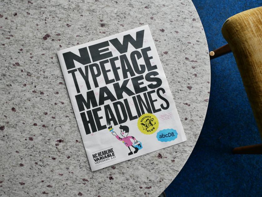
Drawing on the heyday of the tabloid press and the inspiring archives at St Bride, the all-caps variable font marks the launch of D8's new type studio – and a break from spiralling licence fees – ahead of its debut at Birmingham Design Festival.
Any discerning designer will tell you how expensive typography can get. Not to mention the minefield of licences and usage. And when the fees on your headline font keep on climbing, and that ty
Drawing on the heyday of the tabloid press and the inspiring archives at St Bride, the all-caps variable font marks the launch of D8's new type studio – and a break from spiralling licence fees – ahead of its debut at Birmingham Design Festival.
Any discerning designer will tell you how expensive typography can get. Not to mention the minefield of licences and usage. And when the fees on your headline font keep on climbing, and that typeface is the backbone of your visual identity, there comes a point where owning one outright makes more sense.
That's why Anne Ward, CEO of Newspaper Club, has teamed up with old pals D8 to create a bespoke typeface, NC HEADLINE, that is uniquely theirs and no one else can use. It's the first of many typefaces for the creative agency, which this week has launched abcD8 – its new foundry that designs typefaces clients own outright, with no licence fees attached, ever.
Newspaper Club is its first customer, and what they've created will be revealed this week at Birmingham Design Festival, where a type specimen printed on the company's own tabloids – plus a short film documenting the process – will put the new font through its paces.
To inspire its design, Anne and the D8 team went through St Bride Foundation's archives – the home of the printing press in London, and a brilliant place to visit if you haven't already. "Initially, we looked at the sophistication of broadsheet mastheads, but it felt like it really lacked the energy that Newspaper Club has," says Anne. They turned instead to the heyday of tabloids, when typefaces like Interstate (Daily Mirror) and Franklin Gothic (The Sun) ruled the front pages. "Rather than simply copying the tabloid look, we wanted to refine it a little more and so combined it with more vintage styling, helping to make it more our own."
The archives turned up many surprises, shaping the direction of the design. Show posters and how they handled certain character shapes, for instance. "We liked how they used variable-width characters to shout about something while using all available space on the poster. That wasn't something we'd expected to study initially, but it ended up having a real impact on the design," says Anne. "Those references helped us round out and refine the typeface, giving it more personality and helping us resolve some of the character forms in a way that felt distinctive while still being rooted in print culture."
Creating something with heritage whilst remaining forward-looking and modern is no easy task for any designer. Rules will inevitably be broken to accommodate both print and digital demands. "From our perspective, we wanted to evoke the confidence and character of classic newspaper headlines, but we also needed something that could work seamlessly across all of our channels," adds Anne.
"One of the biggest departures from our historical references was the emphasis on flexibility. Traditional newspaper headline typography tends to be quite static, designed for a specific context on a printed page. We needed something much more dynamic: a typeface that could work across social media, video, print and large-scale applications, while still feeling unmistakably rooted in the world of newspapers."
That thinking led Anne and D8 towards a variable design with no fixed widths – one that can expand, condense and adapt to different formats. Despite this, they deliberately kept one restriction: they didn't build a lowercase alphabet. "We wanted the typeface to remain all caps, reinforcing its role as a headline typeface," explains Anne. "We stack our headlines a lot, so having the ability to adjust the width gives us much more flexibility. Depending on the space available, we can make the type incredibly condensed or much wider and more expansive, often even within the same headline."
The new foundry abcD8 has launched, promising to design typefaces that brands can own outright, "free from fees or ongoing licences". But how does that model work commercially, and why go against the standard licensing approach?
Steven Bonner, creative director at D8 and abcD8, says: "We treat the way we work with type in exactly the same way that D8 does with other design projects. This means using a transparent pricing structure where the client pays for our time. We don't charge for licensing design work anywhere else, so why do it with type?
"We've found that the pricing structure for type has left a lot of our clients more than a little confused and struggling to navigate a complex world of licences across a host of touchpoints, so we want to make it simple. If we provide good service, we hope clients come back to us the next time they have the same need, rather than charging them over and over for the same work."
It makes total sense. Which raises the question, whose idea was the typeface for Newspaper Club? Did Anne go looking for one, or did abcD8 propose it as a launch project? It was Anne who approached D8 after working with them for over a decade. "During that time, we'd seen font licence fees rising and rising," she says. "Our headline font had always been such a huge part of our identity; it just made more sense that we should own it outright."
Along with the launch of a newspaper specimen at Birmingham Design Festival this week, Newspaper Club has released a film about the making of the new typeface. "We didn't just want to say 'here's a new typeface' and walk away," says Anne. "We know how much our community loves to see the work that's gone into something. People always ask to see behind the scenes at the printing press, and we thought this was a fun way to bring that energy to this project."
Anne explains it's important for them to showcase not only the design process but also the collaboration and teamwork that goes into creating a typeface so fundamental to their brand identity.
The popular Netflix series Abstract: The Art of Design was a major inspiration for the film, which features an animated version of Newspaper Club's brand mascot, Russell. Worth a watch.
Can you get your hands on the typeface or the specimen? Not NC HEADLINE, no. But you can get your hands on the specimen by visiting Newspaper Club's stand in the Analogue District at Birmingham Design Festival this week. They're also hosting a talk about print on Friday, and will be handing out copies of the type specimen, which doubles as a pretty gorgeous poster.
If you can't make it to Birmingham, don't worry… Newspaper Club will be taking the specimen on tour at future events, so look out for where they're heading next.