Palesa Monareng has drawn over 100 self-portraits – and is now turning them into a book
Candle, 2022
The London-born illustrator has spent a decade building a distinctive pencil-based practice, and she's only just getting started.
Ideas come to Palesa Monareng on long walks with her dog, Herzog. Not from scrolling – she is already fretting about how much the "near catatonic scrolling" she does shapes her creative output – and not, despite what her client list might suggest, from the briefing documents of the many major commissions that have come her way. Just the walks with Herzog.
Palesa is a London-born illustrator, a decade into a practice built on graphite portraiture, animated motion drawings and an ongoing body of self-portraits now more than 100 works deep. After a foundation year at Central Saint Martins, she grew her audience through what she describes as "irreverent sketch projects". This included influencer portraiture and Moleskine travel sketches, producing work that was playful, specific and shareable enough to reach art directors in the United States. Early commissions from Nike and The New York Times sprang up from this. And since then, her client list has expanded to include Amazon, Netflix, ESPN, Forbes, The New Yorker, HarperCollins and Macmillan.
What holds it all together is the pencil. Palesa's graphite portraits are precise and atmospheric, carrying weight and texture in a way that feels out of step with what typically fills our screens and feeds. She returns, again and again, to loops and to "arrivals as endings, slices of the surreal and all the fun textures you can arrive at with just plain pencil on paper". Her reading list reflects the same sensibility and shapes the architecture of how she thinks and creates: Borges' short stories, Eduardo Galeano's illustrated Upside Down World, Jodorowsky and Moebius' The Incal, Hofstadter's Gödel, Escher, Bach.
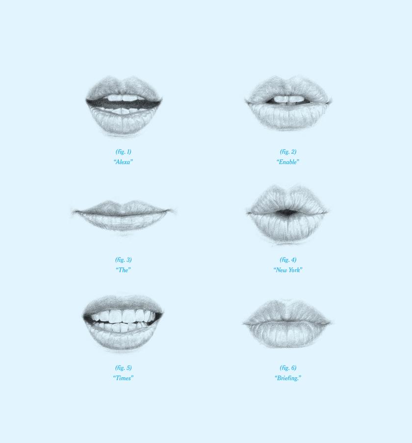
Amazon Alexa campaign
Essence Power 40
Bleacher Report, NFL
Work for The New York magazine
Her motion portraiture, on the other hand, involves a slightly different labour of love. She uses old-school rotoscoping, which involves shooting video, cutting footage to the desired frame rate in Photoshop, hand-drawing each layer, scanning them back in, and generating the animation from the stack. It is painstaking in a way that most digital workflows aren't, and the results bear that out. The Candle animation, in which she worked into a single sheet of paper with pencil layers scanned at intervals, produces a shadow play that feels almost alchemical. "I really enjoy building an animation on a single piece of paper," she says, "in conversation with the scanner."
A more recent piece, Cube Study 2026, came after Palesa signed with literary agency Janklow & Nesbit to write her first book – a manuscript threading together those 100-plus self-portraits with the experience of her digital life. It has her thinking about how identities are filtered and shaped through platforms. "Now that so many of us are in daily conversation with some kind of agentic Tom Riddle's diary," she says, "ruminating on consciousness doesn't seem as esoteric as it used to." The cube in Cube Study functions as a way into that – a moving, Rubik's Cube-like structure that holds the question of the self at a distance as it shifts and swaps around.
Steve Aoki
Whales, 2025
Cube Study, 2026
Doge Study, 2019
On what she hopes her audiences take away from her work, Palesa is refreshingly direct about the conditioning that years of digital-first practice can produce. "Like a lot of digital-first creatives, I've trained myself to gauge a response to my work through engagement rates and virality," she admits. But strip that away, and what she actually wants is pretty clear: "I just hope they enjoy the quality of my lines, and that a sense of mystery and mischief welcomes them into spending time with the works."
With new Nike work dropping soon and the manuscript in full swing, we're excited to see what comes next. Herzog, presumably, is ready for a walk.
The Favourite