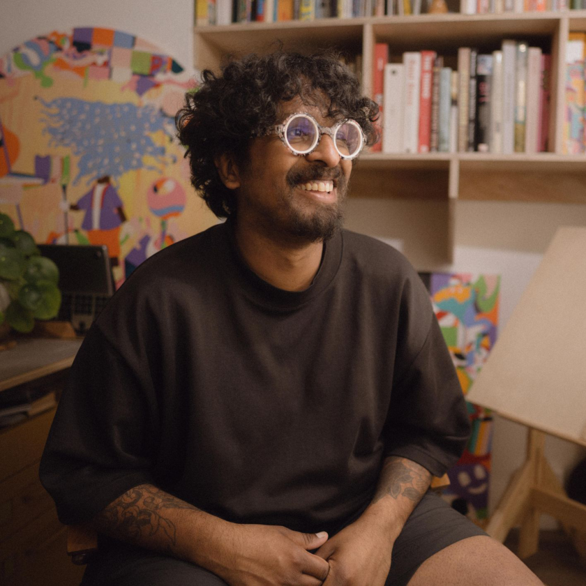
Murugiah. Image credit: Jack Woodhams
The London-based artist behind the Quentin Blake Centre's debut solo show talks to us about parent pressure, pandemic breakthroughs and learning to stop making other people's art.
On day one of his first solo exhibition, hosted at London's Quentin Blake Centre for Illustration, the multidisciplinary artist Murugiah did something unconventional: he showed up. In practice, most artists tend to stay a
The London-based artist behind the Quentin Blake Centre's debut solo show talks to us about parent pressure, pandemic breakthroughs and learning to stop making other people's art.
On day one of his first solo exhibition, hosted at London's Quentin Blake Centre for Illustration, the multidisciplinary artist Murugiah did something unconventional: he showed up. In practice, most artists tend to stay away, spooked by the fear of watching strangers encounter their work for the first time. Murugiah, however, stationed himself in the gallery.
The first visitor to walk in looked around, slightly bewildered, and asked which way to go. He pointed her upstairs. She asked, with polite uncertainty, whether she was supposed to know who he was. "No," he told her. "This is my debut show, so enjoy it." Then he went and sat in the café. Half an hour later, the visitor came and found him. She sat down and spoke with him for 20 minutes about his work. "I didn't know who you were before," she told him, "but I definitely know now."
It's the kind of moment that's impossible to engineer, but for Murugiah, it meant something profound. That work rooted in genuine personal truth can reach people who've never heard of you, on its own terms, without any of the machinery of reputation.
And this idea, that the most personal work is always the most creative, sits at the heart of everything he's been building towards.
Murugiah was speaking as part of The Studio, Creative Boom's membership community for working creatives, and what came across most strongly, beyond the charm and the self-deprecating humour, was the rigour underneath.
This is a creative who's spent years deliberately, and sometimes painfully, figuring out what he actually wants to say, and who's arrived at a genuinely unusual place. A creative practice rooted in personal truth that also happens to be commercially thriving.
The crucial pivot
Murugiah trained as an architect. Not for a year or two, but for a full seven. He emerged qualified and, as he puts it, looking one way while feeling quite another. "Losing all of your hair from stress of a seven-year course suggested that maybe that subject wasn't the right thing to continue with," he says, with characteristic dryness.
He'd loved art and design since school and had asked his parents if he could pursue it at 18, but had been firmly steered towards something more dependable. When he eventually left architecture in 2012 and told his parents he was going back to illustration, their response was more resignation than enthusiasm. "Just do what makes you happy," they sighed. He took it.
What followed was a decade of learning, iteration and accumulated frustration. He worked in-house at a greeting card company. He created packaging for a restaurant chain, designed crisp packets, and learned about kerning. He developed a freelance illustration style that was technically accomplished, which led to editorial work and a book project illustrating scenes from films. And then he stopped, looked at what he'd made, and felt… nothing.
"I just felt so inauthentic making this work," he says. "I was like: 'This is not the way I think. This is not the way my work should be.'"
That reckoning came just before the pandemic. When it hit, and the government support payments arrived, he gave himself permission to start again. "Your rent is covered," he reasoned with himself. "You've got all this time on your hands. You've been complaining about not doing the most authentic thing. Just sit down and try something new."
Digging into his influences
The breakthrough came via a conversation with a friend and fellow illustrator Doaly, who made a simple observation. Murugiah was good at detail, colour, and dense compositions. So were lots of people. What was different about him? "You're a brown guy," he said, matter-of-factly. ("He's brown too," adds Murugiah, "so he's allowed to say that.") Doaly's suggestion was to make work about that specific experience; to bring his heritage into the visual language he was developing, rather than treating it as incidental.
What followed for Murugiah was a period of digging back through his influences: his Sri Lankan heritage, his suburban Welsh upbringing, his love of pop punk, anime, 1960s illustration and cult cinema. He started to see how they could coexist.
His first test piece merged Sri Lankan raksha masks with characters from his favourite Marvel comics and the protagonist of Jodorowsky's The Holy Mountain. "I was like, 'Oh my God, I've come up with something unique, weird and fun,'" he recalls.
From there, he gave himself a simple weekly discipline: one new piece, built on the same visual rules as the last, iterated slightly each time, posted publicly regardless of the response. "I just knew I wanted to build a world, build a visual world for me to play within," he says. "I didn't stop. I just did it over and over again, once every week consistently."
By the end of that year, he had a style. More precisely, he had something that felt inalienable to him. The commissions followed, and they haven't stopped since.
Really saying something
His exhibition at the Quentin Blake Centre represents Murugiah's attempt to take stock of everything those years produced. He approached the centre in 2024 with a proposal to show a small group of personal paintings in their windmill space; they came back and offered him the main gallery.
The U-shaped former pumping hall now houses a chronological journey through Murugiah's commercial collaborations on one side and his personal paintings on the other, with a centrepiece sculpture based on his painting Iceberg, which he describes as being about "not really knowing what's beneath the surface". That phrase could double as a description of his practice more broadly. The candy colours and surreal characters are what you notice first; the emotional weight comes later.
One painting is about external pressure and the point at which it becomes unbearable. Another depicts the creative process as two flower characters, one with broken petals, one fully formed, "almost like they're evolving like a Pokémon," he explains. In short, he's arrived at a place where his personal themes, identity, heritage, and the gap between who you are and who others expect you to be have become inseparable from his visual language.
Murugiah quotes Martin Scorsese's advice to Bong Joon-ho: the most personal work is the most creative, and you can see why it resonates. "I feel good about having a similar ethos," he says. "That making really personal work means you'll get really creative output."
Finding his voice
Asked when he knew he'd found his voice, Murugiah is characteristically precise. It wasn't after the first good piece, but after a year of them, each one building on the last, iterating in small ways, accumulating until the overall direction felt clear. "By the end of that, I was like, all right, I got it."
When asked what assumptions about himself he'd had to let go of first, the answer is disarmingly honest: "That I was good at drawing. Or that I could draw as other people could." The compare-and-despair mentality, he explains, long predates social media.
What matters, in his view, is finding the specific things you're actually good at and doubling down on them. For Murugiah, that meant flat colour, dense composition, strong shapes, immersive worlds. "The skill set you have is good enough," he says. "It feels good enough for you. And once you get out of your own way, everything seems to make sense."
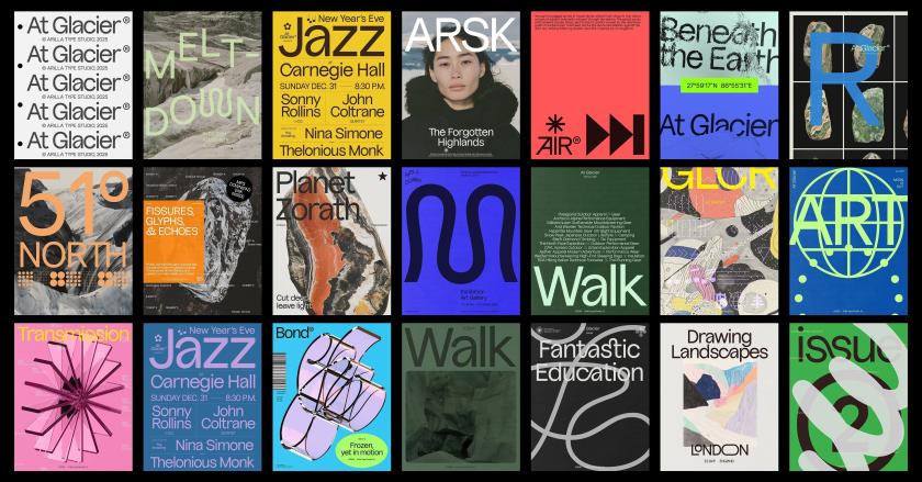
At Glacier by Omar Careaga
For all you graphic designers out there, we've rounded up the latest big releases from foundries across the planet. From display fonts to classic serifs and a family inspired by Iceland's wild landscape, June's offering is so good that some might end up in your current projects.
There's something about midsummer that seems to bring out the best in type foundries and designers. Maybe it's the long days. Maybe
For all you graphic designers out there, we've rounded up the latest big releases from foundries across the planet. From display fonts to classic serifs and a family inspired by Iceland's wild landscape, June's offering is so good that some might end up in your current projects.
There's something about midsummer that seems to bring out the best in type foundries and designers. Maybe it's the long days. Maybe it's a rush of projects finally being signed off on. Whatever it is, June has an unusually rich crop: revivals lovingly reworked, stencils that break their own rules, and display faces with enough presence to fill a poster that could be seen from space. Well, perhaps not. But you get the picture.
What I love about this month's haul is the sheer range. This is creativity at its finest. There are monospaced workhorses built for important data, dashboards and tidy code. We have warm wedge serifs that nod to mid-century America. There's even a display face carved straight out of Iceland's volcanic landscape.
Whether you're after something quiet and dependable or loud and unapologetic this June, Creative Boom has you covered. So grab a brew, settle in, and see which of the following typefaces make their way into your next project.
Sticks is a monospaced typeface built from rectangular shapes with rounded inner corners, reminiscent of reinforced joints in precision-cut metal components. Its strict, rigid appearance follows the same visual language of construction, technology, and industrial machinery. Perfect for any branding projects in that field.
Originally released in 2019 and discontinued a few years later, the typeface was fully reworked, expanded, and re-released this month as a family of individual styles and a variable font. Nicely done, Nguyen Gobber.
Introducing Sahila Stencil, the latest release from Arcane Type Foundry and an expansion of its existing typeface Sahlia, from a single weight to a 10-style family with true italics and a variable font that covers all styles.
Sahlia is a stencil typeface that breaks all the rules. Where most stencils slice away parts of the letters, Sahlia's extreme contrast dissolves the thin parts entirely, as though worn away over time. The result feels both structured and organic: sharp, high-contrast serifs softened by delicate forms.
In the lighter weights, Sahlia has a graceful presence, while at its heaviest, it becomes more dramatic, yet it keeps its luxurious tone.
Designed for projects that want to make an elegant statement but with a little edge, Sahlia performs in editorial layouts, on luxury packaging, and across lifestyle content. Think candles, self-care, and slow living... that sort of thing.
SLTF Curo is a super-heavy display sans-serif typeface designed for brands that want some serious presence. Built around a single extreme weight, Curo comes in five distinct corner-style variants: Sharp, Crisp, Regular, Soft, and Rounded, giving designers a complete tonal range within a single typeface family.
Each variant carries the same bold, unapologetic mass but shifts in character. From the hard-edged tension of Curo Sharp to the warm, voluminous fullness of Curo Rounded, the result is a complete design system of five fonts available with a single purchase.
Curo's large x-height and tight counters make it exceptionally impactful at display sizes. A distinctive lowercase 'g', expressive curves, and an alternate single-story 'a' give it a personality that is both retro and unmistakably contemporary. Built for headlines, packaging, logos, posters, and anywhere a brand needs to take up space with total confidence.
Another bold statement for our June round-up is Unifora by Yep! – a massive sans-serif uniwidth superfamily with an industrial edge and architectural feel. "Unifora starts where DIN leaves off, taking the constructed logic of technical lettering and pushing it to meet the demands of modern screens, without softening the edges," explains the foundry.
It comes with five widths, nine weights, and matching italic and roman styles with slants up to 18 degrees. The variable font spans all three axes: weight, width, and slant—in both directions. What's more, the superfamily is available as five standalone sub-families, each built around the uniwidth principle... that is, within any given width, every glyph holds its advance width across all weights and styles. In practice, that means text never reflows when the weight shifts.
Unifora Condensed works for data-dense interfaces like dashboards, table columns and tight mobile layouts. Meanwhile, Unifora Narrow handles compact body copy and sidebars. Unifora Standard is the default width – comfortable with everything from small UI labels to large display. Then there's Unifora SemiExpanded for display, signage and wide-format applications where letterforms need space to breathe. If all that sounds complicated, there's a user manual to help you decide which is best for you.
Halvar Mono expands the Halvar universe by taking the next logical step: re-engineering Halvar's "constructed forms, raw charm and machine precision" into a monospaced typeface.
With Halvar Mono, every character in each of its nine weights occupies the same width. Built on Halvar's balanced, medium-weight, monospaced typeface, this version is practical and precise across data, tables, and technical systems; steady and dependable in demanding pixel- and print-based applications.
It has an industrial charm and mechanical design for those who value the structure and elegance of monospaced fonts. It includes extended Latin, Greek and Cyrillic and supports more than 190 languages.
Ana Laydner has released a new typeface that joins Fabio Haag Type's exclusive library with a raw, real aesthetic. Letters might "overlap in a hug or collide in a mosh pit" – something that's been compared to the happy chaos of real life. Figures.
With 14 weights of expressive goodness, Drika has strokes that aren't overly polished and are inspired by the earliest sans serifs of the 19th century. Some diagonals end at an unexpected angle, while others have straight forms.
Emojis of all kinds are sprinkled in along with arrows, and that character comes with every weight of the family. In the heaviest weights, some letters might overlap, and that's ok. It's a sans "unafraid of being", according to Ana. She adds: "Drika is a typeface about presence, about occupying spaces without apology". For those of you feeling rebellious this month, we think you'll love how this one breaks all the rules.
Beth caught our eye this month, as it draws on early-twentieth-century English shopfront lettering: a tradition built to stop people in their tracks. Its uppercase draws on Neoclassical type with humanist terminals and convex strokes inspired by hand-painted signage, giving each capital a brightness and precision that feel both nostalgic and modern.
The lowercase follows the calligraphic model of Edward Johnston's Foundational Hand: curves that modulate close to 45 degrees, a single-story 'a' with no traditional terminal, and an 's' that, in the designer's own words, is a poem.
The drawing carries the weight of engraving, particularly the work of Gustave Doré and William Blake. Their influence lives in Beth's fine strokes and the richness of its contrast: a typeface that, according to its maker, holds light and shadow the way a copper plate does – "dark where it counts. Bright where it matters".
A pop gothic serif, if we ever saw one, Beth comes with seven weights, from light to black – each with a standard and alternate character set, plus 594 glyphs and discretionary ligatures.
La Mericana is a vintage-yet-modern type family inspired by Richard Isbell's Americana, originally designed in 1965 for American Type Founders. It builds on the same qualities that made it a distinctive voice in mid-century American typography : warmth, wedge serifs, and generous x-height – and reimagines them for contemporary use.
Nostalgic of classic signage and retro branding, it features a new italic with calligraphic details, adding movement and elegance without losing the family's confident, approachable tone.
La Mericana's large x-height and open proportions keep it legible in tightly set lines. The condensed version preserves the original's distinctive look while making it ideal for branding, editorial, packaging, and compact digital formats, such as Instagram posts, reels, and stories... basically anywhere that needs impact in a small space.
At Glacier is a display typeface inspired by Iceland's raw landscapes. Bold yet refined, it combines sharp structure with flowing forms to create a distinctive and expressive typographic voice. Those famous volcanoes and wild rock formations have clearly made their mark here.
As Arillatype Studio puts it: "Ice-cold elegance with glacial flow" and "a natural grotty, carved by instinct". You could say this typeface is untamed with its unexpected twists and turns. But you'll be glad to know, it's entirely legible and probably our favourite of the bunch this month.
The family includes over 1,000 glyphs, featuring extensive alternates, ligatures, numerals, symbols, arrows, dingbats, and advanced OpenType features. Brought to you by uber-talented graphic designer and printer Omar Careaga.
One of the smartest releases this month is Reel, a condensed headline typeface from Jamie Clarke that asks a deceptively easy question: can a headline grab you without shouting? We all know the usual answer. Condensed ALL CAPS is everywhere, from film titles and posters to tabloid splashes. Sure, it commands attention and locks nicely into a rectangle. But as Clarke points out, it can also feel cold and a touch confrontational, which is why politicians and brands reach for it. Shudder.
His solution is something he calls "Flexi-case": a system that gives lowercase letters the same height and presence as capitals, so you can soften the tone without stray ascenders and descenders breaking that clean rectangular block. It isn't uni-case or anything. Reel keeps the familiar distinctions between upper and lower. It simply lets them share the same space as equals.
Clarke looked to nineteenth-century wood type as inspiration, letting straight strokes bulge gently and curves fill out, especially in the lowercase. "Uppercase is a bit like a poker face," he says. "It projects authority and urgency, but keeps you at a distance. Lowercase carries more personality and humanity because it developed from handwriting."
The upshot is a face built for all the familiar headline territory – film titles, TV graphics, book covers, posters – that still has room to shift tone. Or, as Clarke neatly puts it, a typeface that's "expressive, not oppressive". A fitting typeface to round things off this month.
Image licensed via Adobe Stock
The free routes that used to bring creatives their next commission are closing one by one. It's been happening for some time. And now AI is pretty much destroying the web as we know it. Here's how to keep being found – and, increasingly, recommended – without a marketing budget.
For many happy years, getting found was something any creative freelancer or studio could do on the strength of work alone. A we
The free routes that used to bring creatives their next commission are closing one by one. It's been happening for some time. And now AI is pretty much destroying the web as we know it. Here's how to keep being found – and, increasingly, recommended – without a marketing budget.
For many happy years, getting found was something any creative freelancer or studio could do on the strength of work alone. A website that ranked for your craft. A post that travelled far and wide and carried your name back to your profile. A share that turned a random person into a client. None of it really cost anything except for a bit of time and effort. And all of it was the pipeline to paid work.
Oh, how things change. Organic search has fallen off a cliff. Social media rewards quantity over quality. And the latest? Conversational, agentic AI is now pulling all the shots.
And with today's big news that Pinterest is shifting away from traditional search, it's clear that none of us can out-optimise this on our own. The good news is that the shift rewards a handful of things independent creatives can still build: a direct audience, a distinctive name, and a reputation the new systems can read and recognise as important. Exhausted? Yes, so are we. But here's where to put your energy.
1. Build an audience you actually own
I've been saying it for over a decade – since Meta ruined Facebook for publishers in 2016 – build your own audience. That's because every follower you have is rented. Platforms like Instagram and Pinterest get to decide who sees your work, and the goalposts can change overnight.
An email list is the one audience you get to control. It's a list of people who chose you, and you can reach them directly, whenever you want. So start a simple newsletter, even a short monthly one, and make signing up the clearest call to action on your website. (Our guide to creating a newsletter people actually want is a good place to begin.) A few hundred people who want to hear from you is worth more than ten thousand followers a feed decides to throttle, and it's how plenty of creatives are winning work after quitting social media altogether.
2. Become a "category of one"
Don't roll your eyes, but AI discovery rewards a "good enough" match to a brief, which flattens everyone into interchangeable options. The defence is to be "uninterchangeable". So sharpen the one thing you do that nobody else does in quite the same way. That could be a material, a subject, a voice. You want to be known by name rather than retrieved by attribute. The creatives who survive this current massive shift are the ones a client specifically asks for, because a specific name is the one thing an algorithm can't substitute.
3. Get cited, named and talked about
As someone who worked in PR for two decades, this next tip warms my heart. Because I know public relations is having a golden hour moment. That's because if you still want to be found, recommendation engines lean on signals they can read: who's mentioned in other people's work, who turns up on lists, in interviews, in the press, and in collaborations.
It means that being talked about is more valuable than being optimised. Forget staying in your comfort zone. Say yes to the guest piece, the podcast... even the scary panel on stage that you've been avoiding. Pitch yourself for round-ups in your niche. Every place your name appears alongside your craft is a breadcrumb the systems – and the people – can follow back to you.
4. Make your site easy for a machine to understand
If an AI is going to represent you, it has to be able to read you correctly. That means not blocking AI crawlers on your site. And it means spelling out, in plain language, what you do, who you do it for and what makes your work yours. Don't just have images and a one-word 'work' tab. Name your projects, your clients and your disciplines in actual words. Add alt text to every image. You're not gaming anything here; you're making sure that when a system describes you, it gets you right rather than second-guessing.
5. Show the process and the person
A generative answer can summarise a style, but it can't reproduce the human genius behind it. That's your advantage. In which case, share the process: the sketches, the dead ends, the "why" behind every decision, and the story of a commission. Content about process, along with a real point of view, builds the kind of trust that turns a browsing visitor into a client, and it's exactly the material an AI can't copy from pages that already exist.
6. Make referrals easy to give
Word of mouth is, and always will be, the most powerful marketing channel. And it's still how most independents get their best work. Don't leave it to chance. Tell happy clients you'd welcome an introduction. Keep a tidy one-line description of what you do that someone can paste into a message without having to think. Stay in touch with people you've worked with so you're the name that comes up when they're asked, "Do you know anyone good who can…?"
7. Turn up in real rooms
"In real life" is back, baby. Events, meet-ups, talks and communities – they're all back on the table after those weird post-pandemic years. Like word of mouth, networking is hugely powerful. A conversation at a portfolio night or a face remembered from a meet-up leads to commissions that no number of impressions or page views can match. You don't need a stage, but turning up consistently where your peers and potential clients gather will eventually deliver results.
Just remember to enjoy yourself and make friends, first and foremost. Don't go in with the hard sell, as there is nothing more off-putting.
8. Don't rent your whole presence from one place
Remember the old saying, Don't put your eggs in one basket? It applies here. If a single platform is your entire shop window, one change to its rules can harm you enormously. Spread your presence across things you own and things you earn – your website and newsletter list, plus a couple of channels and the press and communities you show up in. The aim isn't to be everywhere all at once; it's to make sure no one switch, algorithm tweak or new AI layer can take away every route to your door at once.
In summary
None of the above is a quick fix. But don't panic. The creatives who stay discoverable through this enormous revolution won't be the ones who chased the algorithm the hardest; they'll be the ones who built something that's truly their own... a name worth knowing, a direct line to the people who love your work, and a great reputation that travels on its own accord.
She uses real paintbrushes, real pens and real pigments to create images that slip from reality into dreams and beyond.
When Maki Yamaguchi created her first portrait illustration for The Drift magazine, she was pleased with the outcome. With fine detail and bold, gestural spontaneity, her image captured the likenesses of former New York mayor Eric Adams and former Chicago mayor Lori Lightfoot in Maki's characteristic style. She produc
She uses real paintbrushes, real pens and real pigments to create images that slip from reality into dreams and beyond.
When Maki Yamaguchi created her first portrait illustration for The Drift magazine, she was pleased with the outcome. With fine detail and bold, gestural spontaneity, her image captured the likenesses of former New York mayor Eric Adams and former Chicago mayor Lori Lightfoot in Maki's characteristic style. She produced versions in portrait and landscape orientations: the former in black-and-white for print, the latter in colour for the web.
Unfortunately, the article and artwork were dropped, but the story is an excellent example of why a young creative should never give up. Maki dusted herself down, kept the images in her portfolio, and entered them in the 3x3 International Illustration Show 21. The work won a Merit Award, which is now just one of the many in her trophy cabinet, so to speak.
And The Drift? Well, the magazine became one of Maki's regular clients.
Smoke
Tilt
Originally from Japan but now based in New York, Maki's work is characterised by juxtaposition and balance. "I love simple, bold, abstract brushstrokes, but I also love extremely detailed, delicate, realistic pen drawings. I'm drawn to black-and-white or muted palettes as much as to highly saturated, bright colours. I feel awestruck when I see artwork that has these opposite extremes in harmony," she says.
This sense of balance seems ever-present in her approach. On the one hand, she's inspired by folklore and mythology and is a light sleeper whose dreams have been fed by fantasy stories and comics. Yet on the other hand, nature and scientific learning excite her mind just as much. The result is imagery full of sensitivity, arising from Maki's thoughtful approach to art and life.
"As a Japanese person, I'm familiar with the concept that there's a spirit in every living and non-living thing," she explains. "The way you treat them has real consequences. I love folklore, myths, science and nature because they all draw my attention to things that I cannot see with my naked eyes or experiences I cannot have, which further fuels my imagination."
"Whenever strange narratives or images pop up in my head, I want to capture them as something visible by drawing them on paper," she continues.
Attentive clients scouting out her portfolio might notice a little skeleton character that appears here and there in some of her images. It looks cool and has a spooky vibe, but that's not why she draws the character, per se.
Vision of Phuket
"It's funny and surreal to think that we all have a skeleton inside our bodies, but it became more important to me when I realised it could represent a human being devoid of gender, race, age, body shape or facial features – common biases about which become the basis for conflicts," says Maki. "I use the character as my avatar when I want to be seen just as a 'human' so anyone could identify with it."
In her artwork, she's creating an ideal world where everyone is a skeleton and a person's beauty is determined by their inner qualities, because, beyond that, everyone is just bones. She's asking what society would look like in this scenario.
Alongside the mayors Adams and Lightfoot piece, one of Maki's favourite projects so far is a conceptual cover illustration for The Writer's Chronicle, exploring discrimination in publishing – racial, and particularly against women of colour.
Another of her favourites is a personal piece called Smoke, which won awards in the US magazines Communication Arts and Applied Arts in 2023. It's a cityscape she left unfinished for a long time. "I learned that I should always finish drawing no matter what because the last brushstroke can change everything," says Maki.
In the future, she'd love to see her work used in larger formats, such as signs and billboards, but in general, Maki is delighted to work on anything that has a positive impact on society. She has just signed with the agency IllustrationX.
The Slovenian graphic designer and recent Werkplaats Typografie graduate approaches typography with a messy, intuitive process, making work that is impossible to look away from.
Earlier this spring, Tjaša Cizej was staying at her parents' place in Slovenia, surrounded by nature, and noticed buds on a branch. She had spent the previous two years in Arnhem, in the Netherlands, attending the Werkplaats Typografie master's programme. "Mayb
The Slovenian graphic designer and recent Werkplaats Typografie graduate approaches typography with a messy, intuitive process, making work that is impossible to look away from.
Earlier this spring, Tjaša Cizej was staying at her parents' place in Slovenia, surrounded by nature, and noticed buds on a branch. She had spent the previous two years in Arnhem, in the Netherlands, attending the Werkplaats Typografie master's programme. "Maybe that has something to do with the fact that I spent a lot of time in cities over the last couple of years, and when I came back home, I became more aware of the beauty and ordinariness of the nature I grew up around," she tells Creative Boom.
Tjaša started studying graphic design at 15, in high school in Slovenia, before going on to a bachelor's degree at the Academy of Fine Arts in Ljubljana. She graduated from Werkplaats Typografie last summer and is now based in Arnhem, taking on client work and learning to build a variable font on the side. Her practice sits between typography, colour and printmaking, designing posters, identities and collaborative pieces that treat letters as forms to be pushed, pulled, recombined and, occasionally, made almost illegible (almost).
Her process, by her own description, is very messy and very simple. She doesn't sketch beforehand. She starts with a letter and follows the feeling – you know, things like what colours appear first and what forms are starting to take shape. "I'm not professionally trained as a type designer, and honestly, I never really planned to become one," she says. "Mainly, I'm just putting parts of letters together, almost like a puzzle." The posters and identities that emerge from this approach are vivid and restless, awash with saturated colours, forms that hover between legibility and abstraction, and energetic compositions that seem to be communicating something with each line and dent.
Her personal projects are where she creates her favourite pieces, in part because they turned out well, but also because the process of making them was more "lighter and joyful" than others. The Kompas poster is one she is most attached to. Made during her time at Werkplaats Typografie, it involved working with traditional Chinese characters for the first time. "I liked discovering how I could find my own way of working with completely different letterforms," she says. The poster was installed in the lightbox at the Werkplaats Typografie building in Arnhem, where it guided visitors in the right direction, giving the piece a functional dimension alongside its graphic one.
The Book Launch poster, made in collaboration with her classmate and friend Xiaohan Zhang, worked a little differently. Xiaohan provided images and drawing material, while Tjaša's role was to respond, bringing her typographic and visual interpretation to what she was given. For this piece, she chose a photograph of a child hiding playfully and built around it with small typographic elements. "I'm very happy with how it resonated with the event itself and how everything came together," she says. "It also brings back very nice memories of my classmates at Werkplaats Typografie."
The Orange poster, on the other hand, features a grid of 12 uniform squares, each with its own identity. This isn't necessarily a favourite of hers, but she enjoyed how the project pushed her towards printed matter and physical experimentation, a direction she wants to keep following. "It made me want to create more things like that."
What Tjaša does not carry into the work is any particular expectation of how it should land. "I don't carry any particular message or meaning in my work," she says, "but it feels very good to express myself through it and to feel fulfilled by that." This summer, she hopes to turn towards personal projects – potentially a first full typeface, and some interactive publications she has been thinking about for a while.
Malika Favre and George Wu's curated bazaar, I Can't Afford This But Maybe She Can, is full of brilliant, creative things. Here are five of our favourites for bringing a bit of character, and the odd touch of glorious colour, to your space.
I'm going to level with you here. I'm a sucker for a beautiful accessory for my home or studio – even if it serves no function whatsoever, other than to brighten a corner or make me smile. I'm talki
Malika Favre and George Wu's curated bazaar, I Can't Afford This But Maybe She Can, is full of brilliant, creative things. Here are five of our favourites for bringing a bit of character, and the odd touch of glorious colour, to your space.
I'm going to level with you here. I'm a sucker for a beautiful accessory for my home or studio – even if it serves no function whatsoever, other than to brighten a corner or make me smile. I'm talking an unusual lamp that stands out. Maybe a ceramic piece that swells your heart. It's what being a creative person is all about. You want to be surrounded by gorgeous things made by artists and designers you admire and want to support.
It's a sentiment I know illustrator Malika Favre and creative George Wu will understand only too well, as they run their own curated marketplace, I Can't Afford This But Maybe She Can. But beware: money will be spent. Oh yes. How do I know this? It's the whole point of the duo's side venture, which began in 2020 as an Instagram account and has since become a respected catalogue of the most delightful things the design world has to offer.
It now features more than 500 handpicked objects we can't resist – from over 125 indie brands and makers around the world. Everything from homeware, tableware and lighting to art, fashion and the occasional glorious oddity. Everything is chosen with their impeccable taste, humour and a healthy disregard for boring.
For the creative who loves a well-made thing but hasn't got the hours to go hunting for it, this part of the Internet is a gift. Here are five we can't stop thinking about – equal parts useful, beautiful and faintly (dare we say it) absurd.
If you're thinking of updating a room to make it stand out, one safe bet is to decorate your walls with something special. With Alice Guillier's series of tapestries, you'll definitely feel like you have something no one else has.
Made through her studio Safareig, each piece takes a simple geometric framework and gives you a composition that offers plenty of interest to your home or studio. Hang one above a desk, and you'll smile every time you look up at it.
There's something really clever about this work. It reads as bold and minimal from across the room, then rewards you the closer you look. Magic.
Who doesn't love candles? They add atmosphere. A certain cosy charm. They're perfect for summer evenings, and they help add ritual to the darker, colder nights. If you're looking for a centrepiece for your dining table or living room sideboard, Atelier Toit offers stunning candleholders made from solid wooden blocks on asymmetrical pedestals, all in a happy array of bright colours. It's playful function at its best.
As you'd expect from such an art form, each one is made to order in the studio's Amsterdam atelier, and no two come out quite the same, so that yours will be entirely unique. But let's be honest, who needs a candle when the holder itself alone is so nice to look at?
Here's a surprising bit of softness from an industrial material, but a whole load of satisfying colour for your home. Brussels studio Tilt builds this oversized pendant from translucent 3D-printed mesh, so it seems to hover in mid-air, catching the light and throwing delicate, lattice-like shadows across walls and ceilings.
Better still, it shifts as the day goes on, its colour and transparency moving with the light so the lamp never looks quite the same twice. Light as texture, rather than just illumination. This is a design piece guests won't be able to stop admiring.
Yes, they're shelves shaped like hands. Your eyes do not deceive you. And no, you don't need a reason. Tadashi Studio moulded this surreal little pair from the exact measurements of the designer's own hands, landing somewhere between sculpture and storage. Ready to cup your keys, your rings, your phone or whatever you like to keep close while you work.
They're sold as a pair because one hand on its own would look a touch lonely. Equal parts useful and slightly uncanny, in the best possible way.
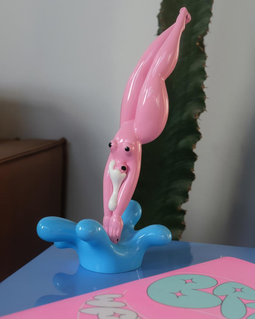
Having bumped into Marylou Faure at Pictoplasma in Berlin, I want this figurine even more. It's a small celebration of curves in object form. Crafted by the French illustrator known for her bold, colour-saturated work and her joyful, unapologetic take on the female form. She's translated her signature style into a glossy, sensual figurine, released in a limited edition of just 100.
One to proudly place on a mantelpiece, giving a whole room some personality. Collectable, characterful and very much a "she can" rather than an "I can't". Marylou, if you're reading this, I'll be purchasing this next.
The self-taught animator on collage, control and why fingers, hair and breasts are the most expressive things to draw and make move.
Most of us spend a lifetime trying to feel at home in our own skin. Sara Priorelli would rather pull it apart, stretch it and twist it to see how far it goes. Somewhere along the way, she finds comedy gold in what it means to be human.
The fifth of seven children, Sara grew up in a house surrounded by chaos
The self-taught animator on collage, control and why fingers, hair and breasts are the most expressive things to draw and make move.
Most of us spend a lifetime trying to feel at home in our own skin. Sara Priorelli would rather pull it apart, stretch it and twist it to see how far it goes. Somewhere along the way, she finds comedy gold in what it means to be human.
The fifth of seven children, Sara grew up in a house surrounded by chaos and fun, along with an entire family of Basset Hounds. You can see all of that joy and madness in her animation work, where bodies distort, sag and bend into weird shapes – all with cartoonish glee. There's no storyboard or script behind her ideas; it's all built from memory and a constant stream of notes scribbled down – a handy archive that Sara says has never let her down.
Her route in wasn't through animation at all, but collage. A teenage obsession with Hannah Höch's photomontages and Terry Gilliam's cut-out sequences led her to turn mismatched body parts into little monsters and try to make them move. That was way before she had the software or the skills to do it properly. She taught herself the rest – and it shows in the loose way she works.
The fascination with bodies, she says, is one she can't fully explain. What she can trace is the discomfort underneath it. "Behind my obsession with playing around with the human body lies a certain discomfort of having one, and distorting and twisting it feels like a way of laughing off the awkwardness of being stuck in the same body for so long."
There's real pleasure in it, too. "It's still incredibly fun to take control of a body and move it around as much as possible," she says, and she has her favourite parts to draw: "Fingers, hair and breasts, because they are so expressive and fluid and constantly changing shape." Even the Basset Hounds left their mark. "They carry way too much skin, and that makes their movement very expressive. I'm pretty sure their disproportion and cartoon-like appearance have unconsciously shaped my work."
Having fun is far more important than efficiency.
Being self-taught shapes how she works as much as what she draws. "I never learned how to do it properly, and my files are always a mess," she laughs. "Even in my longer projects, I rarely work with a storyboard, or a proper script, or a character design – which is probably why my characters look different in every frame."
In her work, Sara constantly switches between digital animation, the light box and short comics. "Every medium has its limits, and changing those limits keeps my work challenging. If I get used to a certain approach, then I try another tool and it feels like starting from scratch."
The light box, in particular, takes away her safety net. "I have to accept that there are no tricks like Ctrl+Z, and I like forcing myself to keep things simple and trust my hand a bit more." Comics, on the other hand, ask something different again: "I like the challenge of making a static drawing dynamic, and a silent image loud."
A piece rarely begins with a grand idea – more often, it's a single detail that inspires her next artwork. "It usually starts with a very quick sketch of a detail, sometimes a shoe or just a funny posture, and that makes me think of a story or a particular movement."
Place feeds the work as well. After the Academy of Fine Arts in Urbino, Sara took a master's in Budapest, a move that left its mark on the tone of her storytelling. "I come from a small town, and I had dreamed of living in a big city for so long that, once there, I felt disappointed because my expectations had been so high." That dissonance found its way onto the page. "The sense of being out of place, mixed with the excitement of the change, led me to push the bittersweet side of my stories even more." A "sketchy" neighbourhood and a few surreal encounters supplied the cast. "I'm sure that shaped the kinds of characters I ended up using."
Whatever tool she reaches for, Sara always draws frame by frame – even though it's a lengthy process. "Having fun is far more important than efficiency. There's something really satisfying about drawing every frame by hand, and of course, it gives me total control over the movement." The imperfections are a feature, not a flaw. "I always try to bring a sense of irony to my work, and I feel that those technical imperfections add to the comedy of the movement."
A working day is gentler than you might expect. "I spend my mornings sketching on paper while drinking coffee, then I go for a walk," she says. "I come back home, scan the drawings, digitise them and start adding frames." Music is non-negotiable, and she works with her notes and reference pictures close at hand.
What's next is a return to playing. "I never really gave myself the time to experiment and explore more techniques, so I feel like I need to go back to that phase and take more breaks from my laptop." One medium has her especially curious. "I'm super fascinated by paint-on-glass animation, so hopefully I'll start sharing more of my experimental work in the next few months."
As for who she returns to for inspiration, the answer is pretty specific. Her early hero was the Italian comics artist Altan: "His graphic novels had such a big impact on me that I still regularly go back and browse through his pages. I love the combination of nastiness and sensuality in his work." And two classics stay on permanent rotation – Yellow Submarine and Bruno Bozzetto's Allegro non troppo.
We're big fans of Sara's approach, and look forward to following her work. As for the awkwardness of having a body, it turns out it's a lot more bearable when you're the one pulling it out of shape.
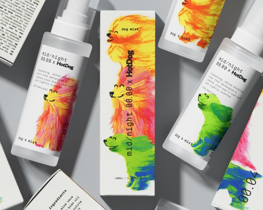
The Barcelona and New York studio was asked to merge Midnight Cosmetics' sleek monochrome world with HotDog's bold, chaotic energy – and found the answer in gouache, flying fur, and dogs in a state of pure bliss.
The brief, on paper, looked like a collision waiting to happen. Midnight Cosmetics – a company defined by minimal, clean, sophisticated aesthetics – wanted to collaborate with HotDog, a pet brand known for its bold colours and
The Barcelona and New York studio was asked to merge Midnight Cosmetics' sleek monochrome world with HotDog's bold, chaotic energy – and found the answer in gouache, flying fur, and dogs in a state of pure bliss.
The brief, on paper, looked like a collision waiting to happen. Midnight Cosmetics – a company defined by minimal, clean, sophisticated aesthetics – wanted to collaborate with HotDog, a pet brand known for its bold colours and energy. Two visual identities that had almost nothing in common were brought together for a dog fur mist.
SMLXL, the Barcelona and New York design studio founded in 2023 by Anna Berbiela, Guillem Casasús and Javier Arizu, was handed the project and told to make it work. What they produced is a fine example of clever packaging design. Midnight's signature black-and-white structure was left almost entirely intact, then detonated by an explosion of gouache-painted dogs caught in moments of pure sensory pleasure – fur flying, faces rapturous and colour running riot across the clinical white ground.
"We decided to take Midnight's signature, clean black-and-white packaging and 'intervene' on it," Guillem explains, "by introducing an explosion of colour and personality." The key was to stop thinking of the two brands as conflicting forces and treat Midnight's minimalism as a base. Once they did that, everything followed. "This allowed HotDog's vibrant, expressive energy to break through, creating a visual tension that is both conceptually sound and highly striking."
The mist itself is utterly intangible and physical – designed to soften and refresh a pooches' fur – so SMLXL needed a medium that could communicate that through movement. "We realised those benefits are best expressed through movement – specifically, hair flowing freely in the air," Guillem says. Gouache, with its saturated colour and rich texture, gave the illustrations the energetic quality they needed and a physicality that makes the product's softness feel almost transferable through the bottle, or like your own hair is starting to move.
It is a good example of how SMLXL generally operates. The three founders met during their first year of university in Barcelona in 2008, went on to work together at the design studio Mucho, spent time separately at studios in London, Barcelona and New York, then reunited to co-found Pràctica in 2018. They ran that studio until 2024, when they launched SMLXL – now a team of seven, with Anna and Guillem in Barcelona and Javier heading up New York. The name captures something essential about how they work across whatever the project demands.
Their portfolio runs from the visual identity system for the America's Cup to Barcelona's Christmas lights, from a New York Times Magazine cover to the signage system for the recently redesigned MoMA Design Store in SoHo. The thread between it all is a process that starts with finding the core idea, then jumping right in. "Before diving into design or any purely graphic exercise," Guillem says, "we zoom out to focus on the core idea. We view the concept as an abstract element that must fit the project perfectly; once that foundation is locked in, the graphic design work begins."
In the future, they are considering opening their own experimental shop – an object-oriented space free of client briefs, driven purely by curiosity. They have also just directed their first music video, stepping into entirely new territory that they clearly relish. "Embracing the unknown is exactly what sparks those unexpected creative executions that we love so much," Guillem says. The HotDog packaging project is also out in the world now, and the Pomeranians holding the bottles in the campaign photography are, it should be noted, extremely good.
Candle, 2022
The London-born illustrator has spent a decade building a distinctive pencil-based practice, and she's only just getting started.
Ideas come to Palesa Monareng on long walks with her dog, Herzog. Not from scrolling – she is already fretting about how much the "near catatonic scrolling" she does shapes her creative output – and not, despite what her client list might suggest, from the briefing documents of the many major commis
The London-born illustrator has spent a decade building a distinctive pencil-based practice, and she's only just getting started.
Ideas come to Palesa Monareng on long walks with her dog, Herzog. Not from scrolling – she is already fretting about how much the "near catatonic scrolling" she does shapes her creative output – and not, despite what her client list might suggest, from the briefing documents of the many major commissions that have come her way. Just the walks with Herzog.
Palesa is a London-born illustrator, a decade into a practice built on graphite portraiture, animated motion drawings and an ongoing body of self-portraits now more than 100 works deep. After a foundation year at Central Saint Martins, she grew her audience through what she describes as "irreverent sketch projects". This included influencer portraiture and Moleskine travel sketches, producing work that was playful, specific and shareable enough to reach art directors in the United States. Early commissions from Nike and The New York Times sprang up from this. And since then, her client list has expanded to include Amazon, Netflix, ESPN, Forbes, The New Yorker, HarperCollins and Macmillan.
What holds it all together is the pencil. Palesa's graphite portraits are precise and atmospheric, carrying weight and texture in a way that feels out of step with what typically fills our screens and feeds. She returns, again and again, to loops and to "arrivals as endings, slices of the surreal and all the fun textures you can arrive at with just plain pencil on paper". Her reading list reflects the same sensibility and shapes the architecture of how she thinks and creates: Borges' short stories, Eduardo Galeano's illustrated Upside Down World, Jodorowsky and Moebius' The Incal, Hofstadter's Gödel, Escher, Bach.
Amazon Alexa campaign
Essence Power 40
Bleacher Report, NFL
Work for The New York magazine
Her motion portraiture, on the other hand, involves a slightly different labour of love. She uses old-school rotoscoping, which involves shooting video, cutting footage to the desired frame rate in Photoshop, hand-drawing each layer, scanning them back in, and generating the animation from the stack. It is painstaking in a way that most digital workflows aren't, and the results bear that out. The Candle animation, in which she worked into a single sheet of paper with pencil layers scanned at intervals, produces a shadow play that feels almost alchemical. "I really enjoy building an animation on a single piece of paper," she says, "in conversation with the scanner."
A more recent piece, Cube Study 2026, came after Palesa signed with literary agency Janklow & Nesbit to write her first book – a manuscript threading together those 100-plus self-portraits with the experience of her digital life. It has her thinking about how identities are filtered and shaped through platforms. "Now that so many of us are in daily conversation with some kind of agentic Tom Riddle's diary," she says, "ruminating on consciousness doesn't seem as esoteric as it used to." The cube in Cube Study functions as a way into that – a moving, Rubik's Cube-like structure that holds the question of the self at a distance as it shifts and swaps around.
Steve Aoki
Whales, 2025
Cube Study, 2026
Doge Study, 2019
On what she hopes her audiences take away from her work, Palesa is refreshingly direct about the conditioning that years of digital-first practice can produce. "Like a lot of digital-first creatives, I've trained myself to gauge a response to my work through engagement rates and virality," she admits. But strip that away, and what she actually wants is pretty clear: "I just hope they enjoy the quality of my lines, and that a sense of mystery and mischief welcomes them into spending time with the works."
With new Nike work dropping soon and the manuscript in full swing, we're excited to see what comes next. Herzog, presumably, is ready for a walk.
New Hapworks Studios in Dundee
Strategy leaders are in demand, social-first agencies are hiring more, and one studio has done the brave thing and handed its own rebrand to someone else. Gulp. Here's what's been happening in the creative industry this month.
Welcome back to Booms & Shakes, our monthly round-up of the hires, promotions, launches and wins making noise across the creative world right now.
A few patterns jumped out of
Strategy leaders are in demand, social-first agencies are hiring more, and one studio has done the brave thing and handed its own rebrand to someone else. Gulp. Here's what's been happening in the creative industry this month.
Welcome back to Booms & Shakes, our monthly round-up of the hires, promotions, launches and wins making noise across the creative world right now.
A few patterns jumped out of the inbox this rainy June. Half the industry seems to be hiring a head of strategy. "Social-first" studios are building empires. And after May's run of agencies redrawing their own identities, this month we've got the opposite instinct: a studio that decided the best thing it could do for its brand was let another team loose on it.
Read on for who's moving, who's launching, and who's worth keeping half an eye on. It's been quite the busy one.
Story of the month
The studio that let someone else do its rebrand
Ok, first things first. Most studios, when the time comes for a refresh, do it themselves. It's cheaper, on-brand, and, frankly, a nice break from client work. We've watched plenty go down that route lately. So we were impressed by a studio that went the other way.
As it approached its 20th year, 3D and moving-image studio Bolder Creative decided that a proper reset deserved an outside eye and brought in creative studio Monday Nights to do the thinking. If the name rings a bell, Monday Nights is the team we featured last summer for its work on the football game CLUB.
Bolder handed over full creative freedom from day one, and, by Monday Nights' account, the two teams discovered they shared the same belief that good design doesn't need to be wrapped in serious language or a complicated process. Bolder admits it was unusual going on the kind of journey it usually guides its own clients through, which must be a peculiar feeling for any studio used to running the room. They seemed to enjoy being on the other side, though and couldn't resist taking the new brand for a spin in 3D, producing some suitably outrageous animations for the case study.
The new identity is due to land this month. We rather like the principle behind it: sometimes the most confident thing a studio can do is admit it's too close to see itself clearly.
Hires and promotions
Method1 names Jodi Heelan as CEO
New York behavioural-science agency Method1, which builds its work around "indulgence" brands across spirits, drinks and the wider CPG world, has appointed Jodi Heelan as chief executive. Heelan arrives after more than a decade at The Variable, latterly as president, where she helped steer the shop to five Ad Age Small Agency of the Year nods.
Founder MichaelAaron Flicker reckons she understands how creativity, operations and business performance fit together in a way few agency leaders do, and given the brief is to build a more modern, scalable model, that's the right thing to be good at.
Jodi Heelan at Method1
ByDESIGN appoints Christian Murphy as global CEO
Architecture and design media brand ByDESIGN has named Christian Murphy as its global chief executive as it pushes further into broadcast, streaming and branded content. Murphy, known across the industry as "Murph", brings close to three decades in international television and content, much of it at A+E Global after he moved from Australia to the US in 2008. A media veteran taking the reins of a design-led brand makes for an interesting combo.
Landor keeps building, on both sides of the Atlantic
If May's WPP Brand & Design restructure told you branding was back at the top of the agenda, Landor is making sure you don't forget it. The consultancy has appointed Alana Eversole as global EVP, experience, and promoted Ryan Frost to global executive creative director.
Ryan Frost and Alana Eversole, Landor
Eversole returns from Jones Knowles Ritchie, a "boomerang" in Landor's own affectionate phrasing, having already spent more than a decade in the business. Her newly created role pulls together Landor's work across retail, hospitality, events, spatial and immersive design into a single experience offering, the argument being that "in a fragmented, increasingly AI-shaped world, physical and sensory brand moments matter more, not less".
Frost, meanwhile, has spent nearly two decades at Landor across London, Singapore and New York, and steps up to help shape creative direction globally alongside the existing roster of ECDs. Two more signs that the category sees "experience" and "craft" as its growth engine.
M+C Saatchi Talk brings in Pete Harrison
M+C Saatchi Talk has appointed Pete Harrison as managing partner as it enters its 25th year. He joins on the back of a busy run for the agency, following the arrivals of managing director Amaya Alvarez and head of brand PR and influence Callum Powell. Harrison has close to two decades of experience across the UK, the US and Asia-Pacific, with roles at EVH, Salesforce and NBCUniversal, and lands at what the agency calls its "culture-first story-making" proposition. He'll also co-chair the group's Proud employee-led network in the UK.
Pete Harrison, M+C SAATCHI Talk
Lindsay Turner at BBC Studios Digital Brands
BBC Studios Digital Brands hires Lindsay Turner, with the numbers to back it up
BBC Studios Digital Brands, home to the likes of Bluey, Doctor Who, BBC Earth and Top Gear on YouTube, has appointed Lindsay Turner as VP digital growth and strategy to lead its advertising and commercial partnerships.
For background, the business has held the number-one spot for YouTube watch time in its global competitor set for a second year running, with watch time up 60% year on year to 2.1 billion hours, and branded content growing a frankly startling 124%.
Turner joins from VCCP Media, where she was managing director, with earlier stops at LADbible Group, Spark Foundry and Blue 449. When the platform's already this big, the job is turning attention into revenue, and that's squarely her remit.
Ian Millner resurfaces at ZEAL and NewGen
After 26 years of building Iris Worldwide from a challenger to a global network, founder Ian Millner left in March, and the industry has been wondering where he'd go next. Well, all has been revealed as he's taken the chairman role at brand activation group ZEAL, become non-executive chairman of creator-economy agency NewGen, and joined marketing group MSQ as a non-executive director.
Three businesses, all firmly in growth mode. ZEAL, founded in Manchester in 2014, has been busy acquiring social studio Tommy and launching shopper-PR shop Joe Public; NewGen runs across London, Manchester, New York and Paris. Millner will keep advising Iris in a global capacity, too, so he's hardly stepping back.
Born Social promotes Simon Cooper to ECD
Social-first agency Born Social has promoted Simon Cooper to the newly created role of executive creative director. Cooper joined in 2024 to lead the Ford account, and his back catalogue is impressive: Ford's "The Legend Is Back" Capri reveal, Spotify Wrapped 2022, the Puma Gen-E launch and "The Internet Takeover" with Dan and Phil for BBC Radio 1.
He'll report to chief creative officer Paddy Smith, who's relocated to the US to grow the agency's presence over there, and lead a team of 22 creatives. Part of a wider leadership build-out that also saw Alex Green made UK head of growth.
Ian Millner making moves
Simon Cooper at Born Social
JOAN London adds Nicky Vita as head of strategy
JOAN London has appointed Nicky Vita, previously of Atomic London, as head of strategy. She follows close behind Gerry Graf, who was named global chief creative officer earlier this month. Vita started in planning at TBWA in Johannesburg before taking on London roles at BBH (where she rose to partner) and VCCP, working on clients such as Primark, LinkedIn and O2, and arrives with awards from the IPA, The Drum and the Marketing Society in tow.
The female-founded agency, which has been in London only since 2023, counts eBay, Ancestry and TOTM among its clients. Vita's own verdict on the move was endearingly honest: excited, she says, but also "terrified, nervous, delighted, optimistic".
Pearlfisher names Christina Papale head of strategy in New York
Independent brand design agency Pearlfisher has appointed Christina Papale as head of strategy for its New York studio, with a brief to bring strategy, insight and creative closer together.
Papale brings more than 20 years of experience across food and drink, health and wellness, retail, spirits, and beauty, most recently running her own consultancy, Verboten Group, and, before that, 12 years at CBX. She describes her approach as "intrapreneurial", which is a different way of saying she likes working out what a brand needs next before it thinks to ask.
Christina Papale
More movers
A clutch of other moves worth a mention. Spin, last year's Social Media Agency of the Year at the Europe Agency Awards, has hired George David as group commercial director, joining from Havas-owned Wilderness to drive growth across Spin and its sister brands Be A Bear and Tiny Studios, off the back of pitch wins including Fortnum & Mason, Five Guys and National Rail.
Creative agency Hijinks has appointed Chris Willis, formerly of Fake Empires, as design director, bolstering its brand design work following projects for Fulham Pier and Vue. And in New York, next-generation studio Versus has hired the duo of Rosie Garschina (executive creative director) and Kevin Anderson (executive producer) from Trollbäck+Company to deepen its brand and design practice.
Spin Hires George David as Group Commercial Director
Chris Willis at Hijinks
Rosie Garschina & Kevin Anderson at Versus
Elsewhere, global studio Builders Club has appointed Matt Shannon as executive producer and head of partnerships, bringing experience with Apple, Netflix, Burberry and Rolex to its push into luxury, fashion and tech. Youth marketing agency Raptor, celebrating its 10th year, has promoted group account director Molly Chappin to its board.
GentleForces has expanded its leadership as it turns five, naming Mike Keen as finance director and founding team member Jordanna Andrews as futures practice lead, alongside international wins with Shinola and Kate Spade.
And last but not least, at Fluid Ideas in Derby, Dani Berzins and Sarah Bowler have become the agency's first new shareholders in seven years, exercising EMI share options to step up to partner and co-owner, a lovely example of an agency following through on a progression path.
Matt Shannon at Builders Club
John Wilkinson with the team at Raptor
Sarah Bowler, left, and Dani Berzins of Fluid Ideas
L-R: Mike Keen; Quba Tuakli; Danni Mohammed; Jordanna Andrews & Nathan Wilson at Gentle Forces. Photography by Dennis McInally
SomeBrightSpark moves to a partner-led model
Independent agency SomeBrightSpark has restructured around a partner-led model with two appointments. George Guildford joins as partner and executive creative director from Moshi, tasked with growing the agency's film, production and social-first work, while client services director Ellie Anderson has been promoted to partner after 13 years at the agency.
Founded in 2008 and working with the likes of Caterpillar, Volkswagen Financial Services and Pinterest, the agency is making the case, as MD Daniel Rogers puts it, that studios outside London can compete creatively at the very highest level. Hard to argue with that, given we're doing alright here in Manchester.
George Guildford & Ellie Anderson, SomeBrightSpark
Launches and new ventures
M+C Saatchi UK launches Social House
M+C Saatchi UK has launched Social House, a new practice that folds social strategy, creator and community work, content production, paid media, commerce and measurement into a single offer. The thinking is that social has stopped being a channel and become a whole cultural ecosystem, the place people discover what they love and decide what to buy, so it deserves to be treated as a discipline in its own right.
It's built on the group's proprietary "Fancom Accumulator" methodology, and brings in Katy Ball from Hope&Glory as head of social communications, with Shanice Dover promoted to associate director, creator and community.
Shanice Dover, Laura Coller and Katy Ball at M+C Saatchi Social House
Tracks & Fields opens in London
Berlin-founded music intelligence and operations company Tracks & Fields has opened a London office, with former Superunion and Siegel+Gale leader Mark Mullooly as managing director for the UK. The pitch is an insightful one: as campaigns sprawl across more markets, platforms and rights environments, the music decisions get complicated fast, and brands tend to leave them too late. Since 2008, the company has handled more than €100m in music licensing and artist partnerships for the likes of Mercedes-Benz, Aldi and Zalando, and London joins its offices in Berlin, Warsaw and Tokyo.
Mark Mullooly, Tracks & Fields. Photography by Luke Fullalove
Akcelo lands in London
Brand experience and innovation company Akcelo has opened its first permanent London office, in Farringdon, as part of what it calls a "borderless" model. Founded in Australia in 2020, the agency works with TikTok, PepsiCo, Amazon, OpenAI and Anytime Fitness, and the London team, led by Ben Phillips, Jade Fonteneau, Mike Gethin and Justin Schoenmaker, is the first proper on-the-ground presence in a region it has so far served from afar. Plans are to add 10 to 20 staff over the next year or so.
Glass Productions opens its doors in the North West
A nice one for the regions. Photographer Georgie Glass has launched Glass Productions, a food and drink creative production agency, alongside Glass Studio, a fully kitted-out dual-kitchen studio space in Cheshire. With 13 years in food and drink and a client list that includes HarperCollins and PepsiCo brands such as Quaker Oats, Glass is betting on the North West's appetite for better visual content. The studio is now open for bookings, so give her a shout.
L-R Mike Gethin Creative Lead, Jade Fonteneau Business Lead, Justin Schoenmaker Creative Lead, Ben Phillips Strategy Partner, Akcelo London
Six Dundee studios share a roof at Hapworks
We've got a real soft spot for this one. Six Dundee creative organisations, spanning design, games, culture, research and civic innovation, have come together to launch Hapworks Studios, a shared workspace above The Bach café on Albert Square. Agency of None, Biome Collective, Bit Loom, Creative Dundee, tialt and Very Evil Demons now share the space, home to more than 25 people.
It came together partly by accident, after a flood forced Agency of None to move just as the others were grappling with rising rents, but the principle is deliberate: at a time when independent studios are being priced out of city centres across the UK, here's a group choosing to invest collectively in shared infrastructure rather than going it alone. A small, practical answer to a problem a lot of cities are currently wrestling with.
Georgie Glass
Partnerships and wins
McCann London wins Mindful Chef
McCann London has been appointed agency of record by recipe box service Mindful Chef following a competitive pitch, and is building a new brand platform to launch in the autumn. It's the brand's biggest marketing investment to date, led by recently appointed CMO Mary Rochester Gearing, with the line that Mindful Chef isn't really about convenient meals but about making food a positive force in how people feel. McCann's deputy ECDs Charlotte Prince and Loriley Sessions called it a dream brief, which, for a team that presumably likes eating well, checks out.
Born Ugly wins LHV Bank
Leeds independent Born Ugly has secured a three-year partnership with LHV Bank to build its brand platform and run integrated campaigns for the savings-focused retail bank. Of the brief put before them, Head of Strategy Clare Deacon says that with low brand awareness in the UK, the real risk for LHV isn't rejection, it's being ignored, so the work is about meaning before scale.
Born Ugly x LHV
Havas Miami named by Olive Oils from Spain
Havas Miami has won a three-year, US-wide brief from Olive Oils from Spain, the trade body for Spain's olive oil industry, with the first work due in July. It's more category-building than campaign: the US is about to become the world's biggest consumer of extra virgin olive oil, and the job is to move Spanish olive oil from pantry staple to cultural fixture across food, wellness and modern cooking. ECD Federico Hauri, fresh from co-founding studio MULTI, calls it a dream assignment.
Wonderhood Design picked by VIEVE
Wonderhood Design has been appointed by makeup brand VIEVE, founded by makeup artist Jamie Genevieve, to lead a full brand strategy, identity and packaging project following a competitive pitch back in February. With a community of more than three million followers and fresh investment behind it, VIEVE wants to scale into a next-generation British beauty brand without losing the artistry-led, real-world feel that built it. Wonderhood's job is to bottle that.
Uncovered to lead ClearScore's global social
Social-first agency Uncovered has been appointed by ClearScore to lead its global paid social creative strategy across the UK, Canada, South Africa, Australia and New Zealand. The move is part of ClearScore's shift from scattered local activations to a single, globally aligned model run through its UK HQ. Uncovered apparently won it by balancing global consistency with genuine local nuance, the typical tightrope of any multi-market brief.
Iris London takes on WillPowders
Iris London has won performance nutrition brand WillPowders, founded by Davinia Taylor and Matthew Leyden, after a three-way pitch, and will lead the launch of its new sport range and summer product, Electro Ice. It's WillPowders' first appointment of its kind, and Iris's social and influence lead Melo Meacher-Jones describes the brand exactly as you'd hope an agency would describe a new client: "one with a genuine point of view and the nerve to back it".
BigSmall x War Child
Delsey Paris - Designed to Move You Campaign - SS26
Gung Ho lands DELSEY Paris
Independent creative collective Gung Ho has been named DELSEY Paris's retained UK PR agency, just as the French luggage brand marks its 80th anniversary and rolls out a new "Designed to move you" platform. Gung Ho, which recently passed 20 years of its own "truth told boldly" ethos, will handle UK press, influence and activations. A heritage brand and a bold-by-name agency are, at least, a promising duo.
BigSmall partners War Child UK
Brand strategy studio BigSmall has been appointed as brand strategy partner for War Child UK, following a competitive pitch. The idea is that it will help sharpen how the charity tells its story. With more than 520 million children worldwide affected by conflict, the work is about clarity rather than relevance. As BigSmall's Lucy Taylor puts it, when a cause is this important, you need one idea people can understand instantly and act on immediately.
Milestones and good news
Distant Future Animation makes the shortlist
A well-earned nod for a small team. Yorkshire studio Distant Future Animation has been shortlisted at the 2026 Prolific North Creative Awards, in the Excellence in Creative Craft category, for Maritime Connected, a film made with Lloyd's Register Foundation.
The brief was to explain why maritime safety matters far beyond shipping, and the studio, just three people, deliberately avoided Western-centric storytelling, using culturally diverse characters and a non-Western voiceover to make a complex global subject land emotionally in under 90 seconds. It premiered in September 2025 and has since reached audiences in more than 40 countries. A great example that you don't need a big team to create something brilliant.
Distant Future Animation makes the shortlist
One for the diary
The Prolific North Creative Awards are handed out on 25 June in Manchester, so we'll find out then how Distant Future gets on. And the big one, of course, is the 73rd Cannes Lions, running 22 to 26 June. Expect the inbox, and next month's Booms & Shakes, to be heaving with it.
Key takeaways
Step back from June, and a few threads spring to mind. Firstly, everyone wants a strategist. Pearlfisher, JOAN London and GentleForces all named strategy leads this month, and Born Ugly's winning argument for LHV was strategic. After a long stretch of "performance-first thinking", agencies are clearly reinvesting in the bit that comes before the campaign: working out what a brand is actually for.
Secondly, social-first has matured. M+C Saatchi's Social House, Spin's commercial hire, Born Social's new ECD, Uncovered's global ClearScore win and Iris taking on WillPowders all point in the same direction. After all this time, social is no longer a channel an agency bolts on; it's now the discipline around which the whole offering is built.
And finally, it's reassuring to see so many upbeat news stories despite the economic uncertainty and gloom. Six Dundee studios sharing a roof rather than being priced out one by one. A three-person animation team reaching 40 countries. Two long-servers at Fluid Ideas are finally getting their names on the door. None of these win a prize for the biggest move of the month, but they're the ones that remind you why this industry is worth writing about in the first place.
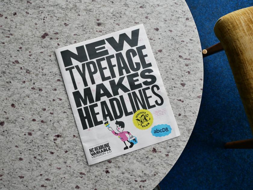
Drawing on the heyday of the tabloid press and the inspiring archives at St Bride, the all-caps variable font marks the launch of D8's new type studio – and a break from spiralling licence fees – ahead of its debut at Birmingham Design Festival.
Any discerning designer will tell you how expensive typography can get. Not to mention the minefield of licences and usage. And when the fees on your headline font keep on climbing, and that ty
Drawing on the heyday of the tabloid press and the inspiring archives at St Bride, the all-caps variable font marks the launch of D8's new type studio – and a break from spiralling licence fees – ahead of its debut at Birmingham Design Festival.
Any discerning designer will tell you how expensive typography can get. Not to mention the minefield of licences and usage. And when the fees on your headline font keep on climbing, and that typeface is the backbone of your visual identity, there comes a point where owning one outright makes more sense.
That's why Anne Ward, CEO of Newspaper Club, has teamed up with old pals D8 to create a bespoke typeface, NC HEADLINE, that is uniquely theirs and no one else can use. It's the first of many typefaces for the creative agency, which this week has launched abcD8 – its new foundry that designs typefaces clients own outright, with no licence fees attached, ever.
Newspaper Club is its first customer, and what they've created will be revealed this week at Birmingham Design Festival, where a type specimen printed on the company's own tabloids – plus a short film documenting the process – will put the new font through its paces.
To inspire its design, Anne and the D8 team went through St Bride Foundation's archives – the home of the printing press in London, and a brilliant place to visit if you haven't already. "Initially, we looked at the sophistication of broadsheet mastheads, but it felt like it really lacked the energy that Newspaper Club has," says Anne. They turned instead to the heyday of tabloids, when typefaces like Interstate (Daily Mirror) and Franklin Gothic (The Sun) ruled the front pages. "Rather than simply copying the tabloid look, we wanted to refine it a little more and so combined it with more vintage styling, helping to make it more our own."
The archives turned up many surprises, shaping the direction of the design. Show posters and how they handled certain character shapes, for instance. "We liked how they used variable-width characters to shout about something while using all available space on the poster. That wasn't something we'd expected to study initially, but it ended up having a real impact on the design," says Anne. "Those references helped us round out and refine the typeface, giving it more personality and helping us resolve some of the character forms in a way that felt distinctive while still being rooted in print culture."
Creating something with heritage whilst remaining forward-looking and modern is no easy task for any designer. Rules will inevitably be broken to accommodate both print and digital demands. "From our perspective, we wanted to evoke the confidence and character of classic newspaper headlines, but we also needed something that could work seamlessly across all of our channels," adds Anne.
"One of the biggest departures from our historical references was the emphasis on flexibility. Traditional newspaper headline typography tends to be quite static, designed for a specific context on a printed page. We needed something much more dynamic: a typeface that could work across social media, video, print and large-scale applications, while still feeling unmistakably rooted in the world of newspapers."
That thinking led Anne and D8 towards a variable design with no fixed widths – one that can expand, condense and adapt to different formats. Despite this, they deliberately kept one restriction: they didn't build a lowercase alphabet. "We wanted the typeface to remain all caps, reinforcing its role as a headline typeface," explains Anne. "We stack our headlines a lot, so having the ability to adjust the width gives us much more flexibility. Depending on the space available, we can make the type incredibly condensed or much wider and more expansive, often even within the same headline."
The new foundry abcD8 has launched, promising to design typefaces that brands can own outright, "free from fees or ongoing licences". But how does that model work commercially, and why go against the standard licensing approach?
Steven Bonner, creative director at D8 and abcD8, says: "We treat the way we work with type in exactly the same way that D8 does with other design projects. This means using a transparent pricing structure where the client pays for our time. We don't charge for licensing design work anywhere else, so why do it with type?
"We've found that the pricing structure for type has left a lot of our clients more than a little confused and struggling to navigate a complex world of licences across a host of touchpoints, so we want to make it simple. If we provide good service, we hope clients come back to us the next time they have the same need, rather than charging them over and over for the same work."
It makes total sense. Which raises the question, whose idea was the typeface for Newspaper Club? Did Anne go looking for one, or did abcD8 propose it as a launch project? It was Anne who approached D8 after working with them for over a decade. "During that time, we'd seen font licence fees rising and rising," she says. "Our headline font had always been such a huge part of our identity; it just made more sense that we should own it outright."
Along with the launch of a newspaper specimen at Birmingham Design Festival this week, Newspaper Club has released a film about the making of the new typeface. "We didn't just want to say 'here's a new typeface' and walk away," says Anne. "We know how much our community loves to see the work that's gone into something. People always ask to see behind the scenes at the printing press, and we thought this was a fun way to bring that energy to this project."
Anne explains it's important for them to showcase not only the design process but also the collaboration and teamwork that goes into creating a typeface so fundamental to their brand identity.
The popular Netflix series Abstract: The Art of Design was a major inspiration for the film, which features an animated version of Newspaper Club's brand mascot, Russell. Worth a watch.
Can you get your hands on the typeface or the specimen? Not NC HEADLINE, no. But you can get your hands on the specimen by visiting Newspaper Club's stand in the Analogue District at Birmingham Design Festival this week. They're also hosting a talk about print on Friday, and will be handing out copies of the type specimen, which doubles as a pretty gorgeous poster.
If you can't make it to Birmingham, don't worry… Newspaper Club will be taking the specimen on tour at future events, so look out for where they're heading next.
Fish House
Partners Nelly Michenaud and Ed Bulmer have moved their animation outfit from London to Nantes, leaving them aglow with positivity and creativity.
There are so many things to love about the animation studio Orca, but let's start with its name. Killer whales are cool, for sure, but this wasn't a moniker founders Ed Bulmer and Nelly Michenaud pulled out of thin air on that basis. They've got a black and white cat called Orca,
Partners Nelly Michenaud and Ed Bulmer have moved their animation outfit from London to Nantes, leaving them aglow with positivity and creativity.
There are so many things to love about the animation studio Orca, but let's start with its name. Killer whales are cool, for sure, but this wasn't a moniker founders Ed Bulmer and Nelly Michenaud pulled out of thin air on that basis. They've got a black and white cat called Orca, and that's where the studio's name comes from. This is just a tiny example of how their imaginative, poetic, associative thinking fed the well of ideas that poured out as we chatted by email.
The big news for Orca is that the studio has relocated from London to Nantes in France, Nelly's hometown. While there's been a lot of talk about a creative exodus from the UK – including here on Creative Boom – the rising costs, difficulty doing business and Brexit-y attitudes in Britain weren't key reasons behind the move.
The Three Little Pigs - a studio favourite for Exel
Pendulum
Watch Nelly's Nantes video
"We wanted to deepen our connection to Nantes by living here for a few years and for me to learn le français... but mostly to eat croissants, cheese and drink excellent wine," says Ed. "The business is still UK-based, and all our regular collaborators are based in London, so our activities are across the two cities. France also offers a lot more opportunities for the funding of narrative, non-commercial projects – we're already in the process of applying for funds and creating co-productions with companies here."
As an exclamation point marking Orca's arrival in Nantes, Nelly has made a short animation – a moving, visual ode – that straight away captures the unusual vibe to be experienced there. It began as a single shot, just a few frames, but then a giant heron sidled into view… It's still quite short, but there was a little more to it by the time Nelly reached full expression mode.
Anniversary Pond
"There is literally a massive mechanical elephant taking a stroll on l’Île de Nantes, gigantic flowerpots and a moon play area, sculptures and installations all across the town, acting as little winks or jokes in your daily experience of its specific urbanism," she explains. "I wanted to translate that into animation with my own additions to convey this dream-like, beautiful randomness, floating feeling that artists and designers have created here."
Partners in and outside the business, Ed and Nelly have complementary professional skills. Ed is the more technically minded, an expert with applications like Adobe After Effects and Blender. Nelly is the one who draws, creating 2D animations and the storyboards that drive their projects. However, their aesthetic sensibilities are similar, and they can usually tell whether a brief leans more towards Nelly or Ed's directorial approach, backed up by freelancers who come on board whenever they need to scale up for a project.
While the studio takes on projects for big brands such as Netflix, Disney, the BBC, and Sony, the Play section of their website is just as interesting as the Work section. A stacked buffet of different looks Ed and Nelly have played with is on show.
Ink Black Heart
How to Rob a Bank for Netflix
"Self-initiated projects are fundamental for us to stay creative and test out ideas that we can then develop or put to the side, use on other jobs and give proof of concept. We love our Halloween mini films, for example, drawing each other's characters and mixing 2D and 3D was really fun. Nantes was one of these spontaneous projects that were very hypnotic to work on. Ed is currently working on his next comedy short about his first job as a pot washer," says Nelly.
These experiments ultimately feed the exciting proprietary creative projects the studio is working on. Orca is currently creating, writing, pre-producing and pitching three shows – all developed in-house – and is collaborating with a Nantes production company on one of them.
First up is The East Midlands Murder Squad, about three kids who awaken an ancient curse on their village – like a British, animated Stranger Things for six- to 11-year-olds. Then there's Witch Western, which kind of does what it says on the tin. It's an all-action Western where the cowboys have been swapped for witches, and the tone here is a little like Avatar: The Last Airbender. Finally, there's Why Are You Like This?, a live-action puppet sitcom more aimed at adults.
The East Midlands Murder Squad
Orca's Orcat
As you-know-what continues to destabilise the creative industries, the move to France and the creative energy it released has put them in a good moment. "We're connecting the most with people, even more motivated to reach out and exchange on each other's expertise, teaming up to complement one another, getting into the immersive industry and the creation of an app," says Nelly. "Sometimes it's best to focus on nourishing what makes us feel authentic, to not get lost in the noise, and create work that truly resonates with others."