Reading view

“The Crystal Gazer” (1941)

Columbia really made some bizarre cartoons! This week’s selection in no exception.

But first — in brief Thunderbean news:

This is “reviews” week at CCS, the College for Creative Studies, where I teach. It’s a crazy busy week where we look at every students work, in teams of professors. My brain in generally mush afterwords, but watching a Columbia cartoon and talking a little about it was a nice break.

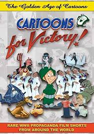
I can’t wait to get some quality time over some days just concentrating on Thunderbean things. “Cartoons for Victory” is the title getting the most attention at the moment here as we get it closer to finish. We’ll be talking about that title more in the coming weeks, along with some other projects that are coming together.

The last of a big batch of special discs just went out today, and the next ones are getting prepared. I’m especially happy with this batch of stuff, and the next ones are pretty enjoyable too. We’ve launched two new ones today, but I’m not sure how much longer we’ll do them. We’ve also opened ‘The Vault’ of the older special discs for a week. It’s been a lot of fun doing them.


Now– this week’s cartoon!

The Crystal Gazer (1941) is a Columbia I hadn’t seen before scanning a print. It’s a spoof of live “Psychic” prediction shows, with Mel Blanc lending his voice (and some sound effects). The plot of cartoon consists of a show featuring “Famous Astrologist Professor Ja Ja Rajah”, who is almost the same character in design and demeanor that stars in the all time classic Columbia Cartoon The Cuckoo I.Q. My favorite summery of *that* cartoon comes from a review in the old Mindrot ‘zine that said a better title for it would be “Seven Minutes of Color Film”.

An audience member asks the question “Should I put Whipped Cream in My Potato Salad?” prompting the professor to go through a series of fairly uninspired convulsions until he gazes into a Crystal Ball, leading to a vision that is a much more interesting cartoon that it looked like it would be.

For some reason, his vision starts with him riding a camel in Egypt. They arrive at a tomb where mummies sing, play checkers, dance and make telephone calls. Mummies are hard to screw up, and this section of the cartoon makes the whole venture worth while, or at least makes it close to worth while. Please let me know if you agree or disagree!

Sadly, after that vision we return back to the original plot of the cartoon- but knowing Columbia it wouldn’t have been unlikely that they didn’t return to it.

All of that said, I’m glad Columbia kept making cartoons, even if they’re not on anyone’s favorite list. Heck, maybe this one is someone’s favorite.

Have a good week all!

  •  

Van Beuren’s “A Cat-Fish Romance” (1932)

When I’m super tired, there’s sometimes nothing better than an old PRC film or maybe even a good Pre-code Warners, preferably with Cagney if possible, but I’ll take a Van Beuren if there’s one laying around…

A Cat-Fish Romance (1932) is a cartoon we haven’t cleaned up yet for the new Aesop’s Fables, Volume 2 Blu-ray set. It’s about to go into the restoration pipeline though, and as I looked at the main print we’re using I thought it would be a fun one to post.

Of course, the best Van Beuren shorts keep things moving right along throughout, while the not-as-good ones tend to meander around the idea while this or that musical interlude interrupts things. Sometimes if there’s enough of those musical interludes you can end up with a pretty solid little musical short. I don’t know if they were particularly worried about how the mix of the elements would come together in the end, honestly. Perhaps a basic outline was good enough, then the layout would basically be the storyboards.

Mannie Davis and his solid rubber characters start things off in this short with a cat fisher-man bouncing along happily as Mexican fish play a mean guitar. A mermaid cat (voiced by Margie Hines, who by this point was the majority of the female characters in Van Beuren films) sees our hero on her sunken-submarine house Television, and within moments she manages to pull his fishing pole and him underwater. Happily, he has no trouble changing from breathing to whatever underwater (this is never explained — am I wrong to find this odd?). They sing and swoon together as Margie (uh, I mean the mermaid cat) sings “I Can’t Give You Anything But Love”. This also allows the studio to reuse animation from past underwater cartoons, including an extended sequence from The Haunted Ship (1930) and scenes from Rocketeers (1931).

For the conclusion (and a little conflict) at the end of the picture, a big spider (?) shows up and takes our Mer-cat-girl away. A fight ensues, with our cat-boy hero stabbing the spider with a sword. He meekly cries “Mammy!” As he floats up out of the scene at the end in a strange moment of silence. Doesn’t it seem like a sea creature would’ve been a better idea? All is well in Cat-love land again as our heroes ride a fish while singing. Somehow our hero cat never loses his hat throughout.

Manny’s well-drawn animation really dominates this film, and brings the quality up of the studio in all the pictures he works on. Even though there’s a lot of reuse here, it works just fine, and of course the audience would never know or care. As a rising animation star, I find it surprising that he didn’t end up over at Fleischer’s during this period. After It makes some sense they would trust him to carry the Cubby Bear series soon after this. Davis of course would spend a good amount of his career at Terrytoons after Van Beuren. I wonder if his brother, Art, ever visited the Van Beuren studio during this period. There’s way too little documentation of the Van Beuren Studio in general, compared to other shops.

While this picture will never make the AFI’s top cartoon list, it’s a solid little picture, and a great example of where Davis was going in terms of character animation, especially in appealing action and drawing.

Have a good week everyone!

  •  

Famous Studios “The Old Shell Game” (1948)

In keeping with the Paramount cartoon theme, in today’s cartoon a turtle has to deal with Wolfie. I wish someone would give this poor wolf some food…

But first, life here, Thunderbean and related:

Yesterday was an incredibly busy and exhausting day here with the Senior Studio students at CCS all showing their final projects. It’s also a farewell or sorts, after spending four years knowing them and helping them through their college years. Some of the students graduating have helped more recently on Thunderbean projects, including digital restoration and cleanup for the things we’re doing for MeTV as well as a little animation for titles on the Blu-rays.

We’re nearly done sending a batch of eight special discs, and I’m working on preparing the next batch to go out hopefully within the month. I’m also helping Tommy Stathes finish off his excellent Dinky Doodle Blu-ray, a project with many years and many hours invested in it. It’s been one of my favorites to work on, as was the recent Back to the Inkwell Blu-ray/DVD set.

As I wait for several things to get back from replication, I’ve been putting the Cartoons for Victory set to the forefront after it was on a sort of holding pattern for a while. We were waiting for the four “Hook” cartoons from the Naval film archive. Sadly, we were recently informed that their prints of all four films are deteriorating, as were the prints that were scanned many years back. We’ve decided to no longer have the set in a holding pattern and are working on getting this Blu-ray upgrade together with the best material we have. We have the Hooks from the master tape we have and a partial print of one of the shorts. There’s so many great things on the set, and, as the other in progress titles, we’ll be glad to have this one out.


And – onto The Old Shell Game (1948)

I know a lot of you folks are enjoying the new Famous Studios Champions set from Cartoon Logic. It’s so nice to see these films from their master materials- a great improvement over previous available copies. Thad Komorowski did a beautiful job in cleanup/restoration of the shorts. If you haven’t gotten this set yet and like the Famous Studio cartoons, it’s a must.

Thunderbean did a DVD set of Noveltoons back in 2012. It was some of the first scans we did in HD, and cleaning them up with very primitive software back then was a real chore. We were so happy to get a good amount of the films in 35mm Technicolor prints. When we finally ported the set to Blu-ray, Thad was instrumental in cleaning up many of the films as well as providing a few commentary tracks. The set has been out of print for a while, and a few months back we decided to reissue it, re-cleaning up some of the films with the better, newer restoration software and replacing some of the prints. It will be out with the next batch of discs sent from Thunderbean within the next month or so.

Finding vintage 35mm prints in good shape on Famous Studio’s cartoons was always hard, but the collectors have been incredibly generous in lending things for so many of the Thunderbean projects. I’m glad there’s people that are involved in collecting that are generous enough to lend their rare prints. It’s not everyone of course, and some of the things we *really* want have been scuttled away for many years. Hopefully we’ll be able to borrow some of the those in the future.

Jerry Beck lent us this print of The Old Shell Game when we were producing the Blu-ray. It was pretty beat up and missing a little piece of footage near the end, but looked great in Technicolor otherwise. We’ve done a little more cleanup to the short now, removing many of the lines as best as we could. It’s still probably the most worn film on the set, but still a pretty fun watch.

I like the Famous Studios cartoons, and I always wonder how many of the stories came about in the 40s. It’s such a varied group of films in terms of themes and direction, with so many of them being really entertaining.

Let us know your thoughts on this one- especially if you have never seen it before (I bet most of you have though!).

Have a good week everyone!

  •  

“Flea for Two” (1955)- in IB Technicolor!

A quick note: It’s student show week here, one of the busiest weeks of the year, so I’ll forgo anything about Thunderbean for this week other than to say I’m looking forward to some quality time catching up with my own little business in a few days. Lots happening there and more on that soon…

So, here’s a cartoon- and a print I especially love the color on. “Flea for Two”

I’m a huge fan of the 50s Don Patterson pictures at Lantz. They are funny, corny, and surprising in their design at times, yeah are completely unpretentious in design. Sometimes the lack of a stronger sense of design sensibilities could be noted and criticized in Lantz’s work generally in this period- but what a revelation it was to me to see some of these films in IB Tech compared to the TV prints I grew up on.

The first one I saw in IB was Red Riding Hoodlum (57). I was especially impressed with both the color choices and how elegant the overall appearance was in a Technicolor print compared to any other version.

Flea for Two is similar. While this vintage 16mm print isn’t the sharpest and has seen some milage over the years, it’s beautiful to see what these films looked like theatrically. Patterson’s timing seems to be influenced a lot by Avery in pose timing and action, and while this isn’t as strong as a good Avery, it’s still all sorts of fun. Micheal Maltese, over at Lantz in this period, wrote this one, and that combination of talents is especially good here and brings some really fun dialogue.

When I was a kid I especially loved the gags involving the flea jumping from dog to dog and discovering a different group of fleas on each based on the dog breed. As a kid I didn’t understand it but laughed at the silliness of the gags. All these years later I really still enjoy this one a lot.

So, watch for a little escapism and enjoy this small cartoon for what it is: a nice break from the world. Thanks to Tommy Stathes for the lend. Wish this was my print!

Have a good week everyone!

  •  

A Famous Studios Bouncing Ball “Spring Song” (1949)

It’s a Famous Studios sort of week– thanks to Cartoon Logic’s excellent new release, Famous Studios – The Champion Collection. I just got my copy and its a beautiful as I thought it would be (I was lucky enough to see a little progress along the way). Thad Komorowski has done a huge service to these cartoons and film history in this release – these films looking as good (or better) than they were meant to be seen. Support his efforts and get a copy if you haven’t already! [Click Here].

So, as a tribute of sorts to the set, here’s an unrestored Famous Studios cartoon from 1949: Spring Song!

But first, as usual, in Thunderbean land:

Shipping, shipping, shipping. We’re still getting out a batch of special discs with another following it, and then almost immediately following those we’ll be starting to ship the Rainbow Parades, Volume 2 disc. We’ll have an article about that set as it gets back here. The Thunderbean Noveltoons disc is just about to get back from being re-replicated as well, so we’ll be shipping those soon too.

It’s the last weeks of school here at CCS, where I teach animation. Even though I enjoy the job a lot, I’m especially excited for the summer this year and so happy to have a break. Having the extra time makes all the difference in being able to accomplish big things each summer- and this one is packed. I’ll be taking a trip out west to get a bunch of films to scan, then headed east to scan a bunch of other things too! Since there’s a lot of projects wrapping up, and as each wraps up it frees me to work toward the finish of another. Four are close right now, so those will be the first out the door. I’m already trying to figure out when to rest


Enough of that! Back to today’s cartoon!!

The Screen Songs are definitely not at the top of the list of best cartoons from the studio- but that said, they’re still full of quality work. The drawing and animation is appealing throughout this short, and the design and layout is well done. This is a Myron Waldman directed one, and I can recognize some of his layout in the early scenes. I especially love the illustrations during the song in this one, and can recognize some of the layout of those stills are also by Myron. Larry Silverman is also credited, and I’m sure a good amount of the usual team in the unit is on this film. I wish I had talked to Myron more about the Screen Songs. They’re such an afterthought in the history of the studio since they’re so simple, and sort of half-length in terms of actual animation footage.

The Jerry Colonna-baby bird is an especially strange moment in this film. Super fun to watch frame by frame or slow if you’re interested in a few extra laughs.

We were able to get some color back into this old NTA print that had faded, but yellows don’t pop the way I’d like them to. Still, it’s nice to see at least some color on this particular title.

Have a good week all!

  •  

Merrie Melodies: “I Like Mountain Music” (1933)

The Harman/Ising Studios Have never really gotten the credit they deserve for the evolution and improvements in character animation that they deserve. Hugh Harman’s animation hasn’t really either, compared to his contemporaries. Their work at their own studio all the way through the 30s steadily improved in design, drawing and character animation, keeping pace and sometimes outpacing their other contemporaries. Many of the artists that got their start at the studio ended up being among the most creative and productive artists in the golden age and beyond. Why is it that the studio never receives the same accolades as others?

Perhaps the cards were stacked against the studio in both of their major partnerships from the start. Hugh Harman and Rudolph Ising never achieved the same public fanfare as other producers. Of course the big studios took most of the accolades for the achievements of most of the cartoon contractors, and even though Harman and Ising had their names at the front of the MGM cartoons throughout, the general public didn’t have much else to associate them with to help them stand out as the producers of actual series. Perhaps the nature of the few series they produced also lent themselves less to a better branding.

After they ended their association with MGM, there was never a time where the characters they created were marketable again.

By 1933, as the studio’s output had achieved a solidity in their slickness of production, they parted ways with Warners/ Schlesinger for a similar reason that Disney’s deal with Mintz ended- a request per film for larger and larger budgets. One wishes that the studio could have had the same ability as others to survive their attempts at further improvements.

Of course most of you folks reading this know these things and more, but I think it’s fascinating to watch some of the best of the 1933 films with knowledge of their work at Disney and their earlier pictures.

So, that said, here’s a print of I Like Mountain Music. I think it’s the first of the many ‘Magazine comes to life’ pictures through the 30s. It’s not surprising they made more films with this theme, as did Warners, who had many artists who worked on films for H-I early in their careers.

I especially like the drawing in this film- so solid and detailed – especially “Ping Pong” the gorilla near the end. While their attempts at a more realistic skater leave something to be desired, there is a great attempt to make this short the best it can be- and it shows on screen.

I’d love to hear your opinions on this one as well.

Have a good week all!

  •  

Thunderbean Preview

Teaching full-time has one big perk: A summer of a lot less commitments and time to work a lot more without interruption on all sorts of things. With me, it’s career-related in that I get to work on the Thunderbean stuff in a more full-time way.

Tomorrow I’m off the Columbus Moving Picture Show in Columbus, Ohio. I’ll be there for a handful of days, so if you come to the show, say hi! I love chatting all things animation as well as talking about the stuff in progress for Thunderbean. Information on the event is HERE.


There’s a handful of major projects on the plate here that are making major progress right now while on their way to being an actual finished set. Here is the status of the eight that are most on my mind, daily:

Rainbow Parades, Volume 2: The set is done and will be starting to ship within a month or so. This is one of my favorite projects we’ve ever done, and I’m glad to have given these films the best treatment possible. Here’s the first sneak preview of the cover art by Mike Kazaleh with background by Jesse Smith:


Lantz Studio Treasures: Another upgrade from the DVD we released some years back, with even more things included. This one is waiting for just a few films to get finished.

Cartoons For Victory: This set just rounded another corner right at the end of the school year. There’s a few films left to clean up, several bonus things to upgrade to HD from the previous DVD sets (from 2005 and 2012). The propaganda poster section is something I especially love. I’ve shown it for years in my animation history class at CCS, and have heard from other folks teaching animation history how useful the DVD sets are for an overview of propaganda. My idea is that the sets (and the Blu-ray now) help to fill in the gaps between the Disney and Warners sets. For the Blu-ray, we’ve upgraded across the board in materials, and after working many years off and on in getting it finished, I’m happy that there’s such a broad representation of countries on the set. The material ranges in quality somewhat in the release, from acceptable to spectacular. This one is the closest next to the finish line right now. We’ll have it out over the summer along with others.

The Comi-Color cartoons: *easily* the hardest project here right now. Our hope is to have one of the two sets out at the end of the summer and both by year’s end if we’re able. The work involves scanning all the negatives that exist. Cleanup isn’t as hard since the material is beautiful- newer scanner technology has made all the difference. We have quite a few done already and I’ll be sharing as we get closer on the first set (I’ve been holding the cards close on this one). Everything exists in 35mm, with only a few titles not having their camera negative or black and white separations. It’s been a long road on all the Iwerks stuff to the finish line, but we’re finally getting there. Looking forward to getting a few of the other titles done so this gets first place in production.

A Spooky Cartoony Halloween: This title is finished, just waiting for replication as soon as we’re able. We sent a ‘tide-me-over’ for last Halloween to the folks that pre-ordered this. If you ordered it, I think you’ll like the surprises we’ve included.

American Animated Cartoons, 1929 and American Animated Cartoons, 1930: These two are getting closer to the finish line as well, and have been so much fun to work on. They’re a mix of 35mm and 16mm material, and a pretty fun overview if you want to introduce someone to the early sound era of American animation.

Lou Bunin’s Magic Puppet Animation, Featuring Alice in Wonderland: This is the project most wrapped up in things out of my control but *almost*. Let’s hope they’re back in control soon. There’s some material that we really *need* to utilize to make this set what I really want it to be— and that it *needs* to be. More on that soon. If I walked into a famous building with 5k right now, the whole thing would move forward much faster. Working on that. Also, with all that said, what we do have done looks lovely on this title. Trying to finish by summer’s end, and that’s looking possible.

I’ll give an honorable mention to Toby the Pup, who isn’t properly dressed at the moment, yet.

It’s off to Columbus for me now. Thanks to all for keeping the faith and keeping the lights on for this tiny business. Hopefully it has been and continues to be worth it for everyone.

Have a good week all!

  •  

Krazy Kat in “Ritzy Hotel” (1932)

The Scrappy cartoons have always been a favorite of mine, and maybe always will be-but, in the past,the collectors of 16mm cartoons I was often chatting with would often here a less-than-favorable review of them – saying “The Krazy Kats are better”. While I *had* a lot of Krazy Kats, I usually wouldn’t pursue them in the same way I would the Scrappys, so I ended up with a lot of Scrappys and only a handful of Krazys comparatively over the years. That isn’t to say I didn’t enjoy them. They were just in a category somewhere below the Scrappys, and when I found some for sale, the Scrappy I didn’t have would be bought first.

Now, all these years later, I’m way, way less likely to focus on collecting film and more about restoring things from film. There’s just too much to do, but I do think, possibly, at some point, I’ll still want to get more Krazys than I have currently.

Of course, The Columbia Krazy Kat isn’t really Krazy Kat at all, at least not in the sense of the brilliant comic strip. The Columbia Krazys are their own entity, bearing more a resemblance to every other studio’s cute 30s characters and the expected population of animals. I have to admit I really like most anything with that formula, so, in that way, the early ones are great. This one, Ritzy Hotel (1932) has all the elements of the best of the series – great animation, funny gags and a happy Joe DeNat score. What could be better?

Ben Harrison and Manny Gould were exclusively helming the direction of the series from 1926, when Mitnz’s studio was in New York, moved to the west coast into the beginning of the sound era though 1933, then continuing to direct some of the cartoons along with the Color Rhapsodies series. It was a popular enough series through those early 30s years, then really began to lose steam in the mid-30s as so many cartoon series do.

I’ve been really enjoying reading your thoughts on these cartoons, and the information each person brings as well. I can’t wait until the end of the school year and the current giant pile of restoration and Blu-ray stuff I’m sorting through to be a little less overwhelming so I can spend a little time writing a little more too!

This week’s print is from Tommy Stathes’ collection- he was kind enough to lend. It’s sadly warping a little here and there, but still a good watch. Thanks Tommy, and have a good week all!

  •  

Flying Monkeys! Terrytoons gives us some “Raspberries” (1931)

Before I give everyone here the “Raspberry”, here’s some quick Thunderbean updating:

Summer is my time to really catch things up, and I go between being incredibly motivated and hiding until certain things are finished and being completely burned out from doing so! This summer, I’m working on one thing at a time as much as I can, then having the other Thunderbean folks also work on one thing at a time to see if we can get through as many of the close to finished projects as possible. Cartoons for Victory is heavily on the plate for me right now along with helping with Tommy Stathes’ beautiful Dinky Doodle project, along with colleague David Gerstein.


And now — onto getting “Razzberried”!!!

I really love the idea of bringing back the entire Terrytoons staff from 95 years ago and have them watch some of their cartoons with a contemporary audience.

Razzberries (1931), like many of the Terrytoons of this period, is working hard to have you laugh at every shot of the film, either with action or, sometimes, just the bizarre or funny drawing. And it *is* funny, and must have been entertaining to the audience at least. The primitiveness of the animation is one of its greatest assets in this case, and pretty enjoyable if you’re not expecting more.

In this nearly plotless cartoon, we’re treated to a series of animals doing funny things for no reason at all, starting with some lions that are dancing in some sort of tribal fashion. It’s animation synced to music for only that reason. The flying monkeys that show up for one shot may be my own favorites. An astute monkey on a high-wheeler uses a small horn to give the lion-tribe the ‘“raspberry”, scaling them off- hence the title of the film. A little more than halfway through the picture, Farmer Alfalfa, game hunter and now the star, shows up in a mechanical elephant rather than riding on a real one. After chasing around a bunch of bear cubs (and eventually being confronted by their angry mom) he gives up that chase, offers our hero a few furs, then. Or monkey on the bike shows up and sells some furs to our hero, but then gives him the “raspberry” to scare him and get them back.

I have to note that the designs of the various animals look barely different than then did in 1925 silent Aesop’s Fables from Terry/Van Beuren. All the said, I sort of don’t mind in this case. It’s animation for enjoyment, not brilliance.

So, that said, enjoy! This cartoon lives again when we watch it, and that’s the best thing we could possibly do for the legacy of these artists.

Have a good week all!

  •  

Screen Gems’ “Mutt ‘n Bones” (1944)

Happy Thursday!

First, at Thunderbean:
Things are humming as we get out a bunch of the special discs and Mid Century Modern 2, now back in stock. We’ve put up the titles we’re sending this week in case anyone missed them as well. I had a chance over this last week to get out to New York and scan a bunch of things. I was also able to visit my friend and collaborator Tommy Stathes, who was nice enough to lend this week’s cartoons and many more. Thanks Tommy!


Now, onto this week’s film:

Maybe Columbia’s Mutt ’N Bones is the closest any studio got to making a Pluto cartoon besides Disney. In this WW2 outing, a dog dreams of being the “king of the bones” but wakes to none. In his local newspaper (“The Hard Times”) he reads about a bone drive to support the war, then spends the rest of the film competing with a Bulldog to bring bones to the bone drive, looking for a bigger one than he already has.

Compared to Disney’s Pluto, Columbia’s dog here is a little more worldly. He completely understands what he reads in the paper, and, like Tom and Jerry, seems to lead a human life even while living like a dog. It’s nice to see such an altruistic animal supporting the war at the expense of the thing he’d like most in the world.

Columbia cartoons from this period tend to be really dialogue heavy, often at the expense of much action. Mutt N’ Bones is refreshing in that it’s a visual gag cartoon without dialogue. While clearly taking cues from both Disney and Tom and Jerry cartoons, it still holds its own. There’s lots and lots of personality poses in the fun animation along the way, and plenty of gags- and while it’s far from the finest entertainment you’ll have this year, it’s enjoyable in the way it’s enjoyable to read the funny papers, and after all, that’s what it was designed to be.

Have a good week everyone!

  •  

UPA’s “Christopher Crumpet’s Playmate” (1956)

First, some quick Thunderbean news:

We’re cranking on sending out special sets this week – 8 in total! We’re trying hard to catch up on all of these and have this be the most productive year at Thunderbean. I’m particularly happy with this group of the special sets, and thanks to everyone who has contributed to these since it’s made so many of the real sets move forward. We also have two new ones (and all Lantz and all Columbia set) at the Thunderbean Shop, and will be working to get Rainbow Parades volume 2 out the door soon as well as several other official sets. I’m really enjoying seeing many longer-term projects finally out the door, and I know many of you are super happy about that too!


Now- today’s film!

The loveliest thing about this period in time is that we have good quality versions of so many things that used to be only available in both less-than-great versions and standard def. It still makes you wish that *everything* was already available, but that’s of course asking for too much!

For the things that are still not available in HD, having access to a good 35mm scan often suits the bill.

Christopher Crumpet’s Playmate (1956) is a feast for the eyes in its simplicity and ‘modern’ aesthetic. Directed by brilliant animator Robert Cannon, it’s full of both the design sensibility and beautiful animation you would expect. T. Hee takes credit for story (along with Cannon) as well as design, with the great Jules Engel simply getting a credit for color. It’s nice to see a credit for voice actors Marvin Miller and Marian Richman, who provided voices for the first Christopher Crumpet film as well.

The film starts out with Christopher Crumpet’s father making Christopher return a very blue dog, suggesting Christopher play with an imaginary friend instead. From there, it’s a fun little story featuring incredibly supportive parents, something I think a lot of us would have loved. I was lucky in that my own parents really tried to help me with artistic pursuits the best they could. If you did have supportive parents and they’re still around, show them this little film!

Seeing this 35mm print projected recently was a feast for the eyes, and I’m glad to be able to share that print here. Seeing a high definition version on these really make a difference- you see the textures of the paint, the self ink lines on the cels, the detail of grids and phone cords in one scene- and the beautiful quality of motion.

While I don’t see this as a top cartoon from the studio, I find it pretty enjoyable as a little piece of entertainment- and I applaud UPA for making films like this one for families that could work like an animated storybook.

Have a good week all!


EDITOR’S NOTE: I’ve been waiting for one of my contributors to mention Christopher Crumpet’s Playmate – like the “secret word” on Groucho’s You Bet Your Life TV show – I descend within a special prize for this post. Over 20 years ago I helped organize and catalog Pete Burness’ archive (for his son) and among the material there were several pencil tests for various UPA shorts… among them, THIS.

The first one below is the raw scan of the film, which was negative. That’s how most pencil tests were screened, in negative form. No need to create a print – the pencil test was going to be thrown away after viewing. I took the liberty if inverting the neg and created a video with the image positive – easier to see the pencil lines. Enjoy them both.
– Jerry Beck

  •  

Dave Kirwan (1951-2026)

Wonderful people live in some form as long as the rest of us remember them and pass forward the things they’ve taught us and helped us to do. Losing this wonderful man is particularly hard, so I thought I’d share a few words about him and post a film he lent to us— and did a commentary too!

Dave Kirwan (1951-2026) was a husband and father, Grand Sheik (and often keeper of the celluloid) for the Sons of the Desert ‘Busy Bodies Tent’, cartoonist and Illustrator, and a generous and talented human being.

While I didn’t know Dave as well as many of his closer friends, I always enjoyed the chats and communication we had over the years. He was an amazing help to Thunderbean and its pre-curser, Snappy Video, by doing a lot of the early film transfers onto 3/4” tape as well as lending many rare prints and even selling a few to me. Dave’s help, along with his good friend Jeff Missinne, helped me at a time where I was completely new to trying to get anything produced or finished, and I’m forever grateful to them both.

Dave’s son, Alex, has worked in animation since the 90s, creating all sorts of beautiful and fun work. He was nice enough to illustrate the cover for the Flip the Frog Blu-ray as well as provide a commentary for Spooks, a cartoon he grew up with from his father’s 16mm film collection.

When Thunderbean was working on the Mid Century Modern 2 DVD set, Dave lent his whole series of ‘Weatherman’ spots, made by Soundac Studios in Florida. I asked Dave if he’d be willing to do a commentary for these short little films, and was thrilled when he said yes. In the four and a half minutes or so of these shorts, Dave does an excellent job of explaining what they are and how they were used.

So, here’s Dave’s commentary and his prints to boot! I hope you enjoy them!


An excerpt of one of Dave’s ads, selling used 16mm prints in the fanzine Mindrot #16 (February 1980)


  •  
❌