Hey, the Fediverse is an incredible space for creators. I connect to it via the Mastodon instance of Framasoft, named Framapiaf, since 2017. As you might now know, this is my favorite social media for everyday use and also for posting my art. The reasons are multiple: post in chronological order (no algorythm), a true decentralization, an efficient filtering system, and much much more.
The experiment and poll:
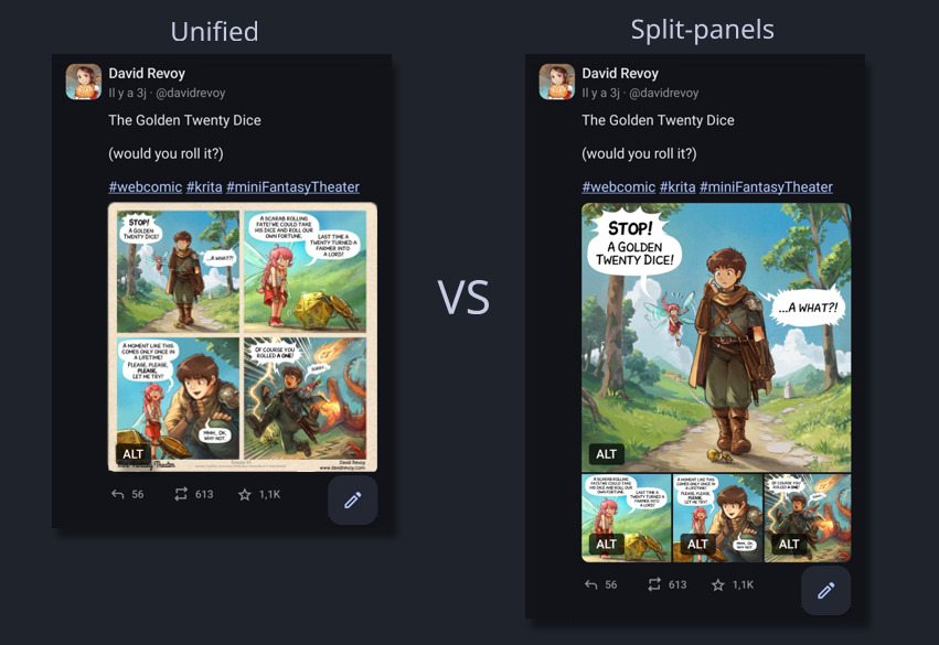
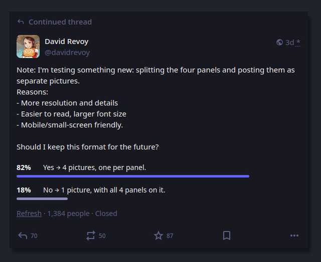
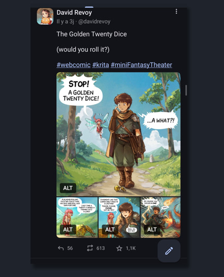
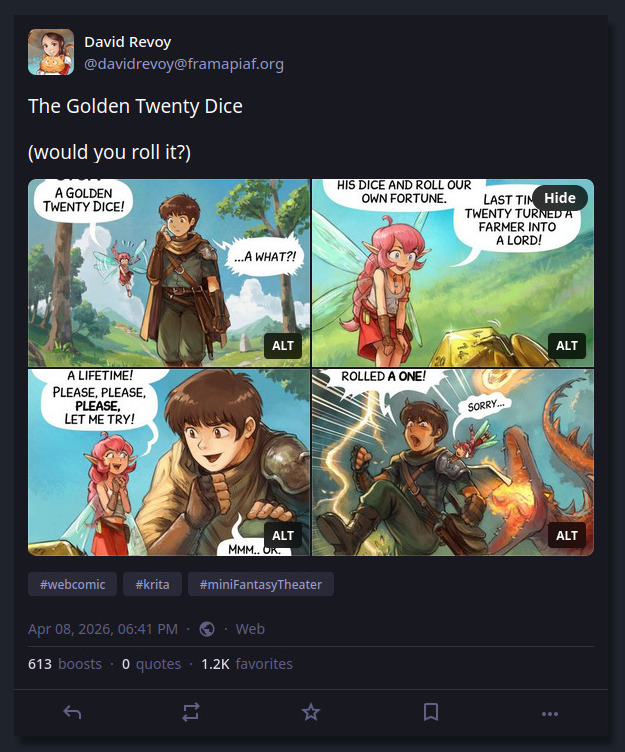
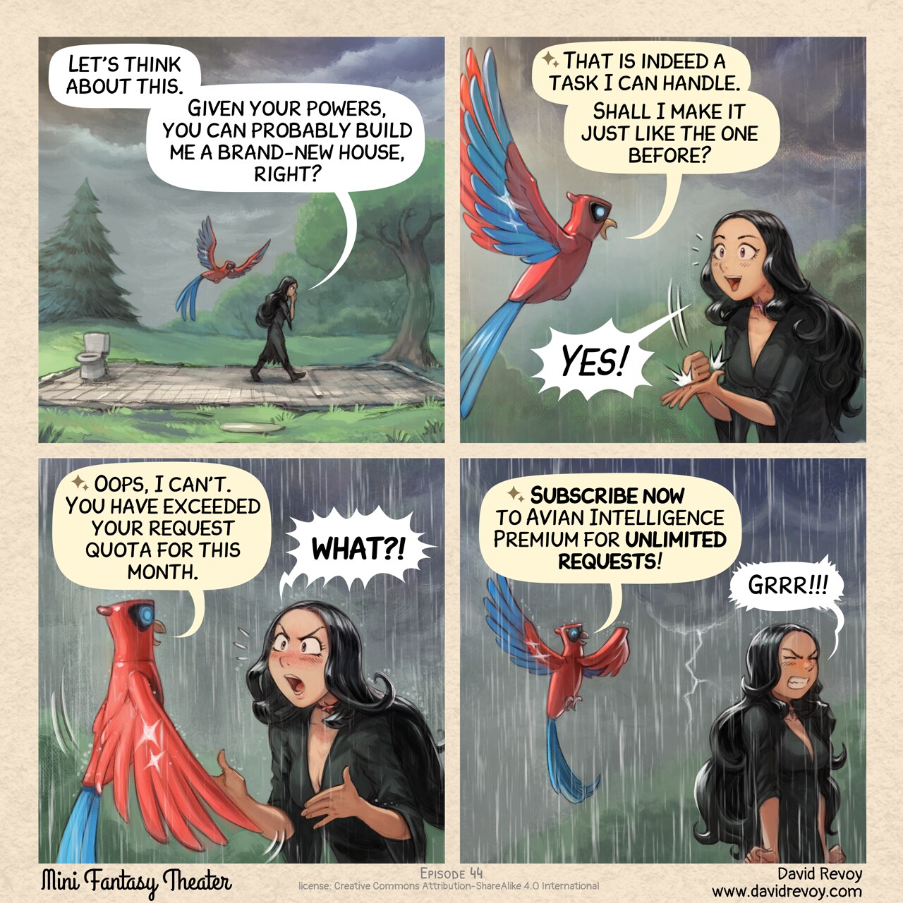
After posting more than fourty comic strip on it weekly, I decided last week to experiment and I posted my episode 47 "The Golden Twenty Dice" in a unusual way: split in four pictures.
Left (Unified) the format I used to post, Right (Split-panels) the format I tried last week.
Under the comic, I questioned the audience on a poll about their opinion about this new format.
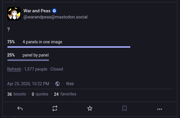
Result of the poll I posted.
A majority (82% on 1384 participants) clearly voted for four separate panels images (split-panels) to my surprise. Also, the comment section under it had a rich debate with over 190 comments about it. Thank you so much to everyone who participated: I could read all, I took notes, but I couldn't reply to all because I spent last part of my week deep in PHP, HTML, CSS and JS: you'll see why later.
So here is a sort of general reply, and what my notes revealed:
The single image (unified):
Pros
- Looks and recognisable like a comic instantly.
- Easy to download and re-share (a single file, easy to save, repost and transport).
- Preserved frame around the panels, with titles, licence and credits.
- Single click to open it.
Cons
- Mobile users must zoom and pan extensively to read it.
- Viewers can see the final panel immediately, potentially spoiling the joke/twist.
- A single long alt text for all four panels, often too long for the field.
- Less immersive, less details (resolution) and visual punch per panel.
All in all: the best format for preserving the artistic composition of the page, simplify sharing, and maintain this comic page aesthetics. But defintely not well adapted to the age of mobile and social media, especially for my detailed Mini Fantasy Theater comic.
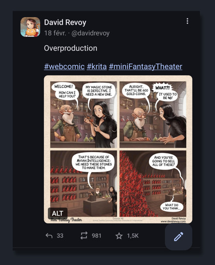
Example of unified, single picture: episode 40 posted on Mastodon .
The four separate panels images (split-panels):
Pros
- Excellent mobile readibility, large text, details and resolution (more immersive).
- Viewers see one panel at a time, avoiding accidental spoilers.
- Each image gets its own concise alt text.
- Easier for users with visual impairments.
Cons
- Fediverse client inconsistency: different crop, reorder, or display. Unpredictable and buggy for narrative art (eg. Mastodon UI crop the thumbnails).
- Requires more clicking/tapping/swiping each image individually.
- Limited to four pictures on Mastodon.
- No more surrounding frame, with title, series name, license info, and authorship context.
- Cumbersome posting effort: four separate pictures, 4 copy/paste of alt text.
- Heavier and more server resources and bandwidth.
All in all: the best format for mobile readers, accessibility, avoiding spoilers and having an immersive experience on the panel's artworks.
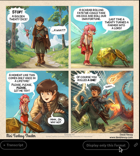
Example of split-panels: episode 47 posted on Mastodon's app, with four split panels: one panel is large, then three little, non are cropped
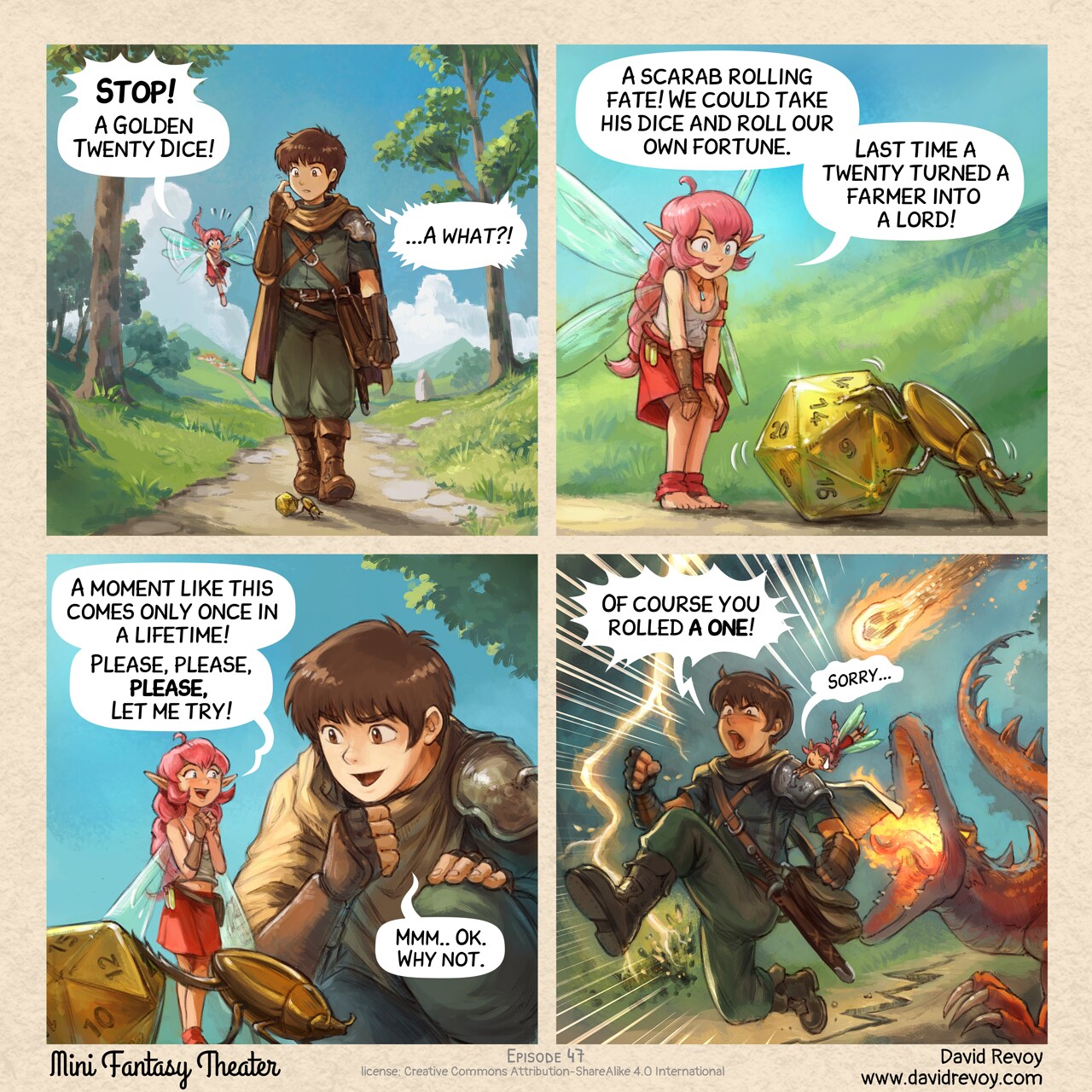
Example of split panels: episode 47 posted on Mastodon's web interface, with four split panels, four panels are trimmed to 16/9
Solution: Both. (Both is good.)
The most frequently mentioned solution was posting both versions, and I agree. But first, Mastodon limits to four pictures per post, so I can't post the four split-panels and the unified result. I would have been too simple. Also, posting the unified version as my main post and then adding the split-panels as a reply in a new post (or vice versa) just doubles my posting effort and polluate your timeline...
That's why I knew I had to come up with an extra something on my own to try to solve that, because I'm sure the Fediverse will remain unconsistent, with many cropping policy about image thumbnails, layout, and no garantee of ordering the pictures or even delivering them (eg. I had feeback that Misskey user could post more than four pictures per post, and user on Mastodon only see four of them, trimmed.)
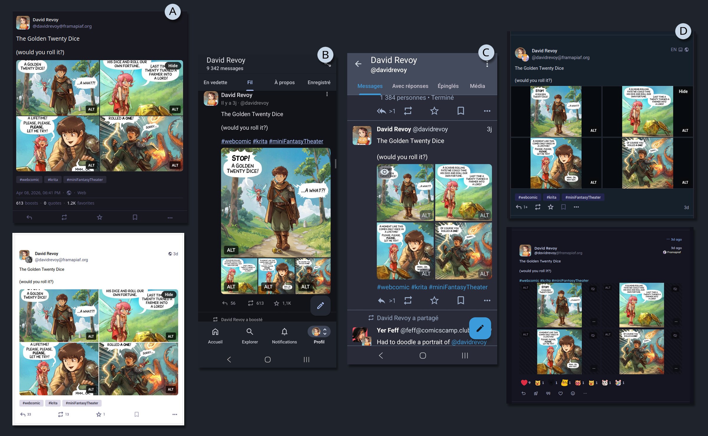
Example of the same post, with many screenshot under various UI: (A) Mastodon web bright/dark theming, (B) Mastodon app VS Tusky, (C) other Fediverse clients having rich emoticon reaction I never saw on my side of the Fediverse...
A KISS comic reader
My first reflex was to do something on my website, and propose a link to that on my post.
But what? So, my first thought was to just continue to post the unified picture, as I already did for very long, and paste an external link for mobile user to a sort of copy of the horizontal carroussel/swipe interface of Mastodon.
I'll spare you the dozens of hours of despair, testing horizontal swiping carroussels techniques in Javascript, loosing braincell and my sanity on concept like swiping threshold, sensitivity and screen resolution. Because, you see, I wanted to do all from scratch, without using any frameworks or library.
A video of my horizontal proof of concept, with bugs
But then someone reminded me of the KISS principle: 'Keep It Simple, Stupid'. The web is well designed; it's web developers who break it by using too much JavaScript. The obvious solution appeared to me: a simple vertical layout of pictures. It's great for scrolling on any device and users can zoom, and manipulate the pictures. It was such a joy to remove a lot of code and create a simple HTML layout with CSS.
A video of my vertical proof of concept, WIP
I then incorporated this into the PHP of my website (see git commits tagged with the [mft-cv] prefix).
On the side of the content itself, I also refactored many transcripts to ease their parsing and auto-split, and also refactor the episode 30 that had a composition that conflicted with the auto-split in four format.
Features of my comic reader:
- Anchor links to individual panels (bottom right of panels).
- Alt & transcript per panel (bottom left of panels).
- Share button to copy the URL on mobile.
- Bonus Timelapse video because too many still accuse my style of looking like AI, even removed by moderators on Reddit... it's depressing.
- Full Sources, including Krita files, Inkscape files, and ready made exported version for print.
- Full credits
- Keyboard shortcut:
- Previous panel: ↑ or Page-up
- Next panel: ↓ or Page-down or Spacebar
- Previous episode: ← p j
- Next episode: → n k
... and you can browse it already, because my result is online since yesterday on:
→ https://www.peppercarrot.com/en/miniFantasyTheater/047__Geek-Fantasy.html ←
Update
Thanks to your comments and suggestions, here is what was implemented after the release of this article:
A new button under the unified panels
- Both, really: A user preference button, (under the unified panel, see picture above) for choosing by default "unified" or "split panel".
- Back to the top: a tiny low opacity button on bottom right (on desktop only).
- Tag indicator: While browsing a tag (eg. Geek Fantasy), display a pill on the top of the comic reader (can be closed).
- Keyboard shortcut hint: Add a little picture of arrow keys on the bottom to give a hint they can be used.
- Split-panel label Added a subtle A, B, C, D letter on the split panels, to save the order.
- Footer on last panel Recover a footer with the branding, the name, author, and license on split-panel D.
- i18n ready Addition of a language selection on top.
When the webcomic "War and Peas" replicates the experiment
A major update: on 25 april 2026, the authors duo Elizabeth Pich and Jonathan Kunz inspired by the experiment I ran here, decided to replicate it on their Fediverse account for their successful webcomic War and Peas.
And their end result is ... totally inverted compare to mine!
I tend to interpret these results because of their graphic style and large font: they are really already optimised and adapted to be easy to read on mobile, even in a 2x2 panel grid without zooming. The facial expressions are often simplified to symbolic emojis, flat colours and gradients, and a thick line-art. That's why you can't miss out any details while reading their comics without zooming in: a big advantage. It's also certainly something that must take them a lot of work: on one hand, to keep the artwork that effective with few lines and shapes, but also to simplify their storytelling and layout each time to the essential.
In comparison, my more complex layouts, facial expressions, backgrounds, concept art and painterly brush work propose an immersion in each panel for a more cinematic effect. I can understand this difference of result under this prism of thinking.
Thank you War and Peas for the very interesting replication!
(Note: more interpretations are continuing in the comments here)
Screenshot of the Poll by War and Peas: 75% for unified, 25% for split
End note
So, what's the "best" format about publishing digital comics on the Fediverse?
As a creator, I can't guarantee how my comics will display on your device when posting on the Fediverse. That's a bit sad. However, one of the advantages of most Fediverse instances is that they don't have a "deboost" system, which means I can still include an external links in my posts without worrying about them being downplayed. This is in contrast to proprietary social media platforms, which often use such systems to keep users engaged within their own ecosystem...
Given this flexibility, my plan is to listen to the poll results and continue to post with the new four-split panel format, as I find it convenient and visually appealing; especially on Mastodon's mobile App, where a large Panel 1 invites readers in, followed by three smaller panels that don't spoil the ending. I really wish the Mastodon Web user interface had the same layout instead of the four cropped thumbnails.
To further enhance the reading experience, I'll include to this post an external link to the episode on my website, which will offer an optimal reading experience, a timelapse, full license, and sources... regardless of the client being used.
You'll see it in action on wednesday, when I'll post the next episode, but it will be a format looking like that:
Title of the comic

Full reader and bonus: <link to the episode on my website>

#webcomic #krita #miniFantasyTheater

(pictures/attachments: the four split panels)
What's your thoughts about it? Let me know in the comments.