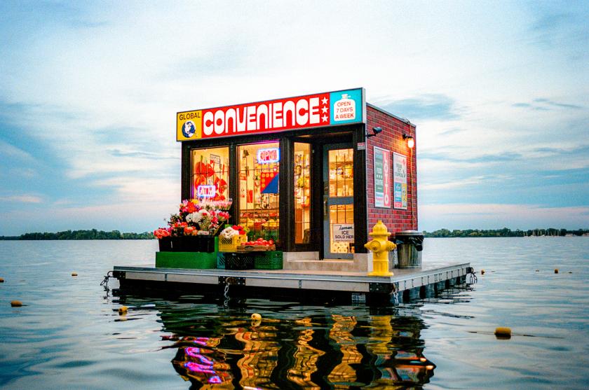
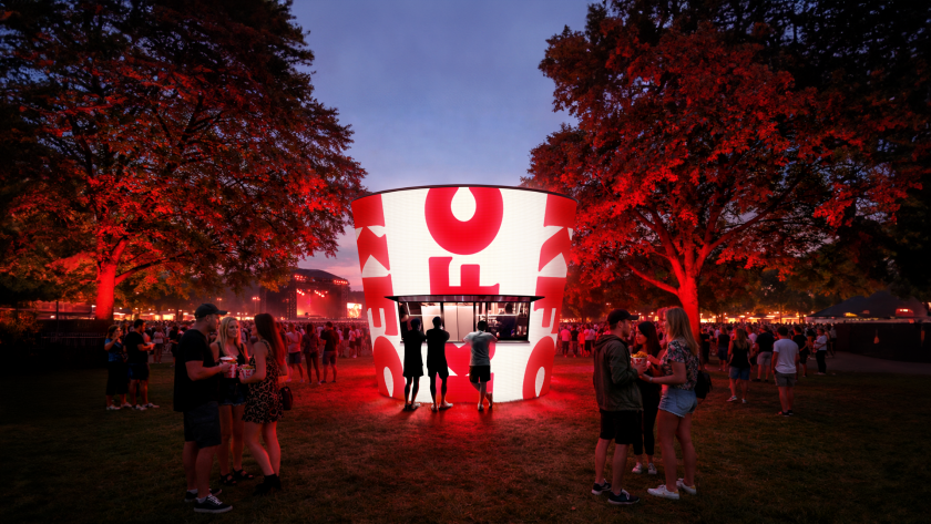
Artists Trevor Wheatley and Cosmo Dean, with design studio Puncture, have moored an entire convenience store on Lake Ontario – glowing, solar-powered and just out of reach.
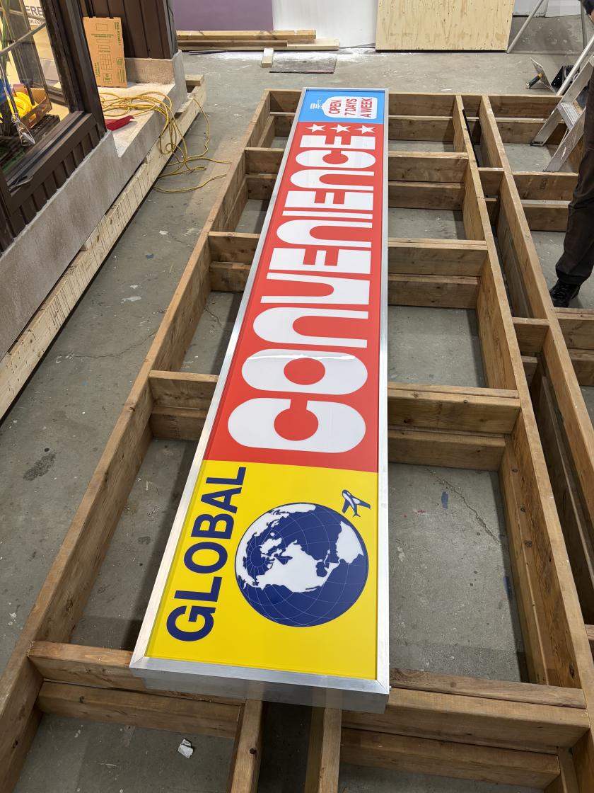
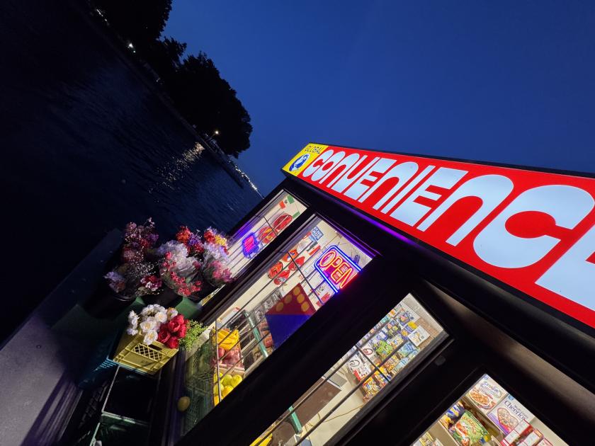
There is a convenience store floating on Lake Ontario right now, and it’s fully stocked. Well, we say "convenient", but that's definitely not the case. Called Global Convenience, it's a new artwork moored at Harbour Square Park Basin on Toronto's waterfront, moving one of the most ordinary spaces in any city – the corner shop – onto the water, filling it from floor to ceiling, yet leaving it deliberately inaccessible.
Made by Toronto artists Trevor Wheatley and Cosmo Dean with design studio Puncture – the partnership of Rashad Maharaj and Spencer Cathcart – it is the sixth piece commissioned for the area's annual Floating Public Art program in seven years, and arrives as the city prepares to host matches for the 2026 FIFA World Cup. Part sculpture, part shared memory, it is built around themes of arrival, daily ritual and migration.
The corner store, Wheatley says, was the whole point because it is unremarkable. "It's one of the most familiar and universally understood spaces in a city," he tells Creative Boom. "Almost everyone has a relationship to a convenience store, whether as a place to buy something quickly, meet a neighbour, or simply pass by on a daily route." Moving it onto the water, he adds, lets people "see something incredibly familiar with fresh eyes. The store becomes less about what it contains and more about what it represents – ideas of convenience, desire, access, and our relationship to the urban environment."
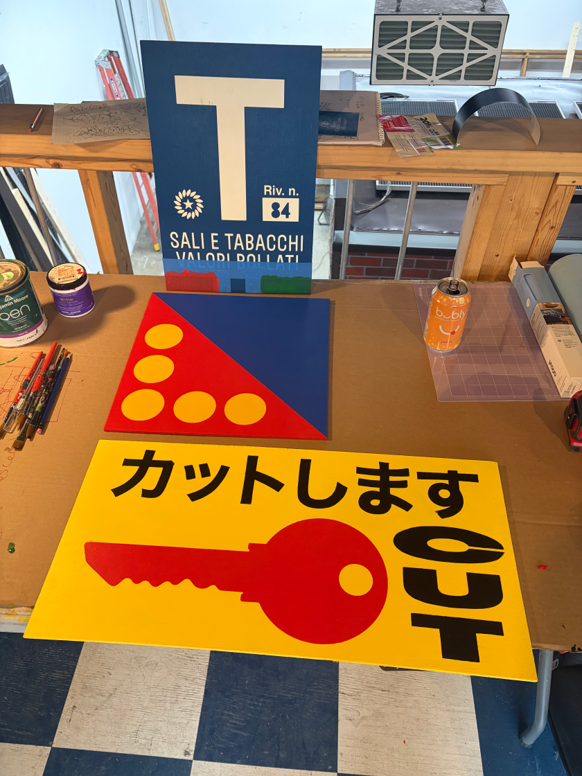
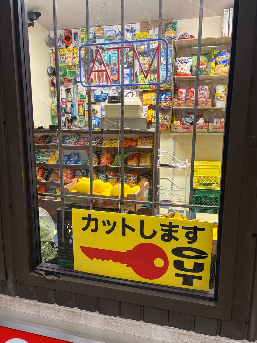
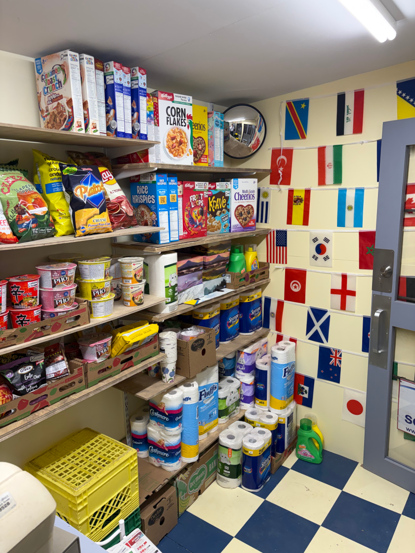
He describes the convenience store as "a kind of cultural crossroads… where products, languages, traditions, and identities coexist in one contained space" – and the team took that literally, stocking the shelves by hand with real products sourced from around the world. Among Wheatley's favourites are the plantain chips, the Coffee Crisps and a stash of vintage newspapers from 1999. But pushed for a winner? "Probably the shrimp puffs," he says, "because I'm allergic."
The signage borrows cues from Japan, Brazil, the US and Turkey, though Cathcart says nothing was meant to be a replica. "We wanted it to have the clarity of a prop or movie set, where people understand it immediately, but the details still feel strange enough to make them look twice," he says.
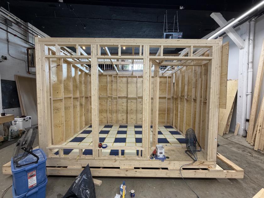
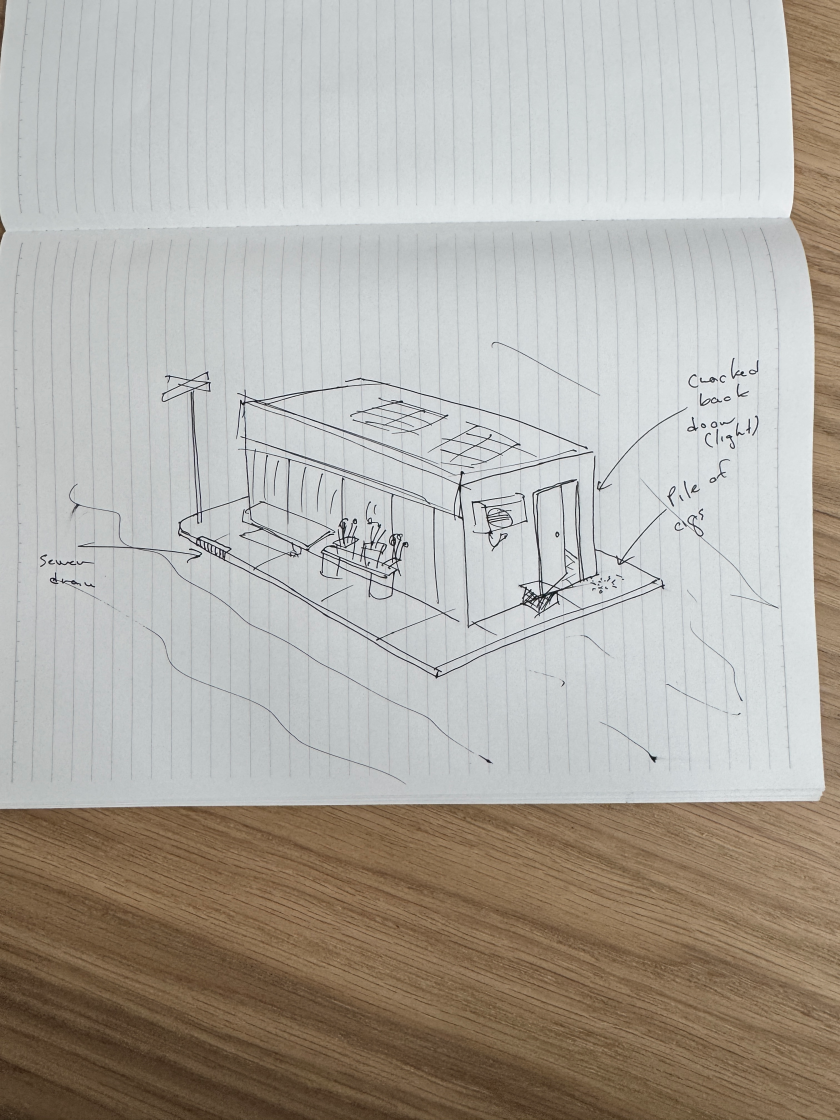
Building on water rewrote every decision, with buoyancy, wind and weather all in play. Weight was the biggest challenge: the walls became vacuum-formed plastic, the fire hydrant foam, and even the ice box freezer is a replica built from leftover studio plywood. "Those constraints improved the work," Wheatley says.
"They forced us to focus on the essential visual cues that make a convenience store instantly recognisable, despite being constructed from surprisingly lightweight materials." And the lake is still editing the piece. "The current and waves move it dramatically," he says. "Since the installation, we've continued to add and adjust elements in response to the site. In that sense, the harbour is still shaping the work."
The team also took "a crash course in solar power" so the store could glow after dark – a version Cathcart calls "totally surreal". "During the day, it is definitely a spectacle… However, at night it gets totally surreal," he says. "Most of us know the glow of a corner store late at night, but seeing that light hit the water was something else. The reflections and patterns make it feel like a fever dream. Let's hope for a sunny summer."
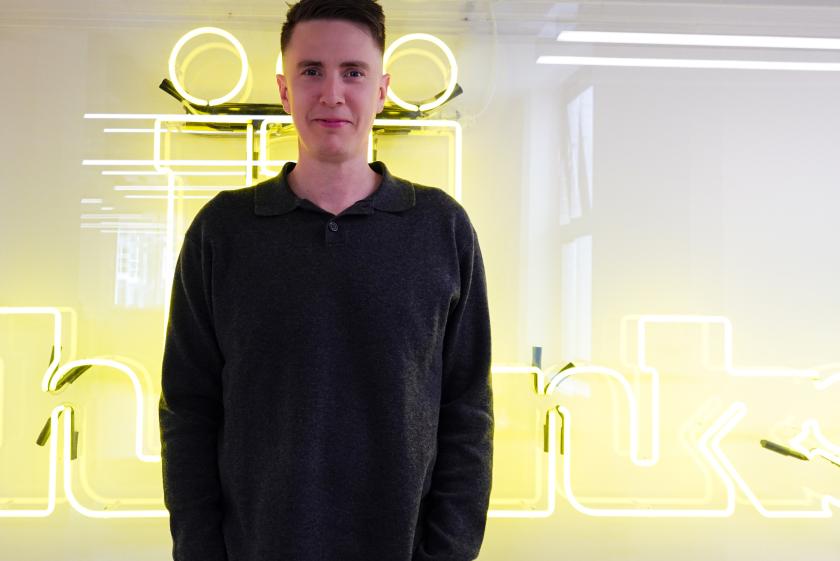
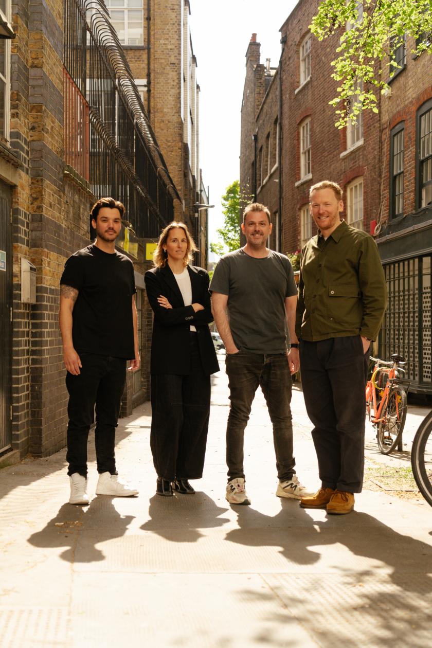
The collaboration is the first of its kind for the four, who met years ago when Puncture brought Wheatley and Dean in to make hanging typographic installations for WayHome Music Festival. "I've always felt designers and artists should work together more often, because each side brings something the other can't," Cathcart says. "Regardless of roles, it was four old friends with an undying dedication to making this project amazing."
The response has already been the way the artists hoped. "The other night, a man came up and told us it reminded him of every convenience store he'd ever been in, all at once, and how that feeling made his day," Wheatley says. "I think that's about the best response you could ask for."
Global Convenience is on the water at Harbour Square Park Basin throughout the summer season, best seen, like any good corner store, after dark.
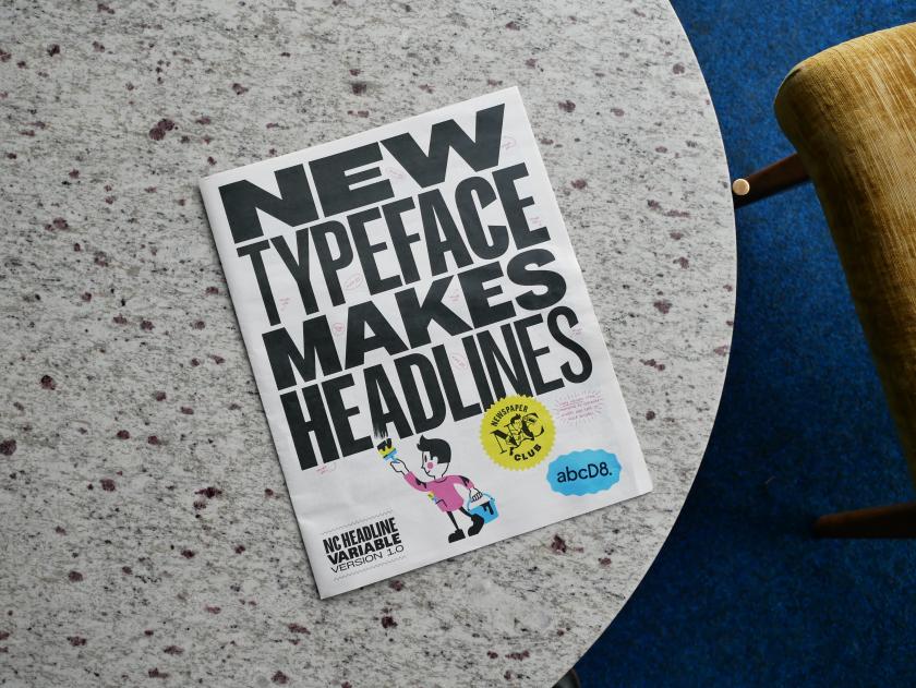
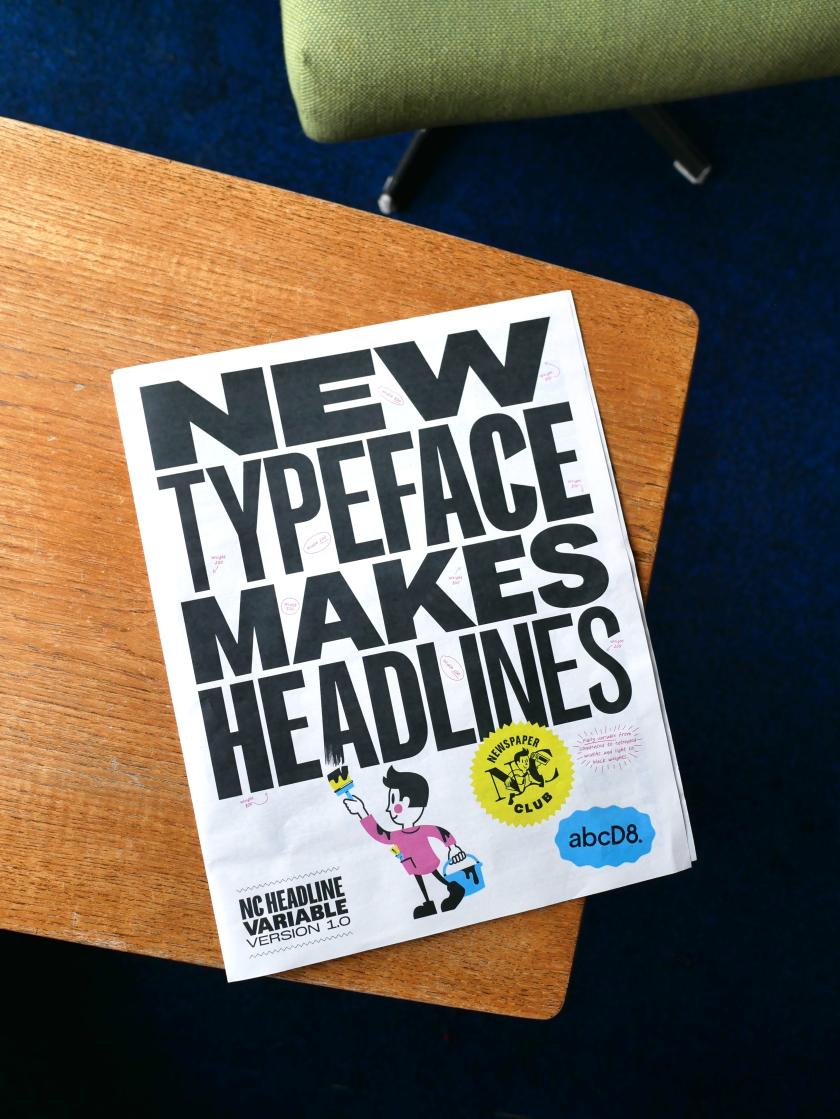
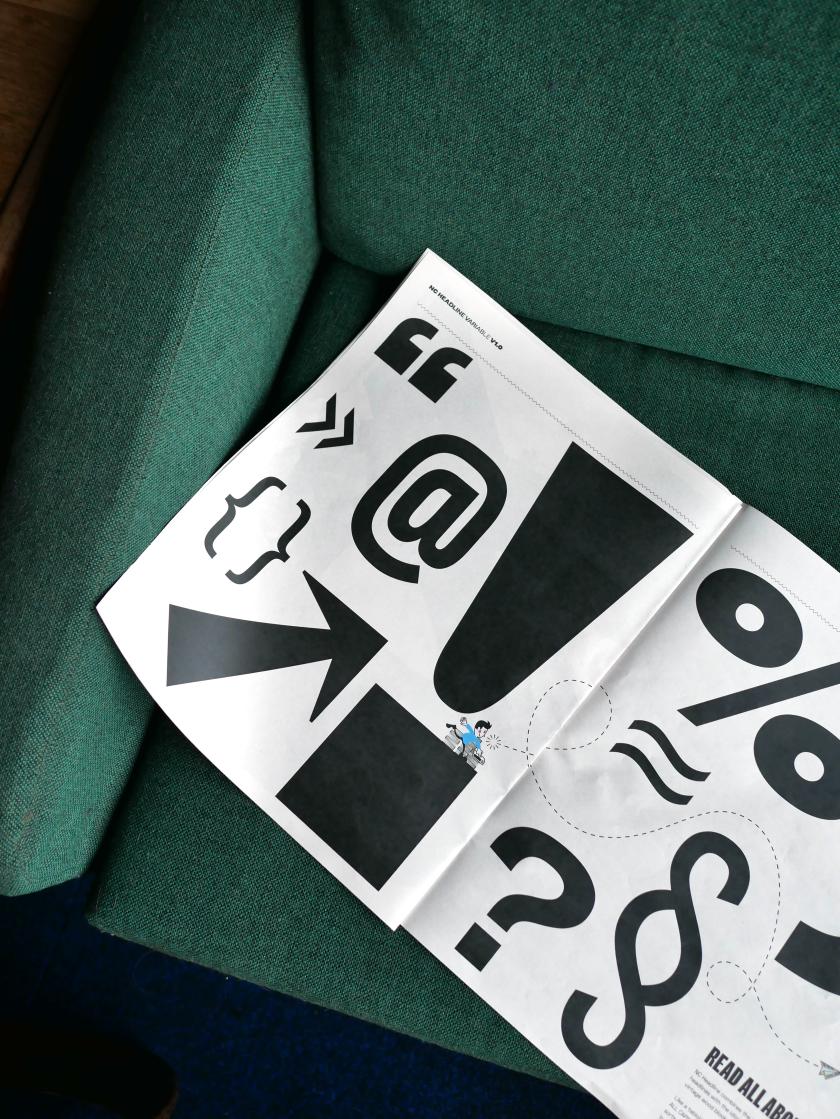
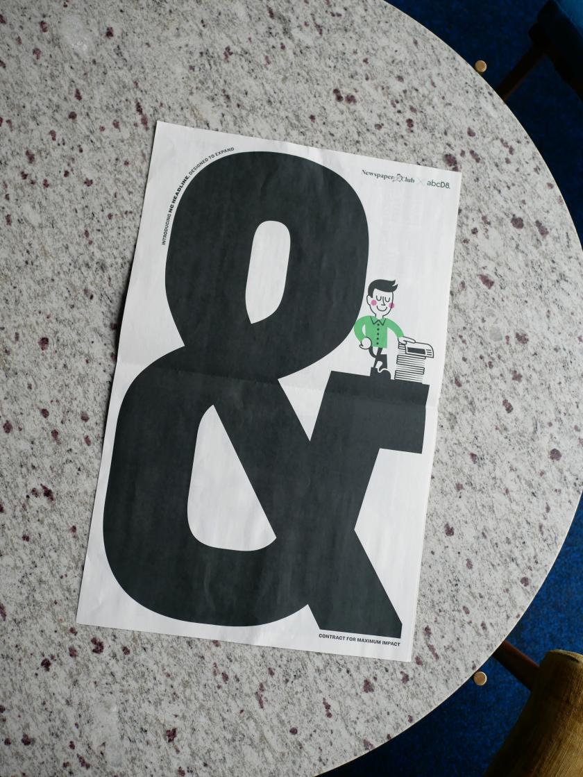
Drawing on the heyday of the tabloid press and the inspiring archives at St Bride, the all-caps variable font marks the launch of D8's new type studio – and a break from spiralling licence fees – ahead of its debut at Birmingham Design Festival.
Any discerning designer will tell you how expensive typography can get. Not to mention the minefield of licences and usage. And when the fees on your headline font keep on climbing, and that typeface is the backbone of your visual identity, there comes a point where owning one outright makes more sense.
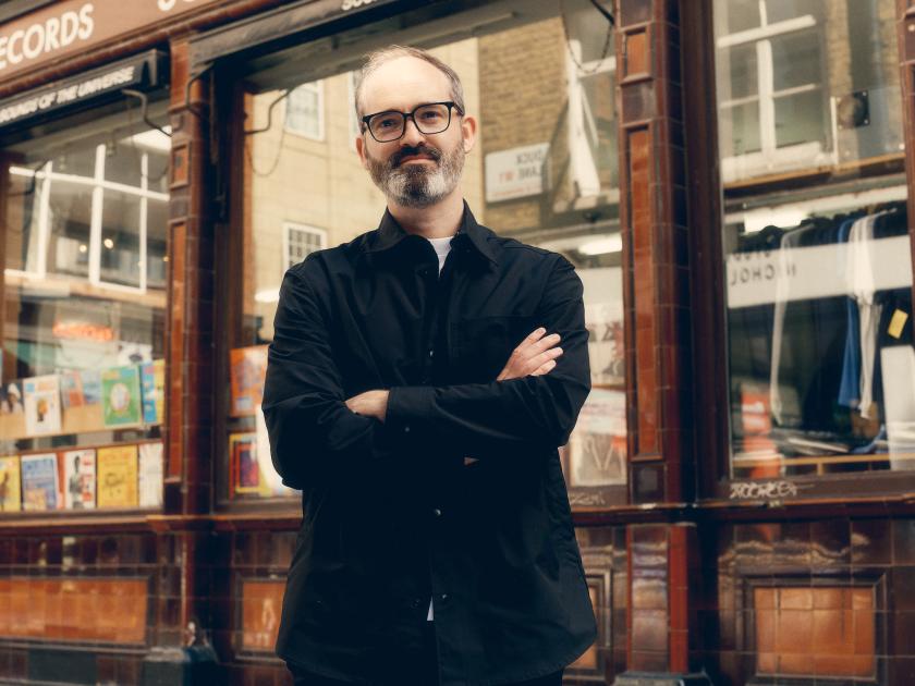
That's why Anne Ward, CEO of Newspaper Club, has teamed up with old pals D8 to create a bespoke typeface, NC HEADLINE, that is uniquely theirs and no one else can use. It's the first of many typefaces for the creative agency, which this week has launched abcD8 – its new foundry that designs typefaces clients own outright, with no licence fees attached, ever.
Newspaper Club is its first customer, and what they've created will be revealed this week at Birmingham Design Festival, where a type specimen printed on the company's own tabloids – plus a short film documenting the process – will put the new font through its paces.
To inspire its design, Anne and the D8 team went through St Bride Foundation's archives – the home of the printing press in London, and a brilliant place to visit if you haven't already. "Initially, we looked at the sophistication of broadsheet mastheads, but it felt like it really lacked the energy that Newspaper Club has," says Anne. They turned instead to the heyday of tabloids, when typefaces like Interstate (Daily Mirror) and Franklin Gothic (The Sun) ruled the front pages. "Rather than simply copying the tabloid look, we wanted to refine it a little more and so combined it with more vintage styling, helping to make it more our own."
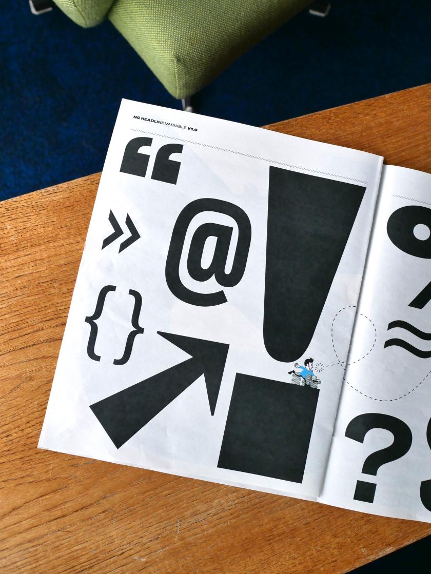
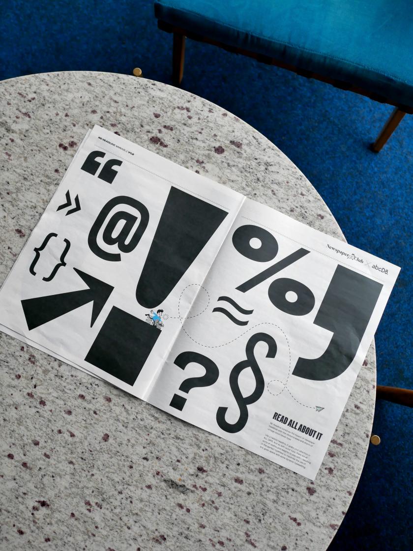
The archives turned up many surprises, shaping the direction of the design. Show posters and how they handled certain character shapes, for instance. "We liked how they used variable-width characters to shout about something while using all available space on the poster. That wasn't something we'd expected to study initially, but it ended up having a real impact on the design," says Anne. "Those references helped us round out and refine the typeface, giving it more personality and helping us resolve some of the character forms in a way that felt distinctive while still being rooted in print culture."
Creating something with heritage whilst remaining forward-looking and modern is no easy task for any designer. Rules will inevitably be broken to accommodate both print and digital demands. "From our perspective, we wanted to evoke the confidence and character of classic newspaper headlines, but we also needed something that could work seamlessly across all of our channels," adds Anne.
"One of the biggest departures from our historical references was the emphasis on flexibility. Traditional newspaper headline typography tends to be quite static, designed for a specific context on a printed page. We needed something much more dynamic: a typeface that could work across social media, video, print and large-scale applications, while still feeling unmistakably rooted in the world of newspapers."
That thinking led Anne and D8 towards a variable design with no fixed widths – one that can expand, condense and adapt to different formats. Despite this, they deliberately kept one restriction: they didn't build a lowercase alphabet. "We wanted the typeface to remain all caps, reinforcing its role as a headline typeface," explains Anne. "We stack our headlines a lot, so having the ability to adjust the width gives us much more flexibility. Depending on the space available, we can make the type incredibly condensed or much wider and more expansive, often even within the same headline."
The new foundry abcD8 has launched, promising to design typefaces that brands can own outright, "free from fees or ongoing licences". But how does that model work commercially, and why go against the standard licensing approach?
Steven Bonner, creative director at D8 and abcD8, says: "We treat the way we work with type in exactly the same way that D8 does with other design projects. This means using a transparent pricing structure where the client pays for our time. We don't charge for licensing design work anywhere else, so why do it with type?
"We've found that the pricing structure for type has left a lot of our clients more than a little confused and struggling to navigate a complex world of licences across a host of touchpoints, so we want to make it simple. If we provide good service, we hope clients come back to us the next time they have the same need, rather than charging them over and over for the same work."
It makes total sense. Which raises the question, whose idea was the typeface for Newspaper Club? Did Anne go looking for one, or did abcD8 propose it as a launch project? It was Anne who approached D8 after working with them for over a decade. "During that time, we'd seen font licence fees rising and rising," she says. "Our headline font had always been such a huge part of our identity; it just made more sense that we should own it outright."
Along with the launch of a newspaper specimen at Birmingham Design Festival this week, Newspaper Club has released a film about the making of the new typeface. "We didn't just want to say 'here's a new typeface' and walk away," says Anne. "We know how much our community loves to see the work that's gone into something. People always ask to see behind the scenes at the printing press, and we thought this was a fun way to bring that energy to this project."
Anne explains it's important for them to showcase not only the design process but also the collaboration and teamwork that goes into creating a typeface so fundamental to their brand identity.
The popular Netflix series Abstract: The Art of Design was a major inspiration for the film, which features an animated version of Newspaper Club's brand mascot, Russell. Worth a watch.
Can you get your hands on the typeface or the specimen? Not NC HEADLINE, no. But you can get your hands on the specimen by visiting Newspaper Club's stand in the Analogue District at Birmingham Design Festival this week. They're also hosting a talk about print on Friday, and will be handing out copies of the type specimen, which doubles as a pretty gorgeous poster.
If you can't make it to Birmingham, don't worry… Newspaper Club will be taking the specimen on tour at future events, so look out for where they're heading next.
The free routes that used to bring creatives their next commission are closing one by one. It's been happening for some time. And now AI is pretty much destroying the web as we know it. Here's how to keep being found – and, increasingly, recommended – without a marketing budget.
For many happy years, getting found was something any creative freelancer or studio could do on the strength of work alone. A website that ranked for your craft. A post that travelled far and wide and carried your name back to your profile. A share that turned a random person into a client. None of it really cost anything except for a bit of time and effort. And all of it was the pipeline to paid work.
Oh, how things change. Organic search has fallen off a cliff. Social media rewards quantity over quality. And the latest? Conversational, agentic AI is now pulling all the shots.
And with today's big news that Pinterest is shifting away from traditional search, it's clear that none of us can out-optimise this on our own. The good news is that the shift rewards a handful of things independent creatives can still build: a direct audience, a distinctive name, and a reputation the new systems can read and recognise as important. Exhausted? Yes, so are we. But here's where to put your energy.
1. Build an audience you actually own
I've been saying it for over a decade – since Meta ruined Facebook for publishers in 2016 – build your own audience. That's because every follower you have is rented. Platforms like Instagram and Pinterest get to decide who sees your work, and the goalposts can change overnight.
An email list is the one audience you get to control. It's a list of people who chose you, and you can reach them directly, whenever you want. So start a simple newsletter, even a short monthly one, and make signing up the clearest call to action on your website. (Our guide to creating a newsletter people actually want is a good place to begin.) A few hundred people who want to hear from you is worth more than ten thousand followers a feed decides to throttle, and it's how plenty of creatives are winning work after quitting social media altogether.
2. Become a "category of one"
Don't roll your eyes, but AI discovery rewards a "good enough" match to a brief, which flattens everyone into interchangeable options. The defence is to be "uninterchangeable". So sharpen the one thing you do that nobody else does in quite the same way. That could be a material, a subject, a voice. You want to be known by name rather than retrieved by attribute. The creatives who survive this current massive shift are the ones a client specifically asks for, because a specific name is the one thing an algorithm can't substitute.
3. Get cited, named and talked about
As someone who worked in PR for two decades, this next tip warms my heart. Because I know public relations is having a golden hour moment. That's because if you still want to be found, recommendation engines lean on signals they can read: who's mentioned in other people's work, who turns up on lists, in interviews, in the press, and in collaborations.
It means that being talked about is more valuable than being optimised. Forget staying in your comfort zone. Say yes to the guest piece, the podcast... even the scary panel on stage that you've been avoiding. Pitch yourself for round-ups in your niche. Every place your name appears alongside your craft is a breadcrumb the systems – and the people – can follow back to you.
4. Make your site easy for a machine to understand
If an AI is going to represent you, it has to be able to read you correctly. That means not blocking AI crawlers on your site. And it means spelling out, in plain language, what you do, who you do it for and what makes your work yours. Don't just have images and a one-word 'work' tab. Name your projects, your clients and your disciplines in actual words. Add alt text to every image. You're not gaming anything here; you're making sure that when a system describes you, it gets you right rather than second-guessing.
5. Show the process and the person
A generative answer can summarise a style, but it can't reproduce the human genius behind it. That's your advantage. In which case, share the process: the sketches, the dead ends, the "why" behind every decision, and the story of a commission. Content about process, along with a real point of view, builds the kind of trust that turns a browsing visitor into a client, and it's exactly the material an AI can't copy from pages that already exist.
6. Make referrals easy to give
Word of mouth is, and always will be, the most powerful marketing channel. And it's still how most independents get their best work. Don't leave it to chance. Tell happy clients you'd welcome an introduction. Keep a tidy one-line description of what you do that someone can paste into a message without having to think. Stay in touch with people you've worked with so you're the name that comes up when they're asked, "Do you know anyone good who can…?"
7. Turn up in real rooms
"In real life" is back, baby. Events, meet-ups, talks and communities – they're all back on the table after those weird post-pandemic years. Like word of mouth, networking is hugely powerful. A conversation at a portfolio night or a face remembered from a meet-up leads to commissions that no number of impressions or page views can match. You don't need a stage, but turning up consistently where your peers and potential clients gather will eventually deliver results.
Just remember to enjoy yourself and make friends, first and foremost. Don't go in with the hard sell, as there is nothing more off-putting.
8. Don't rent your whole presence from one place
Remember the old saying, Don't put your eggs in one basket? It applies here. If a single platform is your entire shop window, one change to its rules can harm you enormously. Spread your presence across things you own and things you earn – your website and newsletter list, plus a couple of channels and the press and communities you show up in. The aim isn't to be everywhere all at once; it's to make sure no one switch, algorithm tweak or new AI layer can take away every route to your door at once.
In summary
None of the above is a quick fix. But don't panic. The creatives who stay discoverable through this enormous revolution won't be the ones who chased the algorithm the hardest; they'll be the ones who built something that's truly their own... a name worth knowing, a direct line to the people who love your work, and a great reputation that travels on its own accord.
Now that anyone can make content in seconds, taste has become the most valuable asset. That means the tools worth using are the ones that take the grunt work without making you compromise on craft or how things are built. Adobe Stock's AI Studio does just that.
Something has flipped in the last 18 months. Since 2009, I've supported the creative industries through my platform, and during that time, I've always known that making the thing was the hardest part. You could have a brilliant idea over coffee, but turning it into a finished image, video, or usable layout took hours, skill and money. The bottleneck was production.
All that has changed. Content can now be made faster and cheaper than at any point in living memory, and the volume expected of creative teams has climbed to match. If you work in a small studio or an in-house team of three doing the work of 10, you already know this. The brief isn't "make something good" anymore. It's "make 40 good things, in five formats, by tomorrow".
Before I go any further, let me be straight about where I stand. I know a lot of you are wary of AI right now – some of you are super angry about it – and you have every right to be. Creative Boom has always been in your corner, and that's exactly why I want to talk about this honestly, rather than cheerlead.
Because the honest response to this isn't to celebrate. Plenty of people will try to sell you the "make more, faster" dream, and most working creatives are right to be wary of it, because "more" was never the point. I think the interesting shift is actually encouraging news. When anyone can produce content quickly, the thing that becomes scarce, and therefore more valuable, is knowing what's worth making at all. That's down to your taste and judgment. It's something Aporva Baxi pointed out in our recent podcast. It's about being able to look at 10 versions and say, with reasons, why the seventh shot is the one. That, to me, has always been the heart of any creative's job.
When making things gets easy, deciding what's good becomes the whole job.
This is where decent AI tools earn their place. The question I'd ask of any tool, then, isn't "how much can it churn out?" Instead, it's "does it give me back the hours that were lost in grunt work, so I can spend more time being creative?"
It's the test I've been putting Adobe Stock's newly launched AI Studio through. For instance, clearing an unwanted object from the background of an otherwise perfect shot. Nudging a colour to match the client's brand palette. Perhaps sizing the same content for 10 different placements. None of that is a creative act; it's the boring stuff around it. And handing that dull drudge to a machine, so I can focus on the choices that need taste, that's a very different proposition from being told to simply produce more, more, more.
I also appreciate where it starts. AI Studio sits atop a collection of nearly a billion images, videos, illustrations, vectors and music tracks. The starting point isn't a blank box and a text prompt; it's real content – shot, drawn, and composed by actual photographers, videographers, artists, and illustrators – that you can refine and play with until you're happy. You can also keep track of your edits with the new in-line editing feature. You're not summoning something from nothing. You're exercising your own judgment on assets that already have a great foundation.
That foundation really matters too – not just to you, but to other creators. The content you start with in AI Studio is commercially safe, and when you license it, the photographers, videographers and other artists who created it are paid as well. In plain terms, you can put it in front of a client without lying awake at night wondering whose work it was built from.
From there, you can choose the edits you feel most comfortable using – whether that's Firefly or other third-party models. The choice is yours. For a lot of us, that's the difference between a tool we'll actually adopt and one we'd avoid like the plague.
"Starting from high-quality, licensed content changes the role of AI. Instead of generating something from scratch, you can apply your own creativity to a strong foundation to make it your own," explains Matt Smith, VP of strategy, design and emerging products at Adobe.
Adobe Stock has also, on multiple occasions, provided bonus payments to contributors whose content was considered for training its Firefly models – it was among the first platforms to do so, and to use licensed content rather than scraping the open web. It isn't a perfect arrangement, but it's further down the road in paying and crediting the people underneath the tools than most alternatives.
And that's really the point. None of this makes the tool the hero. The hero is the person deciding what's worth making, what to cut, and what "good" looks like from one brief to another.
The tools that earn a place in your process are the ones that take the work that was never really yours to do and leave you with the part that is most fulfilling. This matters more than ever because, as content gets cheaper and faster to make, your taste goes from being a nice-to-have to the most valuable thing you can bring to the table.
"Now that making content is easier than ever, what matters is the creator's judgment. The creators who stand out now aren't the ones making the most; it's the ones who know what is actually worth making. And as technology evolves, creators should capture more value from their creativity, not less," adds Smith.
So no, I don't think the machines are going to replace us or our judgment. If anything, they'll make taste the only thing left to compete on. And for anyone who got into this industry because they care whether the work is actually good, that might be the most encouraging thing we've heard in ages.
After more than twenty illustrated books, the New York-based artist has stepped back from publishing to chase something more personal: the way light holds a room, a station or a street corner in the seconds either side of an event.
There's a beautiful stillness to Hannah Li's latest work. A train station empties. Light falls across an armchair in an empty room. A city corner waits in anticipation. Nothing dramatic is happening, and that's rather the point. "I'm drawn to moments that feel suspended in time," Hannah tells Creative Boom, "places where something has just happened, or is about to happen."
Hannah is a Chinese illustrator based in New York City, and light has always been the centre of everything she sees. Through interiors, city corners, train stations, and everyday scenes, she explores how light shapes our memories and changes our emotional relationship with space. It is a happy obsession that gives her images their gentle charm: you arrive a little too early, or a little too late, and you feel the difference.
Her practice runs through fine art. Hannah studied oil painting in China before moving to the United States in 2013 for an MFA in illustration at SCAD, and that grounding in paint still shows in the way she handles colour and atmosphere. Since graduating, she has built a substantial editorial and publishing career, with work for The New York Times, The Washington Post, and Harper's Bazaar Germany, as well as more than 20 non-fiction books for publishers including Penguin, Macmillan, and Usborne.
That publishing run was, by her own account, a serious education. Working closely with authors, editors and art directors taught her visual problem-solving, long-form storytelling and the benefit of collaboration. "It taught me how to communicate complex ideas clearly," she says, "while adapting my visual language across a wide range of subjects." For a few years, non-fiction was the centre of her practice.
Then something changed. After what she describes as a series of personal and life transitions, Hannah felt the pull back towards her own voice. She began stepping away from long-term book commissions and rebuilding her art around observation, curiosity and presence – making for herself again, rather than to another brief.
The result is an ongoing personal series called The Way Back. Rather than documenting specific events, it traces her relationship with the world after she, as she puts it, "returns to herself". The illustrations are less interested in narrative than in perception: the feeling of standing between movement and stillness, familiarity and distance, belonging and solitude. They ask you to notice the in-between rather than the big headline.
Much of the series began on the move. The pieces draw on things Hannah noticed while travelling through Paris, Rome, New York and other cities over the past two years. "Through colour, atmosphere and carefully observed details," she says, "I try to capture small moments where light, space and memory quietly intersect."
It's work that celebrates the art of slowing down, which feels like something she needed for herself after such a busy career in publishing. Beyond books and editorial work, The Way Back asks her only to look, and to trust that a reader will recognise the feeling without being told what it actually is.
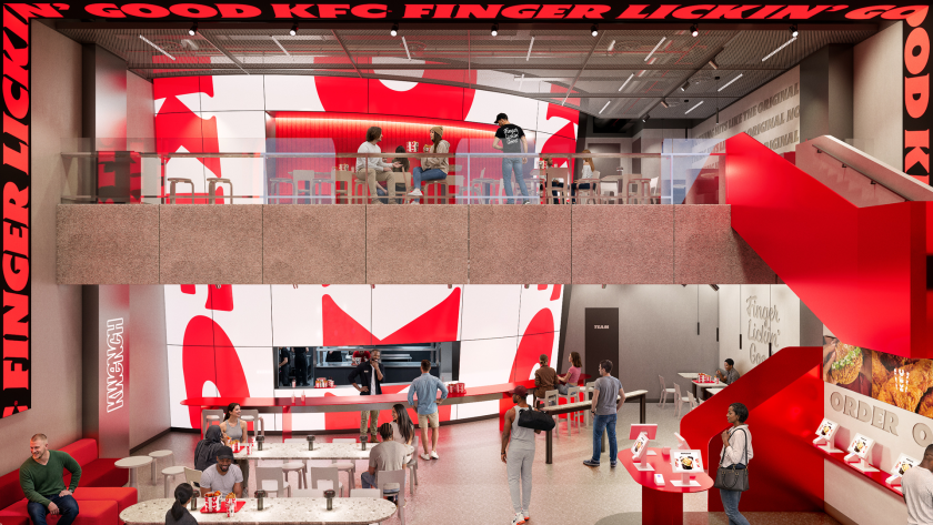
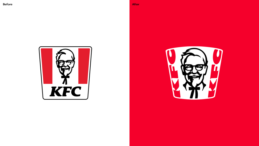
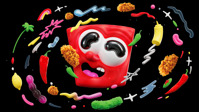
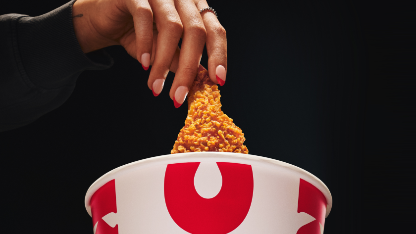
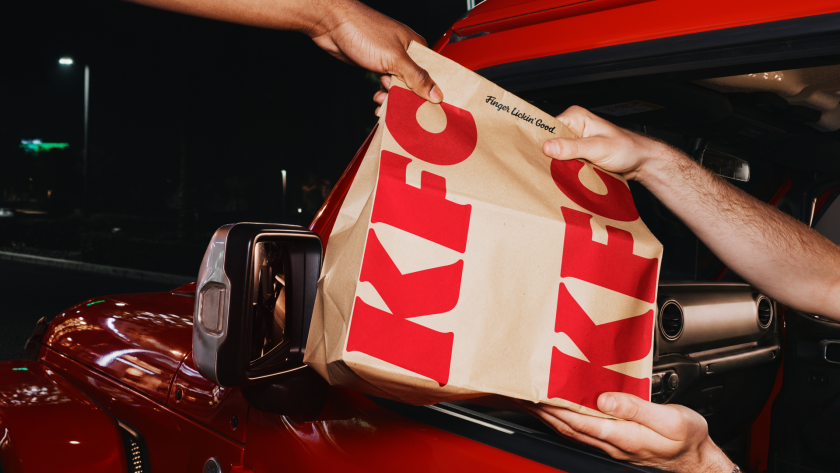
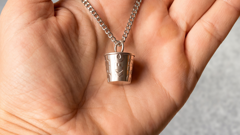
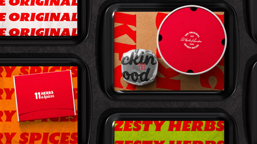
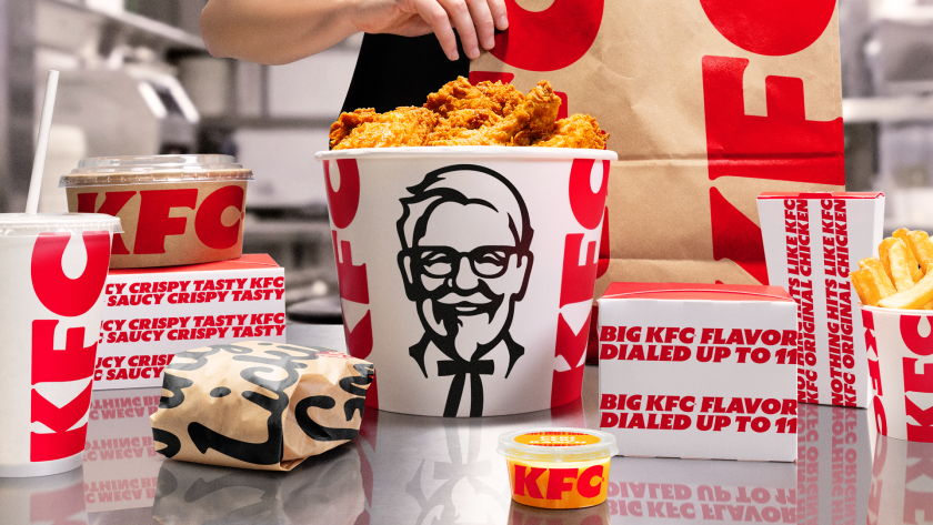
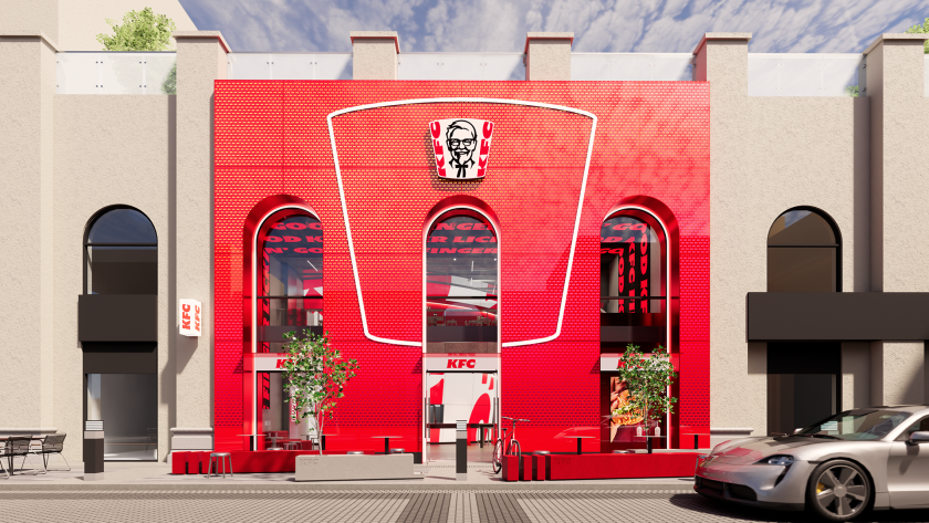
Jones Knowles Ritchie reworks every touchpoint, from a 3D logo and custom typefaces to a refreshed Colonel, as KFC's biggest brand evolution begins rolling out across more than 150 countries.
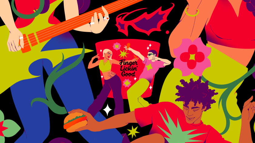
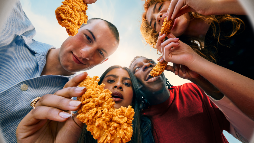
Chicken is having a moment. I only realised this recently at a Spanish airport, when I spotted a new Popeyes branch past security. On further investigation, it appears the brand is rapidly expanding its global footprint as it seeks to dominate the category. It's why an email from Jones Knowles Ritchie (JKR) made me smile this morning. It's just helped KFC evolve its entire identity, reminding us that few fast-food brands carry a kit of parts as distinctive as its own. The bucket, the stripes, the Colonel, and its strapline "Finger Lickin' Good" – each one is instantly recognisable, even out of context. Perhaps KFC wants to remind us that there is only one place to enjoy chicken.
That, in a nutshell, was the mission. JKR, the global branding agency behind the work, was not asked to start KFC over but to take it into what the brand calls its next chapter. It wanted to evolve, confidently, without losing brand loyalty.
The result is a full 360-degree evolution that runs from the design system and brand assets through to restaurant environments, packaging, digital platforms and tone of voice. JKR describes it not as a refreshed logo but as a "single, connected world" – one built entirely around KFC's most famous asset: the bucket.
"Our role was to help it evolve for the next chapter, in a way that only KFC could," says Sean Thomas, global executive creative director at JKR. The studio set about "building a world and experience that consumers could step into. We call it the Bucketverse."
The bucket is the unlock
The bucket sits at the heart of everything. But JKR has redefined it as a central brand device, standardising its distinctive shape for a consistent global rollout and treating it as both a framing system and a storytelling one – an extension of the logo that can hold food, culture, energy, and just about anything in a single frame.
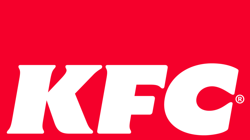
From there, the system spreads out. The logo becomes a three-dimensional asset rather than a flat mark; the lettermark is stripped back to a cleaner, more legible shorthand; and the stripes, once only a background texture, are reworked into an expressive, type-based asset that does much more of the storytelling. The core red, white and black palette, meanwhile, stays put for instant recognition. And it's joined by a secondary system called Herbs and Spices – a nod to the original recipe – for moments that need a bit more oomph.
Typography-wise, KFC now has its own custom-built type system, Kentucky Fried Serif (well, they had to call it that) and Kentucky Fried Sans. Genius. It's drawn from the lettermark and developed in partnership with StudioDRAMA. 'Finger Lickin' Good', meanwhile, is reframed from a tagline into what JKR calls "a standard of behaviour" – a global brand asset rather than a sign-off. Lettering artist Tobias Hall crafted the mark itself.
A gentler Colonel
Then there's the famous Colonel. Looking at the 'before' and 'after' icon, you can spot the difference, but it's incredibly subtle. Not surprising, given that it's the brand's most sacred asset and therefore needs to be handled with care. It's enough to keep any designer awake at night, worrying about getting it wrong.
JKR smashed it, though. The Colonel takes on a clearer, more purposeful role in the new 3D logo and has – dare I say it – a more welcoming expression, along with grounding elements. Despite the tweaks, the agency has preserved his character and legacy. And a new system of stamps carries his spirit throughout, leaning into the brand's heritage and craft.
Accompanying illustration and photography help KFC to feel human and global. The illustration system was built with a roster of international artists – Bernardo Henning in Buenos Aires, Eva Cremers in Amsterdam, UV-朱 in Xiamen, Belén Díaz Guerra in Lima and Boomrangg in Mumbai. While lifestyle photography came from Reece James Morrison, and food photography from Frankie Turner. Film music was created with Antfood.
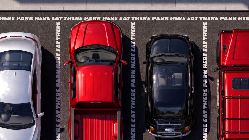
From QSR to 'QXR'
The bigger ambition is experiential. And this is where the new identity gets exciting. The bucket becomes a giant fixture in restaurants, pop-ups, and other retail spaces. It literally swamps each space. JKR frames the work as a category shift – from quick-service restaurants to what it calls 'QXR', or quick experience restaurants. "Nothing hits like KFC, and that sentiment doesn't stop at the chicken," says Matt Michaluk, executive creative director for experience at JKR. He describes it as "a disruptive category shift" and "a brand turning experience-led distinctiveness up to 11".
For Tosh Hall, JKR's global chief creative officer, it comes back to category leadership. "Every category has its leader. When you close your eyes and think about that category, you think of one, maybe two brands," he says. "When you think chicken, you should think KFC. Our job was to make sure the leader of the category was showing up like one."
The rollout has already begun. It starts this month in the UK and Ireland. Expect new Tenders, nine new sauces and refreshed branding across communications and digital touchpoints. It will then expand to Australia and the US in the coming weeks, with more markets following through 2026.
The new-look restaurants arrive from the summer, led by an open-concept space in McKinney, Texas, expected in late summer, and a two-storey, fully immersive restaurant in Dubai opening in the autumn.
Whether the wider world warms to the 'Bucketverse' and 'QXR' language remains to be seen. But as a piece of brand thinking, it's a confident, carefully judged evolution of one of the most recognisable identities on the high street, and a reminder of how much mileage there still is in a really good bucket.
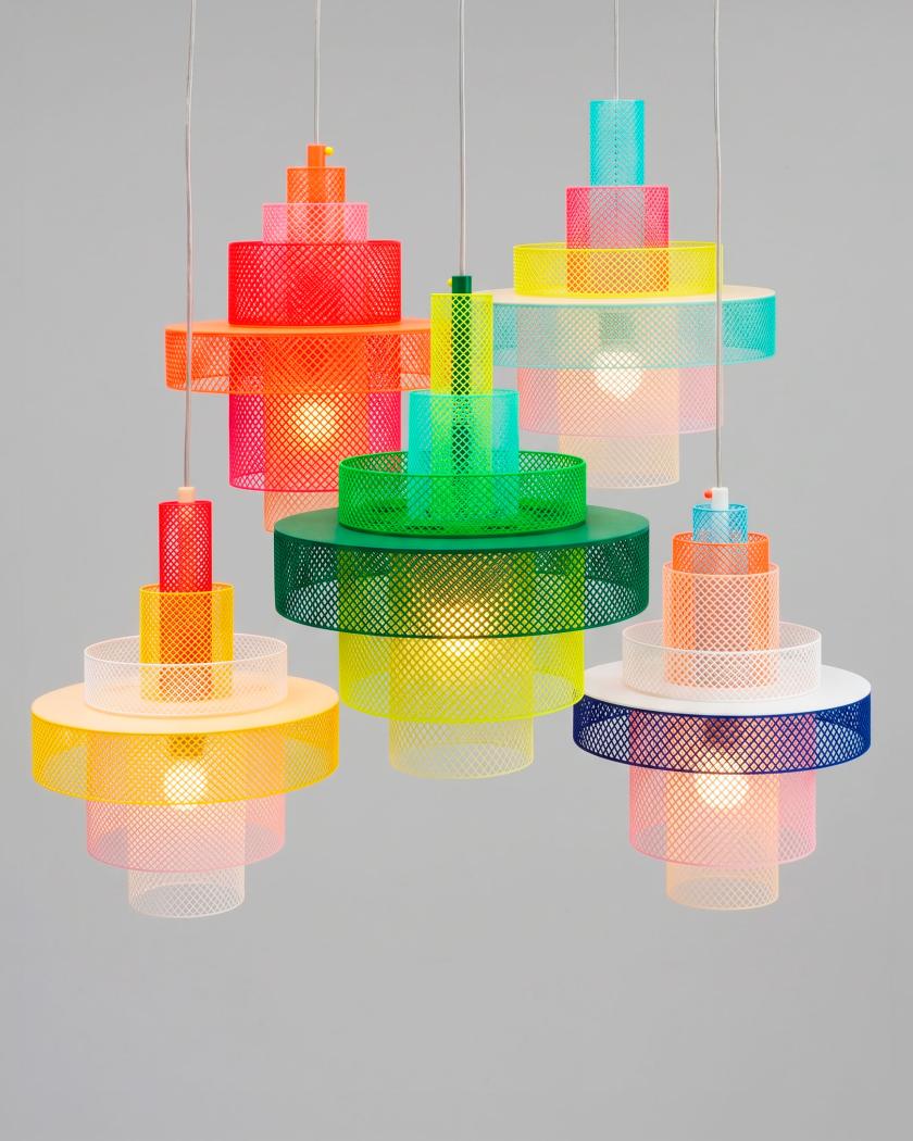
Malika Favre and George Wu's curated bazaar, I Can't Afford This But Maybe She Can, is full of brilliant, creative things. Here are five of our favourites for bringing a bit of character, and the odd touch of glorious colour, to your space.
I'm going to level with you here. I'm a sucker for a beautiful accessory for my home or studio – even if it serves no function whatsoever, other than to brighten a corner or make me smile. I'm talking an unusual lamp that stands out. Maybe a ceramic piece that swells your heart. It's what being a creative person is all about. You want to be surrounded by gorgeous things made by artists and designers you admire and want to support.
It's a sentiment I know illustrator Malika Favre and creative George Wu will understand only too well, as they run their own curated marketplace, I Can't Afford This But Maybe She Can. But beware: money will be spent. Oh yes. How do I know this? It's the whole point of the duo's side venture, which began in 2020 as an Instagram account and has since become a respected catalogue of the most delightful things the design world has to offer.
It now features more than 500 handpicked objects we can't resist – from over 125 indie brands and makers around the world. Everything from homeware, tableware and lighting to art, fashion and the occasional glorious oddity. Everything is chosen with their impeccable taste, humour and a healthy disregard for boring.
For the creative who loves a well-made thing but hasn't got the hours to go hunting for it, this part of the Internet is a gift. Here are five we can't stop thinking about – equal parts useful, beautiful and faintly (dare we say it) absurd.
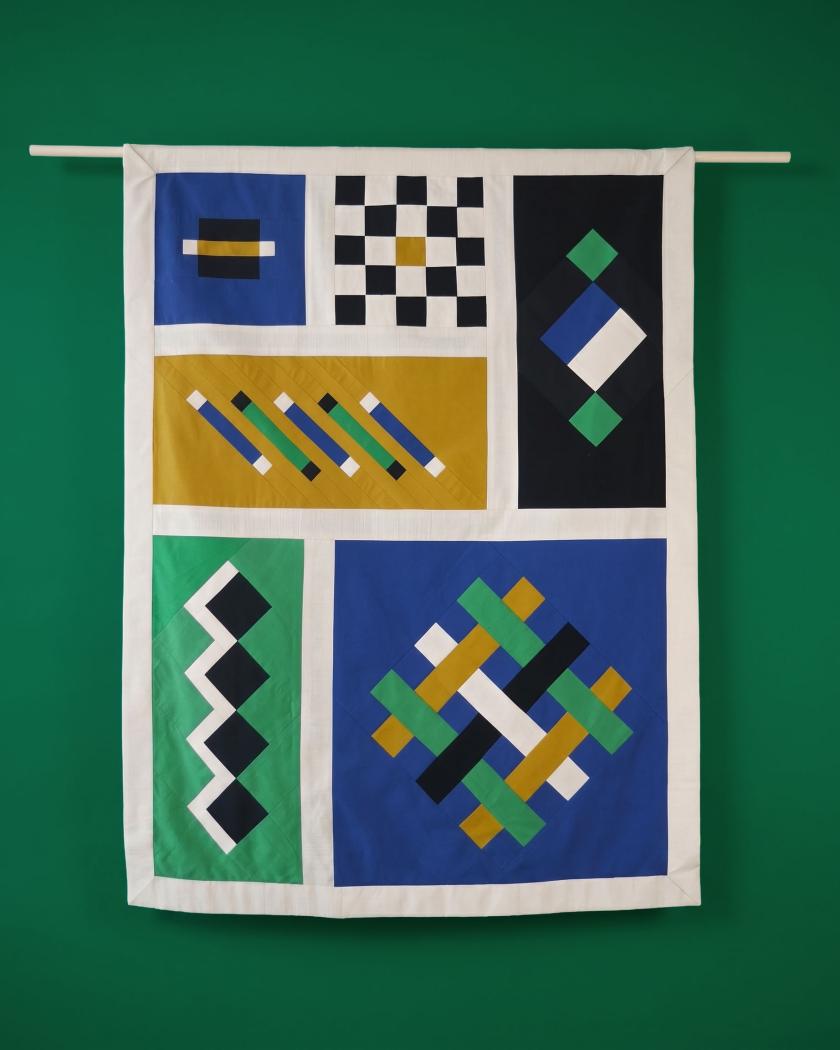
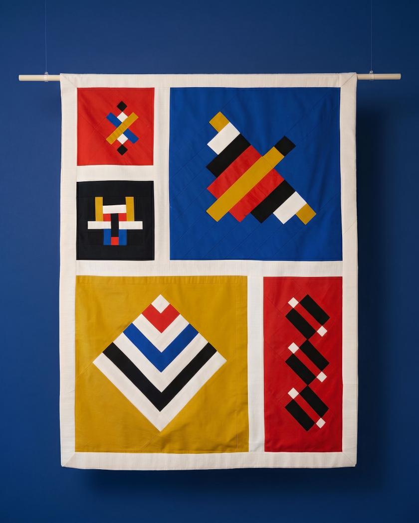
If you're thinking of updating a room to make it stand out, one safe bet is to decorate your walls with something special. With Alice Guillier's series of tapestries, you'll definitely feel like you have something no one else has.
Made through her studio Safareig, each piece takes a simple geometric framework and gives you a composition that offers plenty of interest to your home or studio. Hang one above a desk, and you'll smile every time you look up at it.
There's something really clever about this work. It reads as bold and minimal from across the room, then rewards you the closer you look. Magic.
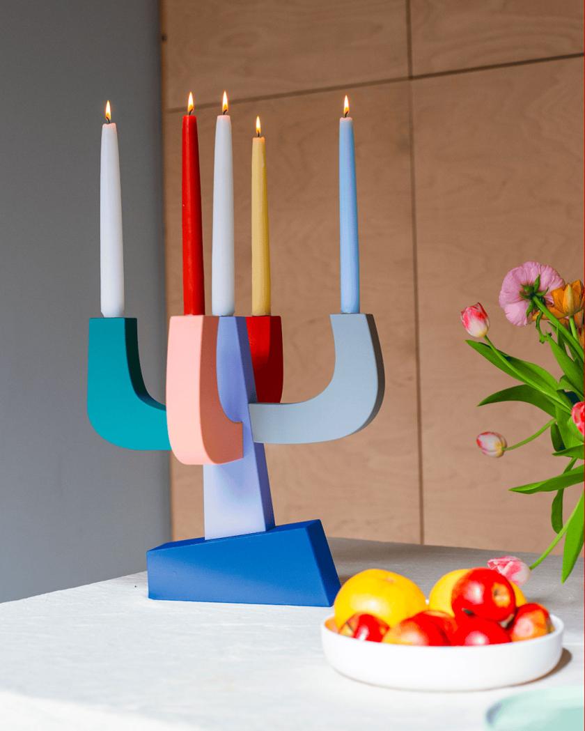
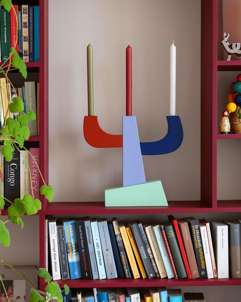
Who doesn't love candles? They add atmosphere. A certain cosy charm. They're perfect for summer evenings, and they help add ritual to the darker, colder nights. If you're looking for a centrepiece for your dining table or living room sideboard, Atelier Toit offers stunning candleholders made from solid wooden blocks on asymmetrical pedestals, all in a happy array of bright colours. It's playful function at its best.
As you'd expect from such an art form, each one is made to order in the studio's Amsterdam atelier, and no two come out quite the same, so that yours will be entirely unique. But let's be honest, who needs a candle when the holder itself alone is so nice to look at?
Here's a surprising bit of softness from an industrial material, but a whole load of satisfying colour for your home. Brussels studio Tilt builds this oversized pendant from translucent 3D-printed mesh, so it seems to hover in mid-air, catching the light and throwing delicate, lattice-like shadows across walls and ceilings.
Better still, it shifts as the day goes on, its colour and transparency moving with the light so the lamp never looks quite the same twice. Light as texture, rather than just illumination. This is a design piece guests won't be able to stop admiring.
Yes, they're shelves shaped like hands. Your eyes do not deceive you. And no, you don't need a reason. Tadashi Studio moulded this surreal little pair from the exact measurements of the designer's own hands, landing somewhere between sculpture and storage. Ready to cup your keys, your rings, your phone or whatever you like to keep close while you work.
They're sold as a pair because one hand on its own would look a touch lonely. Equal parts useful and slightly uncanny, in the best possible way.
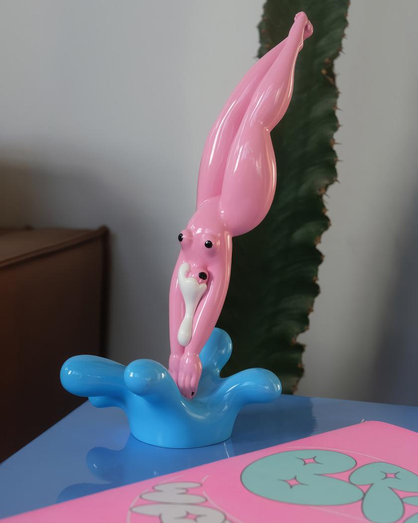
Having bumped into Marylou Faure at Pictoplasma in Berlin, I want this figurine even more. It's a small celebration of curves in object form. Crafted by the French illustrator known for her bold, colour-saturated work and her joyful, unapologetic take on the female form. She's translated her signature style into a glossy, sensual figurine, released in a limited edition of just 100.
One to proudly place on a mantelpiece, giving a whole room some personality. Collectable, characterful and very much a "she can" rather than an "I can't". Marylou, if you're reading this, I'll be purchasing this next.
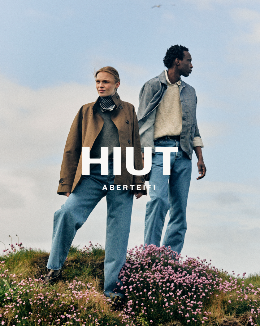
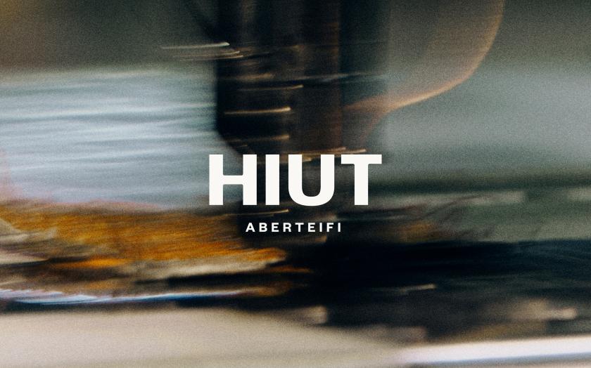
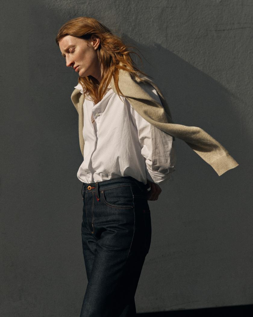
The new identity leans into the contrasts that make Hiut what it is: industry alongside nature, utility alongside craft... right down to a typeface drawn from the makers' own signatures.
There's a lovely bit of stubbornness at the heart of Hiut, and the brand's new look finally does it justice. Pentagram partner Hugh Miller has designed the visual identity and art direction for the premium denim label, which crafts its jeans from a family-run factory in Aberteifi on the Welsh coast.
The town – also known as Cardigan – has denim in its bones. In the 1960s, the first jeans factory employed more than 400 local people and turned out over 35,000 pairs a week, until production moved offshore in 2002, taking the work, though not the know-how, with it. Decades of accumulated skill were simply left sitting there. Hiut was founded in 2011 to bring it back home, put those hands to work again, and train the next generation of makers.
As such, this was never going to be a label that chased trends. Hiut takes its cue from factory life, the skill of its makers and the rugged landscape around it, so Miller's brief was less about reinvention and more about telling that story well. Working closely with the Hiut team, he built the identity around the brand's values, celebrating the factory, its people and its setting, while embracing the contrasts that define it.
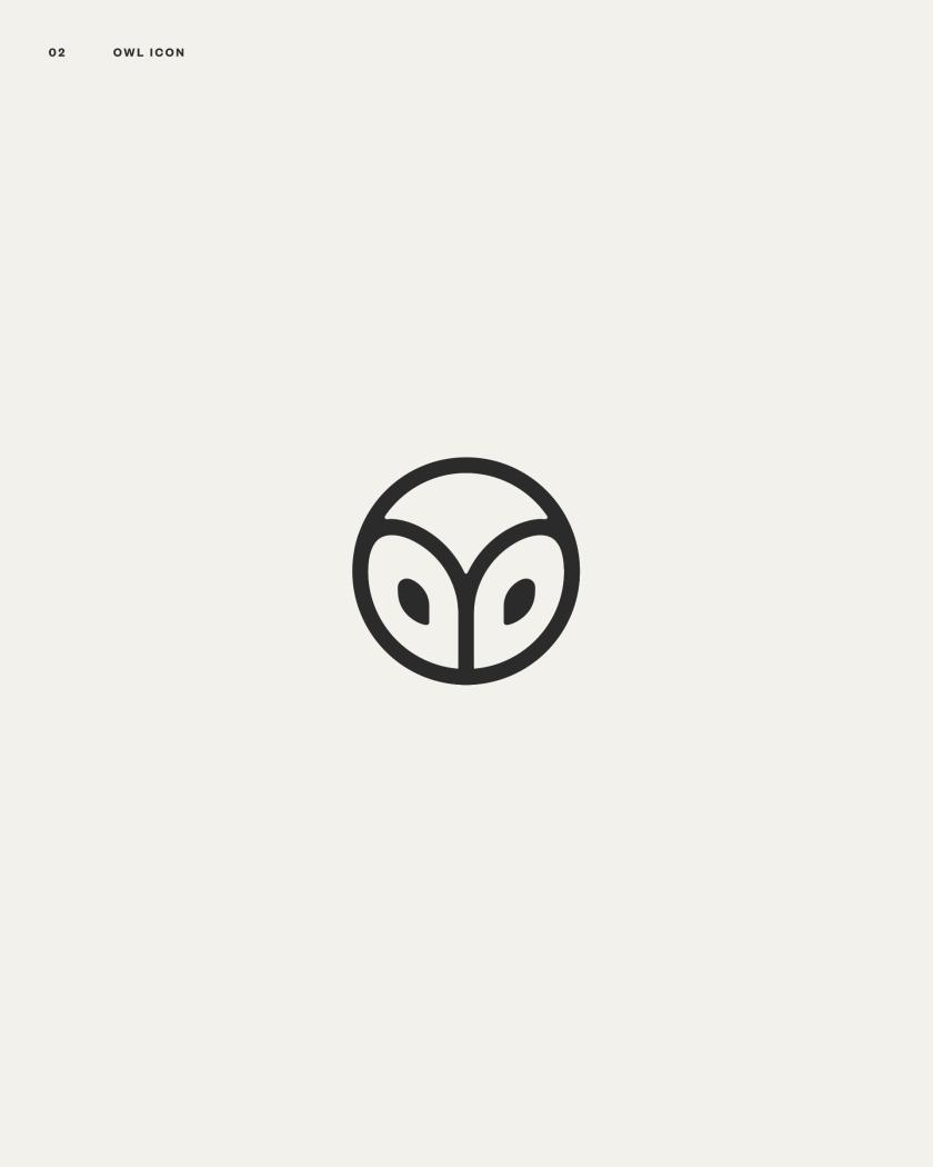
The result balances industry with nature, and utility with craft. At its heart sits a redrawn wordmark that nods to the factory's industrial heart, all craft and resilience, with "Aberteifi" added underneath to root the brand firmly to its location, heritage, and mother tongue. Alongside it is a bolder, rounder and altogether more huggable version of Hiut's much-loved owl mascot.
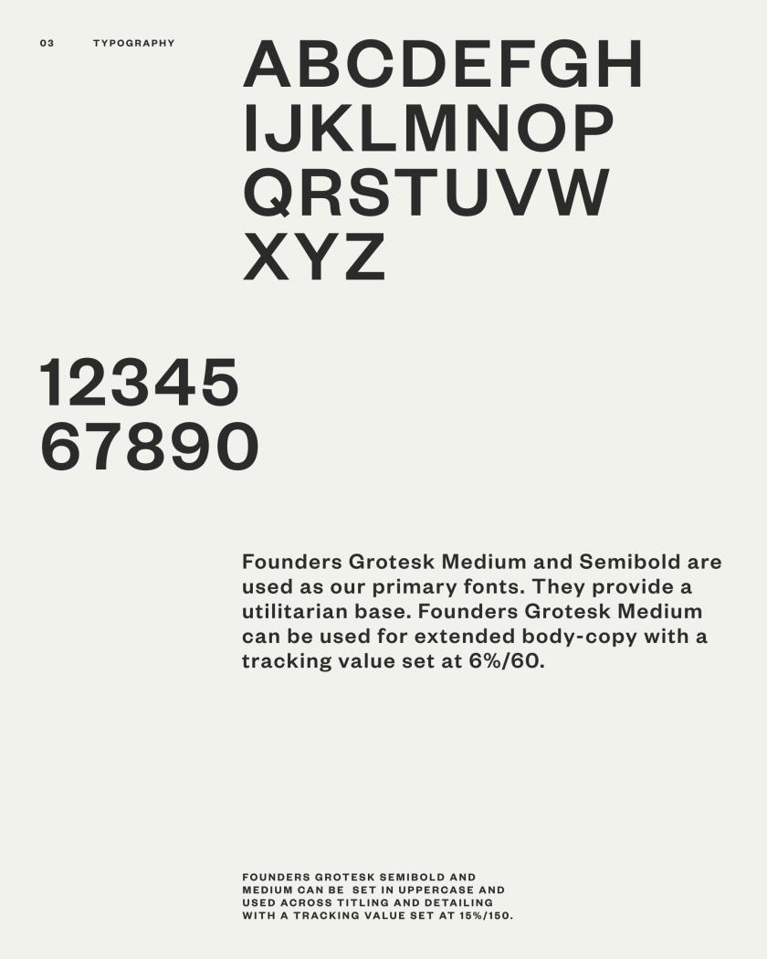
The easy move would have been to reach for navy and the usual heritage-brand polish. Instead, type does some of the heavy lifting. The functional, utilitarian Founders Grotesk handles the day job, joined by 'The Makers Font', an expressive handwritten face drawn from the real signatures the makers scribe into every pair of jeans before they leave the building at night. The colour palette pulls together the muted hues of the local landscape and the raw, functional character of the factory, layered through contrasting textures and tones.
Art direction does the rest. Jess Ellis on stills and Cat Garcia on motion were invited to capture moments of "everyday beauty" from both the surrounding landscape and the factory floor – shot in black and white and colour, leaning into texture and the unexpected details that reveal a brand's human character. From here, the launch campaign and ongoing art direction are led by Hiut's own teams and collaborators, working with photographers, illustrators, videographers, and printers whose approaches genuinely align with the heritage brand.
It's certainly a more elevated and curated expression of Hiut, thanks to Hugh Miller at Pentagram and all involved. It shows the brand hasn't forgotten where it comes from or how it's tied to the people, place and processes that make the jeans so special.
Strategy leaders are in demand, social-first agencies are hiring more, and one studio has done the brave thing and handed its own rebrand to someone else. Gulp. Here's what's been happening in the creative industry this month.
Welcome back to Booms & Shakes, our monthly round-up of the hires, promotions, launches and wins making noise across the creative world right now.
A few patterns jumped out of the inbox this rainy June. Half the industry seems to be hiring a head of strategy. "Social-first" studios are building empires. And after May's run of agencies redrawing their own identities, this month we've got the opposite instinct: a studio that decided the best thing it could do for its brand was let another team loose on it.
Read on for who's moving, who's launching, and who's worth keeping half an eye on. It's been quite the busy one.
Story of the month
The studio that let someone else do its rebrand
Ok, first things first. Most studios, when the time comes for a refresh, do it themselves. It's cheaper, on-brand, and, frankly, a nice break from client work. We've watched plenty go down that route lately. So we were impressed by a studio that went the other way.
As it approached its 20th year, 3D and moving-image studio Bolder Creative decided that a proper reset deserved an outside eye and brought in creative studio Monday Nights to do the thinking. If the name rings a bell, Monday Nights is the team we featured last summer for its work on the football game CLUB.
Bolder handed over full creative freedom from day one, and, by Monday Nights' account, the two teams discovered they shared the same belief that good design doesn't need to be wrapped in serious language or a complicated process. Bolder admits it was unusual going on the kind of journey it usually guides its own clients through, which must be a peculiar feeling for any studio used to running the room. They seemed to enjoy being on the other side, though and couldn't resist taking the new brand for a spin in 3D, producing some suitably outrageous animations for the case study.
The new identity is due to land this month. We rather like the principle behind it: sometimes the most confident thing a studio can do is admit it's too close to see itself clearly.
Hires and promotions
Method1 names Jodi Heelan as CEO
New York behavioural-science agency Method1, which builds its work around "indulgence" brands across spirits, drinks and the wider CPG world, has appointed Jodi Heelan as chief executive. Heelan arrives after more than a decade at The Variable, latterly as president, where she helped steer the shop to five Ad Age Small Agency of the Year nods.
Founder MichaelAaron Flicker reckons she understands how creativity, operations and business performance fit together in a way few agency leaders do, and given the brief is to build a more modern, scalable model, that's the right thing to be good at.
Jodi Heelan at Method1
ByDESIGN appoints Christian Murphy as global CEO
Architecture and design media brand ByDESIGN has named Christian Murphy as its global chief executive as it pushes further into broadcast, streaming and branded content. Murphy, known across the industry as "Murph", brings close to three decades in international television and content, much of it at A+E Global after he moved from Australia to the US in 2008. A media veteran taking the reins of a design-led brand makes for an interesting combo.
Landor keeps building, on both sides of the Atlantic
If May's WPP Brand & Design restructure told you branding was back at the top of the agenda, Landor is making sure you don't forget it. The consultancy has appointed Alana Eversole as global EVP, experience, and promoted Ryan Frost to global executive creative director.
Ryan Frost and Alana Eversole, Landor
Eversole returns from Jones Knowles Ritchie, a "boomerang" in Landor's own affectionate phrasing, having already spent more than a decade in the business. Her newly created role pulls together Landor's work across retail, hospitality, events, spatial and immersive design into a single experience offering, the argument being that "in a fragmented, increasingly AI-shaped world, physical and sensory brand moments matter more, not less".
Frost, meanwhile, has spent nearly two decades at Landor across London, Singapore and New York, and steps up to help shape creative direction globally alongside the existing roster of ECDs. Two more signs that the category sees "experience" and "craft" as its growth engine.
M+C Saatchi Talk brings in Pete Harrison
M+C Saatchi Talk has appointed Pete Harrison as managing partner as it enters its 25th year. He joins on the back of a busy run for the agency, following the arrivals of managing director Amaya Alvarez and head of brand PR and influence Callum Powell. Harrison has close to two decades of experience across the UK, the US and Asia-Pacific, with roles at EVH, Salesforce and NBCUniversal, and lands at what the agency calls its "culture-first story-making" proposition. He'll also co-chair the group's Proud employee-led network in the UK.
Pete Harrison, M+C SAATCHI Talk
Lindsay Turner at BBC Studios Digital Brands
BBC Studios Digital Brands hires Lindsay Turner, with the numbers to back it up
BBC Studios Digital Brands, home to the likes of Bluey, Doctor Who, BBC Earth and Top Gear on YouTube, has appointed Lindsay Turner as VP digital growth and strategy to lead its advertising and commercial partnerships.
For background, the business has held the number-one spot for YouTube watch time in its global competitor set for a second year running, with watch time up 60% year on year to 2.1 billion hours, and branded content growing a frankly startling 124%.
Turner joins from VCCP Media, where she was managing director, with earlier stops at LADbible Group, Spark Foundry and Blue 449. When the platform's already this big, the job is turning attention into revenue, and that's squarely her remit.
Ian Millner resurfaces at ZEAL and NewGen
After 26 years of building Iris Worldwide from a challenger to a global network, founder Ian Millner left in March, and the industry has been wondering where he'd go next. Well, all has been revealed as he's taken the chairman role at brand activation group ZEAL, become non-executive chairman of creator-economy agency NewGen, and joined marketing group MSQ as a non-executive director.
Three businesses, all firmly in growth mode. ZEAL, founded in Manchester in 2014, has been busy acquiring social studio Tommy and launching shopper-PR shop Joe Public; NewGen runs across London, Manchester, New York and Paris. Millner will keep advising Iris in a global capacity, too, so he's hardly stepping back.
Born Social promotes Simon Cooper to ECD
Social-first agency Born Social has promoted Simon Cooper to the newly created role of executive creative director. Cooper joined in 2024 to lead the Ford account, and his back catalogue is impressive: Ford's "The Legend Is Back" Capri reveal, Spotify Wrapped 2022, the Puma Gen-E launch and "The Internet Takeover" with Dan and Phil for BBC Radio 1.
He'll report to chief creative officer Paddy Smith, who's relocated to the US to grow the agency's presence over there, and lead a team of 22 creatives. Part of a wider leadership build-out that also saw Alex Green made UK head of growth.
Ian Millner making moves
Simon Cooper at Born Social
JOAN London adds Nicky Vita as head of strategy
JOAN London has appointed Nicky Vita, previously of Atomic London, as head of strategy. She follows close behind Gerry Graf, who was named global chief creative officer earlier this month. Vita started in planning at TBWA in Johannesburg before taking on London roles at BBH (where she rose to partner) and VCCP, working on clients such as Primark, LinkedIn and O2, and arrives with awards from the IPA, The Drum and the Marketing Society in tow.
The female-founded agency, which has been in London only since 2023, counts eBay, Ancestry and TOTM among its clients. Vita's own verdict on the move was endearingly honest: excited, she says, but also "terrified, nervous, delighted, optimistic".
Pearlfisher names Christina Papale head of strategy in New York
Independent brand design agency Pearlfisher has appointed Christina Papale as head of strategy for its New York studio, with a brief to bring strategy, insight and creative closer together.
Papale brings more than 20 years of experience across food and drink, health and wellness, retail, spirits, and beauty, most recently running her own consultancy, Verboten Group, and, before that, 12 years at CBX. She describes her approach as "intrapreneurial", which is a different way of saying she likes working out what a brand needs next before it thinks to ask.
Christina Papale
More movers
A clutch of other moves worth a mention. Spin, last year's Social Media Agency of the Year at the Europe Agency Awards, has hired George David as group commercial director, joining from Havas-owned Wilderness to drive growth across Spin and its sister brands Be A Bear and Tiny Studios, off the back of pitch wins including Fortnum & Mason, Five Guys and National Rail.
Creative agency Hijinks has appointed Chris Willis, formerly of Fake Empires, as design director, bolstering its brand design work following projects for Fulham Pier and Vue. And in New York, next-generation studio Versus has hired the duo of Rosie Garschina (executive creative director) and Kevin Anderson (executive producer) from Trollbäck+Company to deepen its brand and design practice.
Spin Hires George David as Group Commercial Director
Chris Willis at Hijinks
Rosie Garschina & Kevin Anderson at Versus
Elsewhere, global studio Builders Club has appointed Matt Shannon as executive producer and head of partnerships, bringing experience with Apple, Netflix, Burberry and Rolex to its push into luxury, fashion and tech. Youth marketing agency Raptor, celebrating its 10th year, has promoted group account director Molly Chappin to its board.
GentleForces has expanded its leadership as it turns five, naming Mike Keen as finance director and founding team member Jordanna Andrews as futures practice lead, alongside international wins with Shinola and Kate Spade.
And last but not least, at Fluid Ideas in Derby, Dani Berzins and Sarah Bowler have become the agency's first new shareholders in seven years, exercising EMI share options to step up to partner and co-owner, a lovely example of an agency following through on a progression path.
Matt Shannon at Builders Club
John Wilkinson with the team at Raptor
Sarah Bowler, left, and Dani Berzins of Fluid Ideas
L-R: Mike Keen; Quba Tuakli; Danni Mohammed; Jordanna Andrews & Nathan Wilson at Gentle Forces. Photography by Dennis McInally
SomeBrightSpark moves to a partner-led model
Independent agency SomeBrightSpark has restructured around a partner-led model with two appointments. George Guildford joins as partner and executive creative director from Moshi, tasked with growing the agency's film, production and social-first work, while client services director Ellie Anderson has been promoted to partner after 13 years at the agency.
Founded in 2008 and working with the likes of Caterpillar, Volkswagen Financial Services and Pinterest, the agency is making the case, as MD Daniel Rogers puts it, that studios outside London can compete creatively at the very highest level. Hard to argue with that, given we're doing alright here in Manchester.
George Guildford & Ellie Anderson, SomeBrightSpark
Launches and new ventures
M+C Saatchi UK launches Social House
M+C Saatchi UK has launched Social House, a new practice that folds social strategy, creator and community work, content production, paid media, commerce and measurement into a single offer. The thinking is that social has stopped being a channel and become a whole cultural ecosystem, the place people discover what they love and decide what to buy, so it deserves to be treated as a discipline in its own right.
It's built on the group's proprietary "Fancom Accumulator" methodology, and brings in Katy Ball from Hope&Glory as head of social communications, with Shanice Dover promoted to associate director, creator and community.
Shanice Dover, Laura Coller and Katy Ball at M+C Saatchi Social House
Tracks & Fields opens in London
Berlin-founded music intelligence and operations company Tracks & Fields has opened a London office, with former Superunion and Siegel+Gale leader Mark Mullooly as managing director for the UK. The pitch is an insightful one: as campaigns sprawl across more markets, platforms and rights environments, the music decisions get complicated fast, and brands tend to leave them too late. Since 2008, the company has handled more than €100m in music licensing and artist partnerships for the likes of Mercedes-Benz, Aldi and Zalando, and London joins its offices in Berlin, Warsaw and Tokyo.
Mark Mullooly, Tracks & Fields. Photography by Luke Fullalove
Akcelo lands in London
Brand experience and innovation company Akcelo has opened its first permanent London office, in Farringdon, as part of what it calls a "borderless" model. Founded in Australia in 2020, the agency works with TikTok, PepsiCo, Amazon, OpenAI and Anytime Fitness, and the London team, led by Ben Phillips, Jade Fonteneau, Mike Gethin and Justin Schoenmaker, is the first proper on-the-ground presence in a region it has so far served from afar. Plans are to add 10 to 20 staff over the next year or so.
Glass Productions opens its doors in the North West
A nice one for the regions. Photographer Georgie Glass has launched Glass Productions, a food and drink creative production agency, alongside Glass Studio, a fully kitted-out dual-kitchen studio space in Cheshire. With 13 years in food and drink and a client list that includes HarperCollins and PepsiCo brands such as Quaker Oats, Glass is betting on the North West's appetite for better visual content. The studio is now open for bookings, so give her a shout.
L-R Mike Gethin Creative Lead, Jade Fonteneau Business Lead, Justin Schoenmaker Creative Lead, Ben Phillips Strategy Partner, Akcelo London
Six Dundee studios share a roof at Hapworks
We've got a real soft spot for this one. Six Dundee creative organisations, spanning design, games, culture, research and civic innovation, have come together to launch Hapworks Studios, a shared workspace above The Bach café on Albert Square. Agency of None, Biome Collective, Bit Loom, Creative Dundee, tialt and Very Evil Demons now share the space, home to more than 25 people.
It came together partly by accident, after a flood forced Agency of None to move just as the others were grappling with rising rents, but the principle is deliberate: at a time when independent studios are being priced out of city centres across the UK, here's a group choosing to invest collectively in shared infrastructure rather than going it alone. A small, practical answer to a problem a lot of cities are currently wrestling with.
Georgie Glass
Partnerships and wins
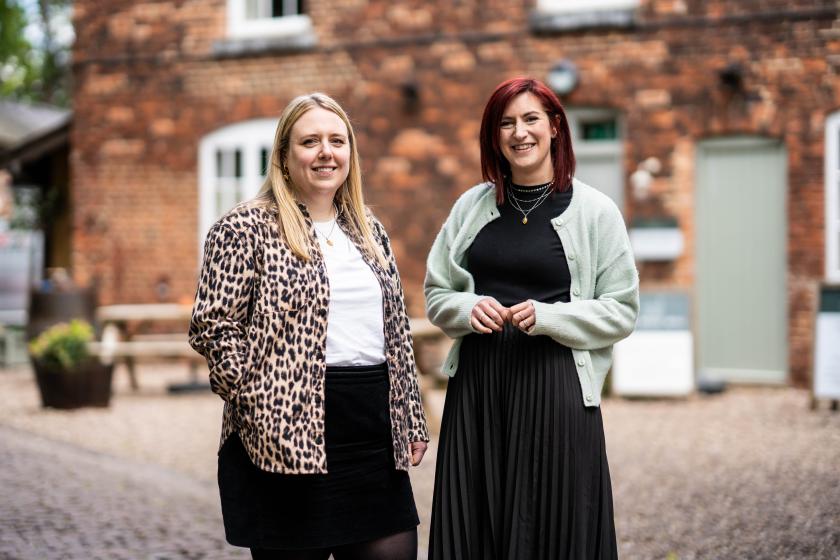
McCann London wins Mindful Chef
McCann London has been appointed agency of record by recipe box service Mindful Chef following a competitive pitch, and is building a new brand platform to launch in the autumn. It's the brand's biggest marketing investment to date, led by recently appointed CMO Mary Rochester Gearing, with the line that Mindful Chef isn't really about convenient meals but about making food a positive force in how people feel. McCann's deputy ECDs Charlotte Prince and Loriley Sessions called it a dream brief, which, for a team that presumably likes eating well, checks out.
Born Ugly wins LHV Bank
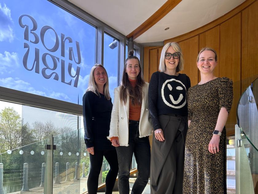
Leeds independent Born Ugly has secured a three-year partnership with LHV Bank to build its brand platform and run integrated campaigns for the savings-focused retail bank. Of the brief put before them, Head of Strategy Clare Deacon says that with low brand awareness in the UK, the real risk for LHV isn't rejection, it's being ignored, so the work is about meaning before scale.
Born Ugly x LHV
Havas Miami named by Olive Oils from Spain
Havas Miami has won a three-year, US-wide brief from Olive Oils from Spain, the trade body for Spain's olive oil industry, with the first work due in July. It's more category-building than campaign: the US is about to become the world's biggest consumer of extra virgin olive oil, and the job is to move Spanish olive oil from pantry staple to cultural fixture across food, wellness and modern cooking. ECD Federico Hauri, fresh from co-founding studio MULTI, calls it a dream assignment.
Wonderhood Design picked by VIEVE
Wonderhood Design has been appointed by makeup brand VIEVE, founded by makeup artist Jamie Genevieve, to lead a full brand strategy, identity and packaging project following a competitive pitch back in February. With a community of more than three million followers and fresh investment behind it, VIEVE wants to scale into a next-generation British beauty brand without losing the artistry-led, real-world feel that built it. Wonderhood's job is to bottle that.
Uncovered to lead ClearScore's global social
Social-first agency Uncovered has been appointed by ClearScore to lead its global paid social creative strategy across the UK, Canada, South Africa, Australia and New Zealand. The move is part of ClearScore's shift from scattered local activations to a single, globally aligned model run through its UK HQ. Uncovered apparently won it by balancing global consistency with genuine local nuance, the typical tightrope of any multi-market brief.
Iris London takes on WillPowders
Iris London has won performance nutrition brand WillPowders, founded by Davinia Taylor and Matthew Leyden, after a three-way pitch, and will lead the launch of its new sport range and summer product, Electro Ice. It's WillPowders' first appointment of its kind, and Iris's social and influence lead Melo Meacher-Jones describes the brand exactly as you'd hope an agency would describe a new client: "one with a genuine point of view and the nerve to back it".
BigSmall x War Child
Delsey Paris - Designed to Move You Campaign - SS26
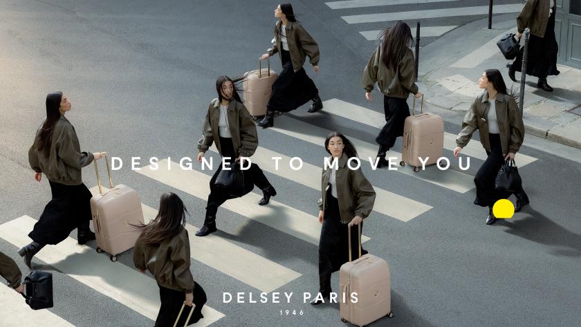
Gung Ho lands DELSEY Paris
Independent creative collective Gung Ho has been named DELSEY Paris's retained UK PR agency, just as the French luggage brand marks its 80th anniversary and rolls out a new "Designed to move you" platform. Gung Ho, which recently passed 20 years of its own "truth told boldly" ethos, will handle UK press, influence and activations. A heritage brand and a bold-by-name agency are, at least, a promising duo.
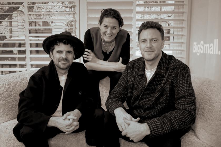
BigSmall partners War Child UK
Brand strategy studio BigSmall has been appointed as brand strategy partner for War Child UK, following a competitive pitch. The idea is that it will help sharpen how the charity tells its story. With more than 520 million children worldwide affected by conflict, the work is about clarity rather than relevance. As BigSmall's Lucy Taylor puts it, when a cause is this important, you need one idea people can understand instantly and act on immediately.
Milestones and good news
Distant Future Animation makes the shortlist
A well-earned nod for a small team. Yorkshire studio Distant Future Animation has been shortlisted at the 2026 Prolific North Creative Awards, in the Excellence in Creative Craft category, for Maritime Connected, a film made with Lloyd's Register Foundation.
The brief was to explain why maritime safety matters far beyond shipping, and the studio, just three people, deliberately avoided Western-centric storytelling, using culturally diverse characters and a non-Western voiceover to make a complex global subject land emotionally in under 90 seconds. It premiered in September 2025 and has since reached audiences in more than 40 countries. A great example that you don't need a big team to create something brilliant.
Distant Future Animation makes the shortlist
One for the diary
The Prolific North Creative Awards are handed out on 25 June in Manchester, so we'll find out then how Distant Future gets on. And the big one, of course, is the 73rd Cannes Lions, running 22 to 26 June. Expect the inbox, and next month's Booms & Shakes, to be heaving with it.
Key takeaways
Step back from June, and a few threads spring to mind. Firstly, everyone wants a strategist. Pearlfisher, JOAN London and GentleForces all named strategy leads this month, and Born Ugly's winning argument for LHV was strategic. After a long stretch of "performance-first thinking", agencies are clearly reinvesting in the bit that comes before the campaign: working out what a brand is actually for.
Secondly, social-first has matured. M+C Saatchi's Social House, Spin's commercial hire, Born Social's new ECD, Uncovered's global ClearScore win and Iris taking on WillPowders all point in the same direction. After all this time, social is no longer a channel an agency bolts on; it's now the discipline around which the whole offering is built.
And finally, it's reassuring to see so many upbeat news stories despite the economic uncertainty and gloom. Six Dundee studios sharing a roof rather than being priced out one by one. A three-person animation team reaching 40 countries. Two long-servers at Fluid Ideas are finally getting their names on the door. None of these win a prize for the biggest move of the month, but they're the ones that remind you why this industry is worth writing about in the first place.
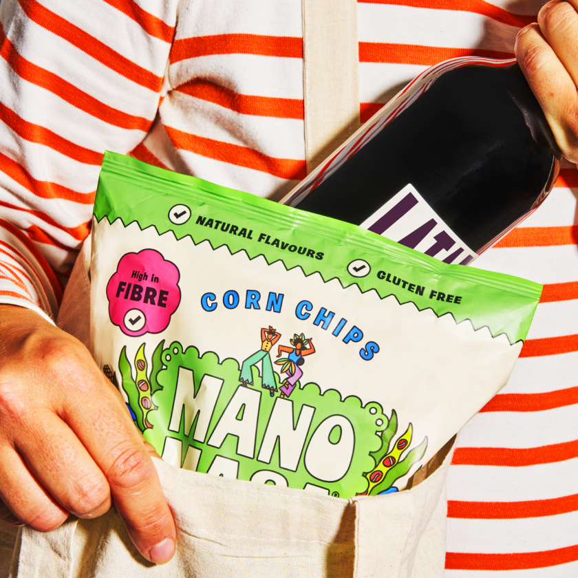
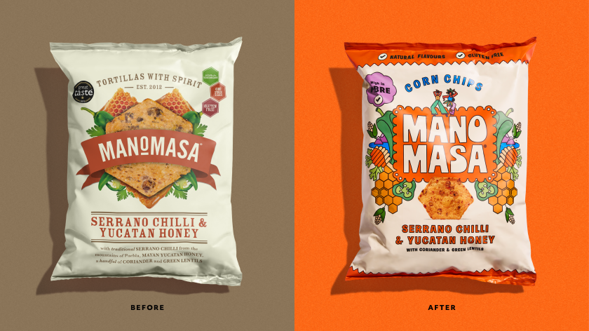
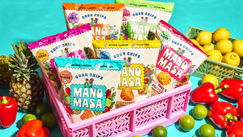
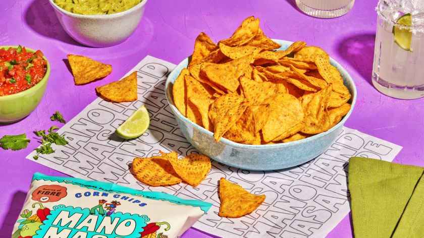
The London studio drags the premium tortilla brand out of the farm-shop aisle with a vibrant new palette, dancing mascots and packaging that tastes as good as it looks.
You know those tasty snack-treats called Manomasa? The ones saved for special occasions or BBQs with friends, and only available from the "posher" supermarkets? It's probably because of the premium offering and rather serious packaging – not to mention the muted tones and grown-up illustrations that describe exactly what high-end flavours might be waiting inside.
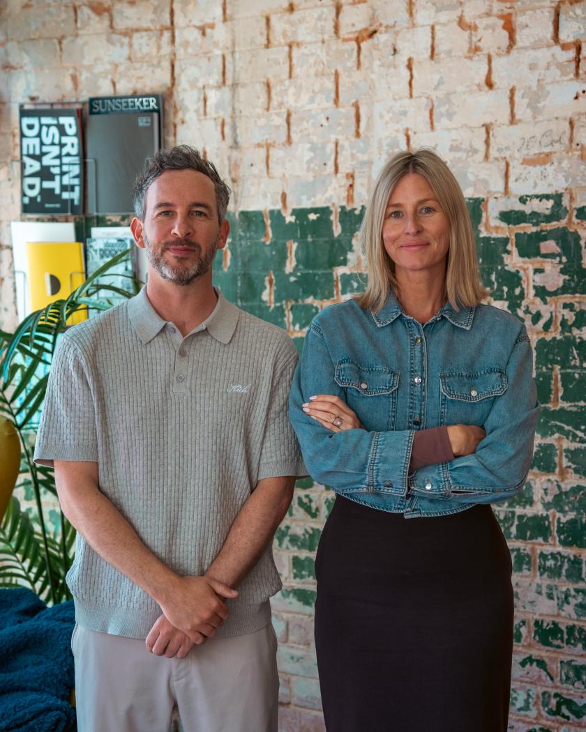
Despite all this, the popular tortillas have just undergone a big brand refresh, thanks to Derek&Eric, the London-based design agency founded by Alex Stewart, Adam Swan, and Jon Gibbs. It's only when you see the new identity and packaging that you realise just how much an update was needed.
Since its launch, Manomasa ("Mano" is Spanish for hand, and "Masa" is the maise dough used to make traditional tortilla chips) might have built a small but devoted following (myself included), but it has struggled to shake off its reputation as a wholesome, "farm shop-esque" snack brand found only in premium retailers. Its parent company, Valeo Foods UK, wanted to break out of this niche and fling itself into the mainstream. How it achieved that began with a review of its strategy.
Derek&Eric went back to basics, focusing on what inspired the product in the first place: making the brand's look match how it tastes, while also drawing on influences from Latin America – its energy, passion, colour and warmth. It kept the existing layout of the packaging, with the logo front and centre, as well as the colourful display of ingredients and the cream background, but gave it all a lively Latin American feel.
What that means is a glow-up founded on the tagline "Snacks With Spirit". The palette, as you'd expect, is now satisfyingly vibrant, with splashes of teal, hot pink, bright orange, acid green, and happy yellow that instantly point out the different flavours. Yellow is pineapple and habanero chilli, by the way. We're not sure how that lands, but we're eager to try it.
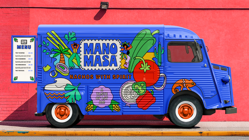
Derek&Eric also added a new icon featuring two dancers. Caught mid-dance, they convey a sense of rhythm that adds life and movement across all platforms. Accompanying materials for social media, recipe books, packaging, and delivery boxes with branded tape complete the refresh – all with their own happy drama. There are even vinyl records and poster designs, which are hopefully up for grabs. (Derek & Eric, if you're reading this... tell us how to get our hands on them!)
But, aside from the product packaging itself, it's the delivery trucks that are the best of all. Against a beautiful blue backdrop, illustrations decorate the surface… the two dancing mascots appear alongside the new logo in handwritten type. On the truck's rear doors sits a menu, as though it were something out of Jon Favreau's 2014 film Chef. I can almost hear the Latin vibes.
It seems we're not the only ones to appreciate this overhaul: the project won Gold at the FAB Awards. Congratulations to all involved. I'm off to Waitrose to find that pineapple flavour.
The self-taught animator on collage, control and why fingers, hair and breasts are the most expressive things to draw and make move.
Most of us spend a lifetime trying to feel at home in our own skin. Sara Priorelli would rather pull it apart, stretch it and twist it to see how far it goes. Somewhere along the way, she finds comedy gold in what it means to be human.
The fifth of seven children, Sara grew up in a house surrounded by chaos and fun, along with an entire family of Basset Hounds. You can see all of that joy and madness in her animation work, where bodies distort, sag and bend into weird shapes – all with cartoonish glee. There's no storyboard or script behind her ideas; it's all built from memory and a constant stream of notes scribbled down – a handy archive that Sara says has never let her down.
Her route in wasn't through animation at all, but collage. A teenage obsession with Hannah Höch's photomontages and Terry Gilliam's cut-out sequences led her to turn mismatched body parts into little monsters and try to make them move. That was way before she had the software or the skills to do it properly. She taught herself the rest – and it shows in the loose way she works.
The fascination with bodies, she says, is one she can't fully explain. What she can trace is the discomfort underneath it. "Behind my obsession with playing around with the human body lies a certain discomfort of having one, and distorting and twisting it feels like a way of laughing off the awkwardness of being stuck in the same body for so long."
There's real pleasure in it, too. "It's still incredibly fun to take control of a body and move it around as much as possible," she says, and she has her favourite parts to draw: "Fingers, hair and breasts, because they are so expressive and fluid and constantly changing shape." Even the Basset Hounds left their mark. "They carry way too much skin, and that makes their movement very expressive. I'm pretty sure their disproportion and cartoon-like appearance have unconsciously shaped my work."
Having fun is far more important than efficiency.
Being self-taught shapes how she works as much as what she draws. "I never learned how to do it properly, and my files are always a mess," she laughs. "Even in my longer projects, I rarely work with a storyboard, or a proper script, or a character design – which is probably why my characters look different in every frame."
In her work, Sara constantly switches between digital animation, the light box and short comics. "Every medium has its limits, and changing those limits keeps my work challenging. If I get used to a certain approach, then I try another tool and it feels like starting from scratch."
The light box, in particular, takes away her safety net. "I have to accept that there are no tricks like Ctrl+Z, and I like forcing myself to keep things simple and trust my hand a bit more." Comics, on the other hand, ask something different again: "I like the challenge of making a static drawing dynamic, and a silent image loud."
A piece rarely begins with a grand idea – more often, it's a single detail that inspires her next artwork. "It usually starts with a very quick sketch of a detail, sometimes a shoe or just a funny posture, and that makes me think of a story or a particular movement."
Place feeds the work as well. After the Academy of Fine Arts in Urbino, Sara took a master's in Budapest, a move that left its mark on the tone of her storytelling. "I come from a small town, and I had dreamed of living in a big city for so long that, once there, I felt disappointed because my expectations had been so high." That dissonance found its way onto the page. "The sense of being out of place, mixed with the excitement of the change, led me to push the bittersweet side of my stories even more." A "sketchy" neighbourhood and a few surreal encounters supplied the cast. "I'm sure that shaped the kinds of characters I ended up using."
Whatever tool she reaches for, Sara always draws frame by frame – even though it's a lengthy process. "Having fun is far more important than efficiency. There's something really satisfying about drawing every frame by hand, and of course, it gives me total control over the movement." The imperfections are a feature, not a flaw. "I always try to bring a sense of irony to my work, and I feel that those technical imperfections add to the comedy of the movement."
A working day is gentler than you might expect. "I spend my mornings sketching on paper while drinking coffee, then I go for a walk," she says. "I come back home, scan the drawings, digitise them and start adding frames." Music is non-negotiable, and she works with her notes and reference pictures close at hand.
What's next is a return to playing. "I never really gave myself the time to experiment and explore more techniques, so I feel like I need to go back to that phase and take more breaks from my laptop." One medium has her especially curious. "I'm super fascinated by paint-on-glass animation, so hopefully I'll start sharing more of my experimental work in the next few months."
As for who she returns to for inspiration, the answer is pretty specific. Her early hero was the Italian comics artist Altan: "His graphic novels had such a big impact on me that I still regularly go back and browse through his pages. I love the combination of nastiness and sensuality in his work." And two classics stay on permanent rotation – Yellow Submarine and Bruno Bozzetto's Allegro non troppo.
We're big fans of Sara's approach, and look forward to following her work. As for the awkwardness of having a body, it turns out it's a lot more bearable when you're the one pulling it out of shape.
When it comes to pricing your illustration work, how do you get it right? Two agents who negotiate fees for a living explain how to charge what you're worth, from your first quote to raising rates years into a client relationship.
Figuring out what to charge clients can be the biggest headache for freelance illustrators. There's no universal published price list. Nor is there a handy calculator that spits out the "right" number. And whatever rate you choose, it has to cover all costs, such as studio rent and utility bills, and even help maintain a healthy cash flow during quieter months. Quote too low and you're going to struggle. A quote that's too high without any explanation is a surefire way to say goodbye to that lovely project.
When chatting about the challenges of freelance illustration, the question we hear most often is: Should you charge a project rate or a day rate? So we asked two people who price illustration for a living to talk us through it, along with everything else worth weighing up before you send that quote.
We invited Jon Cockley, co-founder of Handsome Frank, an illustration agency representing artists like Matt Blease and Molly McCammon, and Clara Marcus from The Jacky Winter Group, an agency in London that represents illustrators such as Adam Parata, Lauren Martin and Jay Cover. Together, they help set prices for work every day. Here's their advice on charging what you're worth.
Start with the inputs: how to arrive at a number
Before you think about a single figure, get clear on what's driving the price. And usage is almost always the biggest factor.
Clara's starting point is to decide how you're calculating the work itself. There are two common approaches: a creation fee, based on the time required to make the work, or value-based pricing, which focuses on what the work is worth to the client rather than the hours involved. Either way, she'd add a separate usage fee based on the licence the client needs.
That licence is where Jon spends most of his attention. "Usage is of course the main factor," he says, so Handsome Frank looks at the media the work will appear across, the territory, and the duration of the licence. The broadest agreement – all media, worldwide, in perpetuity – is also the most expensive, and his advice to clients is to be more specific wherever they can, so their budget goes further. He also factors in the client's profile and size, since that affects how many people will see the work and what it does for the artist's reputation. Even when exclusivity isn't requested, he points out, taking one high-profile client in a sector can quietly close the door on competitors, so it's worth considering.
Then there are the practical realities of being an illustrator – something both agents bring up. How busy is the artist? How long will the work take? Will it mean late nights or lost weekends?
Clara's key piece of advice is to build a pricing structure that works for you. "If your costs are based on a logical calculation rather than just pulling figures from the sky," she says, "you'll feel more confident when you propose them to the client."
Project rate or day rate – which serves you better?
In most cases, a project rate will serve an illustrator better in the long run, but there are clear moments when a day rate is the fairer choice.
"I would venture to say that in most scenarios, a project rate will serve an illustrator better than a day rate in the long term," says Clara. But she flags two big exceptions. The first is the large production houses doing brilliant work, who will only engage artists on a day rate with a work-for-hire agreement – opportunities that are hard to turn down. The second is any project where the scope keeps shifting, with deliverables added and dropped so often it's hard to keep track. There, an agreed day rate can be far less painful than constantly reworking and re-approving estimates. Her tip: bake a licence fee for the intended use into that day rate so usage isn't forgotten.
Jon pitches the day rate as kicking in once the goodwill of a project fee runs out. Handsome Frank's standard contract includes three rounds of feedback and amendments, all wrapped into the agreed price. If a job sails past those three rounds and still needs changes, they pivot to a day rate. It's fairer on the artist, and it has a useful side effect: "Once a client realises they're paying for the artist's time," he says, "it tends to bring things to a quicker resolution." Paying by the day focuses minds and stops endless tinkering.
What is a fair rate?
A fair rate is a sustainable one – it covers your real costs and lets you breathe easy between jobs. There are also a few benchmarks to anchor to.
Clara is quick to point out how much this depends on your location and the kind of work you do. The aim is to avoid wildly under- or over-charging, but what matters most is a rate that genuinely covers your overheads, like studio rent, software subscriptions, and insurance, while allowing you to take a break without too much anxiety.
Her best advice is just talk to your peers. "We are generally very, very bad about talking about our own finances," she says, "but if we can open up these conversations, we'll be in a much better position to push back on awful budgets and build a stronger and fairer creative industry."
Jon is willing to put a number on it. He's seen day rates vary wildly over the years, and while everyone is entitled to price themselves as they see fit, he's clear about a floor. "In 2026, I would advise any experienced illustrator to be charging at least £500 a day," he says. "This can go up to £1,000 per day or well beyond, depending on the artist's profile and the demand for their time."
The most common pricing mistakes – and how to avoid them
As you'd expect, the biggest mistakes happen at opposite ends: underpricing to win the work, and overpricing by charging for usage the client doesn't really need.
For Clara, the root cause of both is the same. "Not understanding the client's expectations is the easiest way to over- or underprice," she says. Beyond being clear on the scope so you can predict the time involved, she suggests digging into the client's vision: how they want the project to benefit their business, and how hands-on they'll be along the way. That tells you how much value they're placing on the work and, therefore, how much they're willing to invest.
"I think the most common mistake is to price a job lower than you think it's worth, because you really want to win the project," says Jon. The temptation to go low is strong, but knowing your value and agreeing on a fair price up front sets the whole project off on a respectful footing.
Overpricing, Jon says, usually comes from the other direction – a client asking for a broader licence than they truly need. Handsome Frank is often asked to quote for a buy-out, only to find, on closer inspection, that the work will run in only one territory or for only a limited time. "My advice to clients is not to pay for usage they don't need," he says. Charge for what's actually being used, and you avoid overpricing yourself out of the job.
What to do when a client asks about rates before the brief
Although it's tempting to give a flat figure before you understand the job, you should always give the client a careful, caveated anchor instead.
"How long is a piece of string?" Jon bluntly asks. Because he thinks it's near-on impossible to price a project without a brief. Handsome Frank will sometimes talk ballpark figures to get things moving, but every quote carries a clear caveat that the prices are subject to a final brief and may change.
Clara takes a similar line. She's sympathetic to why clients do it – usually they're short on time and want to know you'll fit their budget before committing to a longer conversation. The trouble is, name a figure before you really understand the job and it tends to come back to bite you.
She's also seen clients ghost when faced with questions about scope – which tells her that budget sits above style and suitability in their priorities, and they may not be the right creative partner anyway.
Her practical workaround is to ask yourself the absolute minimum you need to give a ballpark, and only ask those questions – respecting the client's time while still giving yourself something to anchor to. If they offer nothing at all, provide a heavily caveated range, or an example from past work: "As a guide, an illustration of this complexity with a 12-month, online-only, UK licence and two rounds of revisions would sit between £X and £Y."
How do you raise your rates with existing clients?
Quoting for an existing client puts you in a strong position, not an awkward one, because they've already shown they value you by coming back.
Clara sees this as a sweet spot. If a client didn't rate you or trust you to deliver, they wouldn't return. You've proven you're an asset, and now your rates should reflect that. Yes, it may mean a slightly awkward conversation – but that's far better than working with the same client for a decade without ever raising your fee. "Make it about you, not them," she says: it's perfectly reasonable to explain that your rates have risen over the past year as your experience has grown, and to use the moment to show off some of the great work you've been doing.
Both agents agree on the cost-of-living argument. "It's fine to say that the cost-of-living crisis has impacted your rates," says Clara – everything else is getting more expensive. Your fees need to keep pace with the wider economy, or freelancing becomes unsustainable.
Jon's take is to be "fair and transparent without being too pushy and unreasonable." Most clients, he finds, are respectful and open to the conversation, especially when you point out that a rate has stayed unchanged, for a while. "Clients are generally empathetic to the fact that rates need to reflect inflation," he says.
The reassuring thing to always keep in mind
There's no single right number, but there is a right way to arrive at one. Work out your costs logically, price usage for what the client needs, lean on a day rate when feedback or shifting scope makes a project fee unfair, and don't be shy about raising your rates as your experience grows.
Perhaps the most useful advice of all, from Clara: talk to your peers about money. Because the more openly we do it, the fairer the whole industry becomes.