❌

Reading view

22 of the best online shops for stationery addicts

Colours May Vary, Leeds

Colours May Vary, Leeds

Forget new technology. Nothing beats the simplicity of a notepad and pencil. It's why stationery is the go-to favourite treat for artists and designers everywhere. If you're looking to update your own kit, here are 22 brilliant shops we highly recommend.

We'll apparently spend five years of our lives doomscrolling. A depressing statistic, and one any of us will be eager to reverse. It's a wonder our hands remember how to do anything other than type and swipe. But all that staring at screens can also take a toll on our creativity. It's why, more than ever before, creatives are craving the physical, tangible, and tactile.

Buying some beautiful stationery can be one of the best ways to re-engage with the physical world and reboot your imagination – not to mention combat all this new technology. Plus, you don't even need to spend a lot of money to adorn your desk with gorgeous, designer-led products. Some of the world's most alluring bespoke stationery can be surprisingly affordable if you know where to look.

To help you out, we've scoured the web to find you the absolute best places to shop for boutique and bespoke stationery right now. These independent shops may fly largely under the radar, but they're passionate about their craft and tend to attract passionate, loyal audiences as a result.

So stop spending your money on boring basics sourced from uncaring tech giants. Check out these amazing stores, and start supporting your fellow creatives instead. As a happy bonus, you'll end up with lots of stunning stationery to die for, helping to reboot your mojo every time you sit down at your desk.

1. Present & Correct

Founded in 2009 by two graphic designers on the go, Present & Correct is imbued with a long-term love for stationery. Their online shop features paper and office objects inspired by homework, the post office and school from more than 18 countries. The pair go on sourcing trips about four times a year in hopes of finding vintage gems, so there's always something new to peruse.

Image courtesy of [Present & Correct](http://www.presentandcorrect.com)

Image courtesy of Present & Correct

2. Fred Aldous

Fred Aldous stocks 25,000 art, craft, photography and gift products online and in its Manchester and Leeds stores. They've been helping people make things they want since 1886. Stationery supplies range from pens and notebooks to washi tape, patterned paper, and more.

3. Hato

Hato store was founded in March 2020. A concept and lifestyle store based in Coal Drops Yard, London, it forms part of the wider HATO family, featuring lifestyle items, books, printed matter, clothing and objects taken from their practice as a design studio and printing press. When it comes to stationery, you can find notebooks, notepads, desktop accessories and plenty more.

Hato, London

Hato, London

4. Papersmiths

Papersmiths specialises in stationery and paper goods and aims to be the shop of your stationery dreams. Alongside their own products, you'll find hand-picked favourites from designers and makers across the globe.

5. Tom Pigeon

Tom Pigeon is a creative studio founded by Pete and Kirsty Thomas in 2014. The pair design and make jewellery, prints, stationery and products, as well as taking on creative commissions and consultancy work. In their online shop, you'll find a particularly beautiful line in cards and year planners.

Image courtesy of [Tom Pigeon](https://www.tompigeon.com)

Image courtesy of Tom Pigeon

6. Before Breakfast

Before Breakfast is named in tribute to the quote from Through the Looking Glass by Lewis Carroll: "Why, sometimes I've believed as many as six impossible things before breakfast." Its founders aim to bring a new perspective to design and craft, using sustainable materials and a responsible-making process. The result is carefully crafted stationery that inspires everyday tasks and creativity in the workspace.

7. The Completist

The passion project of a husband-and-wife duo, Jana and Marko, The Completist features over 400 products, including cards, stationery, gift wrap, and homeware. With a focus on sustainable manufacturing and supporting small British manufacturers, its stationery offering includes planners, journals, notebooks, sketchbooks, calendars and more.

8. Katie Leamon

Katie Leamon founded her London studio in 2010, and her design-led stationery is now stocked everywhere from Harrods to Selfridges. Designed in England with a plastic-free, recyclable approach, the range runs from lay-flat notebooks and weekly planners to greeting cards, gift wrap, pens and desk accessories – considered paper goods with a confident, contemporary look.

9. The Journal Shop

The Journal Shop shares carefully curated stationery and paper goods inspired by the founders' trips to Japan. Its collections of desk and home designs bring joy and comfort while sparking your curiosity and creativity.

10. Nook

Gemma and Jack opened Nook in Stoke Newington, London, in 2012. Their online store showcases accessible designs from the UK, Europe, and beyond, focusing on products that are well-designed and built to last. "Everything we sell we would have in our own home," they say. Stationery includes notebooks, planners, pens, pencils, tape dispensers, scissors and more.

Image courtesy of [Nook](https://www.nookshop.co.uk/collections/office)

Image courtesy of Nook

11. Mark + Fold

Mark+Fold is a London-based stationery studio that prides itself in knowing where and how its products were made, the materials used, and whether they were sustainably sourced. Its notebooks and diaries open flat to 180 degrees, and the pages are made of exceptionally good paper, which is up to 30% thicker than other notebooks.

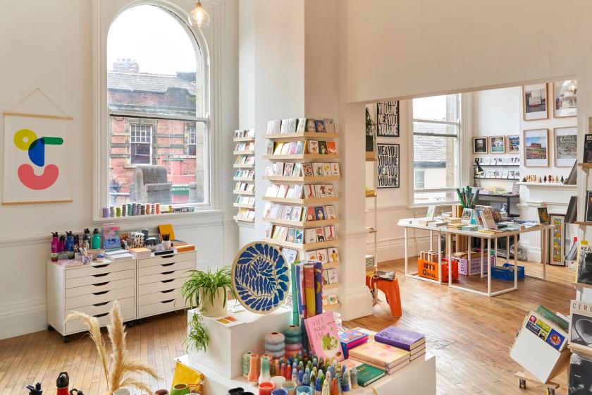
12. Colours May Vary

Colours May Vary is an independent shop based in Leeds stocking a range of beautiful, useful and inspirational wares. Their main focus is graphic art and design, typography, illustration and product design, and they stock a range of books, journals, prints, cards, wrapping paper, notebooks and planners.

13. Papergang

Papergang is a stationery subscription series delivering exclusive products to your letterbox. Each month you'll receive a product selection that varies but includes the likes of greeting cards, notebooks, desk accessories and art prints.

14. The Stationer

The Stationer was born in 2014 out of Tessa Sowry-Osborne's love for pens, pencils, paper and everything else that lives on a desk. It's focused on combining classic design with great functionality: items that will make your desk look cool and help you be that little bit more organised.

15. Happy Dashery

Sarah Arkle and Carrie Wainer opened their Bedfordshire store in 2019, intending to be a bright and colourful beacon on their local high street. They look after their online shoppers, too. They can write personalised messages, gift wrap, and include a greeting card with your order on request. Stationery includes pens, pencils, cards, sticky notes, journals and more.

16. Rifle Paper Co.

Rifle Paper Co was founded in 2009 by husband and wife Nathan and Anna Bond. Their site is full of bold colours, hand-painted florals and whimsical characters, and their goal is to create quality products that bring beauty to the everyday. Their stationery includes greeting cards, social stationery sets, card sets, postcards and photobooks.

Image courtesy of [Rifle Paper Co.](https://riflepaperco.com/)

Image courtesy of Rifle Paper Co.

17. Meticulous Ink

The good people of Meticulous proudly print stationery the old-fashioned way, using beautiful papers, time, patience, and a deep-rooted passion for being meticulous. Two original 1960s Heidelberg printing presses are used to create their own greeting cards, stationery box sets, business cards, wedding invites, packaging and bookmarks.

18. Yoseka Stationery

Yoseka Stationery is the US branch of the much-loved Taiwanese store, bringing its beautiful stationery products to a global audience. These include planners, cards, erasers, fountain pens, inks, letter stationery, markers, notebooks, organisers, pens, pencils, refills, stamps and stickers.

19. Wrap

Wrap celebrates the very best in contemporary creativity through its print magazine, its products, and its online content. Its notebook collection has recently had a glow-up and now boasts new styles featuring illustrated covers and gold-foil detailing. Several classic designs from the Wrap archive have also been brought forward into the range.

20. Counter-Print

Counter-Print is one of our favourite book publishers, and they do a mean line in stationery products. These include everything from pencils, rulers, and tape dispensers to art chalk, white vinyl glue, and a screen-printing kit.

CΓ©line Leterme and Jon Dowling, Counter-Print

CΓ©line Leterme and Jon Dowling, Counter-Print

21. Papier

Since 2015, Papier has been an emporium of eclectic designs, including bespoke stationery products that invite curiosity and contemplation. Alongside their in-house collections, they collaborate with bright, up-and-coming artists, iconic brands and exciting fashion labels.

22. Choosing Keeping

Choosing Keeping began in 2012 as a small shop on Columbia Road, a street in East London best known for its flower market and independent boutiques. They offer a fantastic range of stationery products, including writing paper, decorative paper, art tools, office accessories and wrapping paper.

  •  

JKR evolves KFC's entire identity around the bucket – welcome to the 'Bucketverse'

Jones Knowles Ritchie reworks every touchpoint, from a 3D logo and custom typefaces to a refreshed Colonel, as KFC's biggest brand evolution begins rolling out across more than 150 countries.

Chicken is having a moment. I only realised this recently at a Spanish airport, when I spotted a new Popeyes branch past security. On further investigation, it appears the brand is rapidly expanding its global footprint as it seeks to dominate the category. It's why an email from Jones Knowles Ritchie (JKR) made me smile this morning. It's just helped KFC evolve its entire identity, reminding us that few fast-food brands carry a kit of parts as distinctive as its own. The bucket, the stripes, the Colonel, and its strapline "Finger Lickin' Good" – each one is instantly recognisable, even out of context. Perhaps KFC wants to remind us that there is only one place to enjoy chicken.

That, in a nutshell, was the mission. JKR, the global branding agency behind the work, was not asked to start KFC over but to take it into what the brand calls its next chapter. It wanted to evolve, confidently, without losing brand loyalty.

The result is a full 360-degree evolution that runs from the design system and brand assets through to restaurant environments, packaging, digital platforms and tone of voice. JKR describes it not as a refreshed logo but as a "single, connected world" – one built entirely around KFC's most famous asset: the bucket.

"Our role was to help it evolve for the next chapter, in a way that only KFC could," says Sean Thomas, global executive creative director at JKR. The studio set about "building a world and experience that consumers could step into. We call it the Bucketverse."

The bucket is the unlock

The bucket sits at the heart of everything. But JKR has redefined it as a central brand device, standardising its distinctive shape for a consistent global rollout and treating it as both a framing system and a storytelling one – an extension of the logo that can hold food, culture, energy, and just about anything in a single frame.

From there, the system spreads out. The logo becomes a three-dimensional asset rather than a flat mark; the lettermark is stripped back to a cleaner, more legible shorthand; and the stripes, once only a background texture, are reworked into an expressive, type-based asset that does much more of the storytelling. The core red, white and black palette, meanwhile, stays put for instant recognition. And it's joined by a secondary system called Herbs and Spices – a nod to the original recipe – for moments that need a bit more oomph.

Typography-wise, KFC now has its own custom-built type system, Kentucky Fried Serif (well, they had to call it that) and Kentucky Fried Sans. Genius. It's drawn from the lettermark and developed in partnership with StudioDRAMA. 'Finger Lickin' Good', meanwhile, is reframed from a tagline into what JKR calls "a standard of behaviour" – a global brand asset rather than a sign-off. Lettering artist Tobias Hall crafted the mark itself.

A gentler Colonel

Then there's the famous Colonel. Looking at the 'before' and 'after' icon, you can spot the difference, but it's incredibly subtle. Not surprising, given that it's the brand's most sacred asset and therefore needs to be handled with care. It's enough to keep any designer awake at night, worrying about getting it wrong.

JKR smashed it, though. The Colonel takes on a clearer, more purposeful role in the new 3D logo and has – dare I say it – a more welcoming expression, along with grounding elements. Despite the tweaks, the agency has preserved his character and legacy. And a new system of stamps carries his spirit throughout, leaning into the brand's heritage and craft.

Accompanying illustration and photography help KFC to feel human and global. The illustration system was built with a roster of international artists – Bernardo Henning in Buenos Aires, Eva Cremers in Amsterdam, UV-朱 in Xiamen, BelΓ©n DΓ­az Guerra in Lima and Boomrangg in Mumbai. While lifestyle photography came from Reece James Morrison, and food photography from Frankie Turner. Film music was created with Antfood.

From QSR to 'QXR'

The bigger ambition is experiential. And this is where the new identity gets exciting. The bucket becomes a giant fixture in restaurants, pop-ups, and other retail spaces. It literally swamps each space. JKR frames the work as a category shift – from quick-service restaurants to what it calls 'QXR', or quick experience restaurants. "Nothing hits like KFC, and that sentiment doesn't stop at the chicken," says Matt Michaluk, executive creative director for experience at JKR. He describes it as "a disruptive category shift" and "a brand turning experience-led distinctiveness up to 11".

For Tosh Hall, JKR's global chief creative officer, it comes back to category leadership. "Every category has its leader. When you close your eyes and think about that category, you think of one, maybe two brands," he says. "When you think chicken, you should think KFC. Our job was to make sure the leader of the category was showing up like one."

The rollout has already begun. It starts this month in the UK and Ireland. Expect new Tenders, nine new sauces and refreshed branding across communications and digital touchpoints. It will then expand to Australia and the US in the coming weeks, with more markets following through 2026.

The new-look restaurants arrive from the summer, led by an open-concept space in McKinney, Texas, expected in late summer, and a two-storey, fully immersive restaurant in Dubai opening in the autumn.

Whether the wider world warms to the 'Bucketverse' and 'QXR' language remains to be seen. But as a piece of brand thinking, it's a confident, carefully judged evolution of one of the most recognisable identities on the high street, and a reminder of how much mileage there still is in a really good bucket.

  •  

Eight ways to stay discoverable when search, social and AI stop sending people your way

Image licensed via Adobe Stock

Image licensed via Adobe Stock

The free routes that used to bring creatives their next commission are closing one by one. It's been happening for some time. And now AI is pretty much destroying the web as we know it. Here's how to keep being found – and, increasingly, recommended – without a marketing budget.

For many happy years, getting found was something any creative freelancer or studio could do on the strength of work alone. A website that ranked for your craft. A post that travelled far and wide and carried your name back to your profile. A share that turned a random person into a client. None of it really cost anything except for a bit of time and effort. And all of it was the pipeline to paid work.

Oh, how things change. Organic search has fallen off a cliff. Social media rewards quantity over quality. And the latest? Conversational, agentic AI is now pulling all the shots.

And with today's big news that Pinterest is shifting away from traditional search, it's clear that none of us can out-optimise this on our own. The good news is that the shift rewards a handful of things independent creatives can still build: a direct audience, a distinctive name, and a reputation the new systems can read and recognise as important. Exhausted? Yes, so are we. But here's where to put your energy.

1. Build an audience you actually own

I've been saying it for over a decade – since Meta ruined Facebook for publishers in 2016 – build your own audience. That's because every follower you have is rented. Platforms like Instagram and Pinterest get to decide who sees your work, and the goalposts can change overnight.

An email list is the one audience you get to control. It's a list of people who chose you, and you can reach them directly, whenever you want. So start a simple newsletter, even a short monthly one, and make signing up the clearest call to action on your website. (Our guide to creating a newsletter people actually want is a good place to begin.) A few hundred people who want to hear from you is worth more than ten thousand followers a feed decides to throttle, and it's how plenty of creatives are winning work after quitting social media altogether.

2. Become a "category of one"

Don't roll your eyes, but AI discovery rewards a "good enough" match to a brief, which flattens everyone into interchangeable options. The defence is to be "uninterchangeable". So sharpen the one thing you do that nobody else does in quite the same way. That could be a material, a subject, a voice. You want to be known by name rather than retrieved by attribute. The creatives who survive this current massive shift are the ones a client specifically asks for, because a specific name is the one thing an algorithm can't substitute.

3. Get cited, named and talked about

As someone who worked in PR for two decades, this next tip warms my heart. Because I know public relations is having a golden hour moment. That's because if you still want to be found, recommendation engines lean on signals they can read: who's mentioned in other people's work, who turns up on lists, in interviews, in the press, and in collaborations.

It means that being talked about is more valuable than being optimised. Forget staying in your comfort zone. Say yes to the guest piece, the podcast... even the scary panel on stage that you've been avoiding. Pitch yourself for round-ups in your niche. Every place your name appears alongside your craft is a breadcrumb the systems – and the people – can follow back to you.

4. Make your site easy for a machine to understand

If an AI is going to represent you, it has to be able to read you correctly. That means not blocking AI crawlers on your site. And it means spelling out, in plain language, what you do, who you do it for and what makes your work yours. Don't just have images and a one-word 'work' tab. Name your projects, your clients and your disciplines in actual words. Add alt text to every image. You're not gaming anything here; you're making sure that when a system describes you, it gets you right rather than second-guessing.

5. Show the process and the person

A generative answer can summarise a style, but it can't reproduce the human genius behind it. That's your advantage. In which case, share the process: the sketches, the dead ends, the "why" behind every decision, and the story of a commission. Content about process, along with a real point of view, builds the kind of trust that turns a browsing visitor into a client, and it's exactly the material an AI can't copy from pages that already exist.

6. Make referrals easy to give

Word of mouth is, and always will be, the most powerful marketing channel. And it's still how most independents get their best work. Don't leave it to chance. Tell happy clients you'd welcome an introduction. Keep a tidy one-line description of what you do that someone can paste into a message without having to think. Stay in touch with people you've worked with so you're the name that comes up when they're asked, "Do you know anyone good who can…?"

7. Turn up in real rooms

"In real life" is back, baby. Events, meet-ups, talks and communities – they're all back on the table after those weird post-pandemic years. Like word of mouth, networking is hugely powerful. A conversation at a portfolio night or a face remembered from a meet-up leads to commissions that no number of impressions or page views can match. You don't need a stage, but turning up consistently where your peers and potential clients gather will eventually deliver results.

Just remember to enjoy yourself and make friends, first and foremost. Don't go in with the hard sell, as there is nothing more off-putting.

8. Don't rent your whole presence from one place

Remember the old saying, Don't put your eggs in one basket? It applies here. If a single platform is your entire shop window, one change to its rules can harm you enormously. Spread your presence across things you own and things you earn – your website and newsletter list, plus a couple of channels and the press and communities you show up in. The aim isn't to be everywhere all at once; it's to make sure no one switch, algorithm tweak or new AI layer can take away every route to your door at once.

In summary

None of the above is a quick fix. But don't panic. The creatives who stay discoverable through this enormous revolution won't be the ones who chased the algorithm the hardest; they'll be the ones who built something that's truly their own... a name worth knowing, a direct line to the people who love your work, and a great reputation that travels on its own accord.

  •  

16 of the sweetest business card designs from some of the world's best designers

We Make Stuff Happen by [Maddison Graphic](https://wmshappen.tumblr.com/)

We Make Stuff Happen by Maddison Graphic

Business cards were once deemed dead. Not anymore. They're back in a big way. If you're looking to design your own, here are some great examples to inspire.

Haven't you heard? Business cards are making a comeback. Yes, really. The global pandemic, not that we like to mention it, put a stop to all in-person events. But now they're back, and increasingly so, people are out networking again. Myself included.

The one thing I keep hearing from all the recent conferences, festivals, and talks I've been to is how nice it is to hand something real to the people we meet. A little card of information, beautifully designed and printed on the kind of material that makes designers let out a happy sigh (Laura Boast, I'm talking to you).

I came back with dozens of gorgeous business cards from Pictoplasma in Berlin and OFFF in Barcelona. And it got me thinking, perhaps it's time we pulled together a fresh list of excellent business card designs to inspire you to create your own. The following are either classics from the archive or fresh offerings that caught our eye.

1. Super Peach by Pentagram

For Momofuku's all-day LA restaurant Super Peach, Matt Willey's team at Pentagram built an identity around contrast – a whole family of hand-drawn, off-kilter wordmarks (with illustrator Pol Montserrat) that stretch, squash and jitter, set against a strict black-and-white palette.

The business card and letterhead keep it gloriously restrained: brown paper and off-white stock letting the wonky lettering do the talking. As the studio explains, the "hand-drawn wordmarks [can be]... used interchangeably throughout the system, creating a dynamic identity that complements the restaurant's energy."

We especially love the accompanying invites and the simple, black-and-white packaging for takeaway food. Not to mention the gorgeous postcards, featuring Pol Montserrat's beautiful work, front and centre.

2. Bec Brittain by Lotta Nieminen

One from Lotta Nieminen's archive, this business card design is for Bec Brittain, a New York-based lighting and product designer who is "driven by luxurious materials, intuitive forms and forward-thinking technology".

According to Nieminen, the studio explores and experiments with new techniques and materials, "pushing the boundaries of American-made, centrepiece lighting design". As such, the designer opted for luxurious vintage green hues and a gold/bronze foil featuring the uppercase logo, which comprises two different typefaces to highlight her client's name.

Product photography is by Lauren Coleman. Check out Nieminen's website to see the full project in effect.

3. Pino by Bond

Probably the most colourful example in the bunch, these business cards are for Pino by Bond, a Helsinki-based design studio that is doing some brilliant things in the design world right now.

The work is for the interiors shop Pino, a Finnish word meaning 'stack' or 'pile'. This name inspired the whole store and brand concept, from the logo to the shop fixtures – all crafted by Bond when it was called upon to develop its new identity.

"The interior design, with its subtle colour and material palette, works as a neutral background for the playful, colourful visual identity and products," Bond explained. Photography is by Paavo Lehtonen.

4. Mattias Jersild by BVD

Stockholm's award-winning studio BVD crafted this minimalist design for Mattias Jersild, known locally as "Sweden's best copywriter".

Restrained and beautifully laid out, this business card might not look like much, but to the designer's eye, it's perfect. We're surprised it's no longer on BVD's portfolio. But to be honest, it's a pretty old project. We just had to include the work, as it's such a perfect demonstration of turning something so simple into an elegant piece of art.

5. Estampaciones Fuerte by Hey Studio

Estampaciones FuerteΒ is one of the world's leading metal stamping companies and has been around for over 45 years. In 2015, it approached Barcelona-based design studioΒ HeyΒ to create a new, modern identity for its established brand.

"The main objective was to design a new, modern identity for this metal stamping company," said Hey. "Their industrial experience and professionalism are very important to the company and their clients. The identity needed to reflect these values straightforwardly while also showing the technical side of the business."

The resulting logo consists of three metallic strips that hint at the 'E' and the 'F', while the new brand palette evokes the company's industrial heritage: all orange, grey, black and white. For the business cards, Hey played with those three strips on a simple grey background. Elegant yet on point. Photography by Roc Canals.

6. Story Cafe by For The People

Sydney cafΓ© Story is built around one idea: storytelling. And so when For The People was appointed to handle its brand identity, it ran this premise through every touchpoint, from cups and packaging to the business and loyalty cards.

The accompanying business cards have a lovely old-library-card charm, set in DM Mono, Blaze Type's Surt and Cooper, in a moreish palette of deep blue, millennial pink, chocolate brown and pale yellow. We especially love the chance to collect stamps on one side that feature the new brand mascot: a monstrous figure with big eyes and horns, yet plenty of warmth.

Proof that a humble card can still tell a whole story.

7. University of the Arts Helsinki by Bond

Another great offering from Helsinki studio Bond, this time for Finland's University of the Arts Helsinki.

At the beginning of 2013, three of Finland's most prestigious art academies merged into a single institution. Bond was appointed to create a unified brand identity and architecture that also allowed room for the individual academies to build their own profiles.

The solution was formed around deconstructed logotypes that distinguish the university from business and science institutions, while a simple, bold anchor symbol 'X' has multiple meanings, just like art does. "The symbol can be seen, for example, as a starting point, a destination, a meeting place, a location, a signature, an unknown force, a warning, an irritant, a question and a solution. This holistic project covered all brand touch points," Bond explains.

Business cards were included in the rebrand. All wavy, colourful and unconventional. We love them.

8. We Make Stuff Happen by Maddison Graphic

We Make Stuff Happen is a production company specialising in exhibitions and events. Maddison Graphic designed its new identity, stationery and website, including these lush business cards printed with foil blocking on Colorplan using typeface Merkury.

It's one in Maddison Graphic's archive, but it still deserves a place in this list. We adore the logo that suggests a wall of bricks. And visiting its client's website, it's even nicer to see the identity still in use. When something isn't broken, why fix it?

There are two versions of this business card: a black or white logo on one side, and the person's details on the other. We wonder if they're still using them.

9. Sucre by DutchScot

Sucre is a Latin-American-meets-European restaurant inside a 310-year-old former concert hall on London's Great Marlborough Street, and DutchScot's identity tells its story of immigration.

It features Old World references mismatched and rebuilt into something new, with Argentine tango steps used as decorative motifs and illustrations of Buenos Aires porteΓ±os by Rebecca Sutherland.

The print suite (cards included) carries that richly crafted, heritage-meets-modern feel. It's the perfect solution for a restaurant headed up by a much-respected Argentine chef, Fernando Trocca. We love that the menu tells the story of his immigrant background and the European adventurers who crossed the Atlantic to make their home in his native Argentina. The wine list makes the same trip. While the business cards keep it simple, leaning into the beautiful serif logo, they are imprinted on one side to show the embossed version on the other.

10. The Future Factory by DutchScot

The Future Factory help creative agencies win new business – on the simple principle that people buy from people, not pushy cold calls.

DutchScot leaned into the 'factory' half of the name, building a playful industrial identity where animated typographic 'conveyor belts' ferry the brand's messages, and the logo is an abstracted conveyor-belt 'F'. Witty, kinetic and full of movement, carried right through to the humble business card.

Of course, the business card isn't animated. But you get the hint of movement from the clever use of lines and swirls across its surface. The featured typeface is Rois by the foundry New Letters, while Heldane by Klim is used for smaller body copy.

At the time of its release in 2022, DutchScot confessed it was one of their favourite design projects. We wonder if that still holds today.

11. Pink and Holographic personal business cards by Alexia Roux

For her personal branding, French graphic designer Alexia Roux created pink and holographic business cards. Dazzling, reflective and pink – what more do you need? Printed by Atelier Bulk, a Bordeaux, with paper by G. F. Smith.

Mind you, these cards were released over five years ago, so we're not sure if they still stand. Looking at Alexia's recent portfolio, though, it's clear she's become renowned for logo identities and crafting beautiful printed materials. We're impressed with these designs for Maison Emilienne – another use of pink as a backdrop and gold-foiled materials.

12. Don't Try Studio by Quentin Monge of Don't Try Studio

For his own business card design, Parisian creative Quentin Monge of Don't Try Studio leaned into something tactile and colourful.

The illustrator and art director, known for his muted colours, soft, swirly characters, and distinctive, cheerful style, has graced many magazine covers, product packaging, and posters.

We love the calming yellows and blues of these designs. We're pretty sure Quentin has since updated these bad boys, but they're so nice to look at that they deserve a place in this roundup of inspiration.

13. Wool by Alex Hunting Studio

Wool brings up-and-coming Nordic brands (think MENU, TEKLA, Santa & Cole) to East Asia from its Hong Kong studio store, and London's Alex Hunting Studio gave it a quietly luxurious identity to match.

A bespoke wordmark sits next to chiselled, sharp lines against soft curves, while the print and packaging add tactile finishes – fabric embossing, a deep, clear-foil deboss, and crisp silver foil – all wrapped in a palette that even includes an official 'Hong Kong Tram Green'. A small, beautifully made business card if ever there was one.

Although released in 2022, the work by Alex Hunting is timeless. Which is no surprise, given he's renowned for design direction on Kinfolk, Footnote, and the John Lewis Foundation.

14. Heys Business Cards by Hey Studkoo

Who better to design a joyful business card than the people obsessed with geometry and colour?

For their 10th anniversary, Barcelona's Hey Studio made themselves a set of cards in vibrant colour gradients, across 24 versions, finished in both matt and satin. "It represents Hey's ethos of having a positive attitude and an open predisposition, something fun and expected," says the studio.

Simple, playful and unmistakably Hey – proof a card can be a tiny mission statement.

15. Sewing Thread Card for Matière Noire Studio by Burak Kaynak

This limited edition Sewing Thread Card style handmade business card was designed by Burak Kaynak for Montreal-based fashion label Matière Noire Studio.

To match the brand's high-quality, hardworking nature, materials were carefully selected. And that certainly applied to its client's business cards.

Letter-pressed on 100% cotton Lettra Fluo White paper, each card is hand-wrapped with natural black cotton thread, which helps connect the raw materials used in the fashion directly to the brand identity.

This one is probably the most original of the bunch. We love the clever nod to a cardboard spool organiser – something keen sewers use to wrap and store loose thread. Photography is by Ali Inay.

16. Onslow by Davy Denduyver

Onslow is a no-nonsense, flavour-first restaurant in Bruges named, rather brilliantly, after the Keeping Up Appearances character. Yes, that's right. The "lower-class" relative of the snob, Hyacinth Bucket (pronounced 'bouquet' to those in the know).

Belgian designer Davy Denduyver gave it an identity to suit: a bubbly handwritten wordmark colliding cheerfully with the two most ordinary fonts going, Helvetica and Times New Roman.

One of our fave picks because sometimes, you don't have to go over-the-top to get the results you want. In this case, nostalgic, contemporary and refreshingly unprecious – business cards and all.

  •  

The best new typefaces for June 2026

At Glacier by Omar Careaga

At Glacier by Omar Careaga

For all you graphic designers out there, we've rounded up the latest big releases from foundries across the planet. From display fonts to classic serifs and a family inspired by Iceland's wild landscape, June's offering is so good that some might end up in your current projects.

There's something about midsummer that seems to bring out the best in type foundries and designers. Maybe it's the long days. Maybe it's a rush of projects finally being signed off on. Whatever it is, June has an unusually rich crop: revivals lovingly reworked, stencils that break their own rules, and display faces with enough presence to fill a poster that could be seen from space. Well, perhaps not. But you get the picture.

What I love about this month's haul is the sheer range. This is creativity at its finest. There are monospaced workhorses built for important data, dashboards and tidy code. We have warm wedge serifs that nod to mid-century America. There's even a display face carved straight out of Iceland's volcanic landscape.

Whether you're after something quiet and dependable or loud and unapologetic this June, Creative Boom has you covered. So grab a brew, settle in, and see which of the following typefaces make their way into your next project.

Sticks by Nguyen Gobber

Sticks is a monospaced typeface built from rectangular shapes with rounded inner corners, reminiscent of reinforced joints in precision-cut metal components. Its strict, rigid appearance follows the same visual language of construction, technology, and industrial machinery. Perfect for any branding projects in that field.

Originally released in 2019 and discontinued a few years later, the typeface was fully reworked, expanded, and re-released this month as a family of individual styles and a variable font. Nicely done, Nguyen Gobber.

Sahlia Stencil by Arcane Type Foundry

Introducing Sahila Stencil, the latest release from Arcane Type Foundry and an expansion of its existing typeface Sahlia, from a single weight to a 10-style family with true italics and a variable font that covers all styles.

Sahlia is a stencil typeface that breaks all the rules. Where most stencils slice away parts of the letters, Sahlia's extreme contrast dissolves the thin parts entirely, as though worn away over time. The result feels both structured and organic: sharp, high-contrast serifs softened by delicate forms.

In the lighter weights, Sahlia has a graceful presence, while at its heaviest, it becomes more dramatic, yet it keeps its luxurious tone.

Designed for projects that want to make an elegant statement but with a little edge, Sahlia performs in editorial layouts, on luxury packaging, and across lifestyle content. Think candles, self-care, and slow living... that sort of thing.

Curo by Silver Stag Type

SLTF Curo is a super-heavy display sans-serif typeface designed for brands that want some serious presence. Built around a single extreme weight, Curo comes in five distinct corner-style variants: Sharp, Crisp, Regular, Soft, and Rounded, giving designers a complete tonal range within a single typeface family.

Each variant carries the same bold, unapologetic mass but shifts in character. From the hard-edged tension of Curo Sharp to the warm, voluminous fullness of Curo Rounded, the result is a complete design system of five fonts available with a single purchase.

Curo's large x-height and tight counters make it exceptionally impactful at display sizes. A distinctive lowercase 'g', expressive curves, and an alternate single-story 'a' give it a personality that is both retro and unmistakably contemporary. Built for headlines, packaging, logos, posters, and anywhere a brand needs to take up space with total confidence.

Unifora by Yep! Type

Another bold statement for our June round-up is Unifora by Yep! – a massive sans-serif uniwidth superfamily with an industrial edge and architectural feel. "Unifora starts where DIN leaves off, taking the constructed logic of technical lettering and pushing it to meet the demands of modern screens, without softening the edges," explains the foundry.

It comes with five widths, nine weights, and matching italic and roman styles with slants up to 18 degrees. The variable font spans all three axes: weight, width, and slantβ€”in both directions. What's more, the superfamily is available as five standalone sub-families, each built around the uniwidth principle... that is, within any given width, every glyph holds its advance width across all weights and styles. In practice, that means text never reflows when the weight shifts.

Unifora Condensed works for data-dense interfaces like dashboards, table columns and tight mobile layouts. Meanwhile, Unifora Narrow handles compact body copy and sidebars. Unifora Standard is the default width – comfortable with everything from small UI labels to large display. Then there's Unifora SemiExpanded for display, signage and wide-format applications where letterforms need space to breathe. If all that sounds complicated, there's a user manual to help you decide which is best for you.

Halvar Mono by TypeMates

Halvar Mono expands the Halvar universe by taking the next logical step: re-engineering Halvar's "constructed forms, raw charm and machine precision" into a monospaced typeface.

With Halvar Mono, every character in each of its nine weights occupies the same width. Built on Halvar's balanced, medium-weight, monospaced typeface, this version is practical and precise across data, tables, and technical systems; steady and dependable in demanding pixel- and print-based applications.

It has an industrial charm and mechanical design for those who value the structure and elegance of monospaced fonts. It includes extended Latin, Greek and Cyrillic and supports more than 190 languages.

Drika by Ana Laydner

Ana Laydner has released a new typeface that joins Fabio Haag Type's exclusive library with a raw, real aesthetic. Letters might "overlap in a hug or collide in a mosh pit" – something that's been compared to the happy chaos of real life. Figures.

With 14 weights of expressive goodness, Drika has strokes that aren't overly polished and are inspired by the earliest sans serifs of the 19th century. Some diagonals end at an unexpected angle, while others have straight forms.

Emojis of all kinds are sprinkled in along with arrows, and that character comes with every weight of the family. In the heaviest weights, some letters might overlap, and that's ok. It's a sans "unafraid of being", according to Ana. She adds: "Drika is a typeface about presence, about occupying spaces without apology". For those of you feeling rebellious this month, we think you'll love how this one breaks all the rules.

Beth by Alexis Navarro & Latinotype

Beth caught our eye this month, as it draws on early-twentieth-century English shopfront lettering: a tradition built to stop people in their tracks. Its uppercase draws on Neoclassical type with humanist terminals and convex strokes inspired by hand-painted signage, giving each capital a brightness and precision that feel both nostalgic and modern.

The lowercase follows the calligraphic model of Edward Johnston's Foundational Hand: curves that modulate close to 45 degrees, a single-story 'a' with no traditional terminal, and an 's' that, in the designer's own words, is a poem.

The drawing carries the weight of engraving, particularly the work of Gustave DorΓ© and William Blake. Their influence lives in Beth's fine strokes and the richness of its contrast: a typeface that, according to its maker, holds light and shadow the way a copper plate does – "dark where it counts. Bright where it matters".

A pop gothic serif, if we ever saw one, Beth comes with seven weights, from light to black – each with a standard and alternate character set, plus 594 glyphs and discretionary ligatures.

La Mericana by Elena Genova of My Creative Land

La Mericana is a vintage-yet-modern type family inspired by Richard Isbell's Americana, originally designed in 1965 for American Type Founders. It builds on the same qualities that made it a distinctive voice in mid-century American typography : warmth, wedge serifs, and generous x-height  –  and reimagines them for contemporary use.

Nostalgic of classic signage and retro branding, it features a new italic with calligraphic details, adding movement and elegance without losing the family's confident, approachable tone.

La Mericana's large x-height and open proportions keep it legible in tightly set lines. The condensed version preserves the original's distinctive look while making it ideal for branding, editorial, packaging, and compact digital formats, such as  Instagram posts, reels, and stories... basically anywhere that needs impact in a small space.

At Glacier by Omar Careaga

At Glacier is a display typeface inspired by Iceland's raw landscapes. Bold yet refined, it combines sharp structure with flowing forms to create a distinctive and expressive typographic voice. Those famous volcanoes and wild rock formations have clearly made their mark here.

As Arillatype Studio puts it: "Ice-cold elegance with glacial flow" and "a natural grotty, carved by instinct". You could say this typeface is untamed with its unexpected twists and turns. But you'll be glad to know, it's entirely legible and probably our favourite of the bunch this month.

The family includes over 1,000 glyphs, featuring extensive alternates, ligatures, numerals, symbols, arrows, dingbats, and advanced OpenType features. Brought to you by uber-talented graphic designer and printer Omar Careaga.

Reel by Jamie Clarke Type

One of the smartest releases this month is Reel, a condensed headline typeface from Jamie Clarke that asks a deceptively easy question: can a headline grab you without shouting? We all know the usual answer. Condensed ALL CAPS is everywhere, from film titles and posters to tabloid splashes. Sure, it commands attention and locks nicely into a rectangle. But as Clarke points out, it can also feel cold and a touch confrontational, which is why politicians and brands reach for it. Shudder.

His solution is something he calls "Flexi-case": a system that gives lowercase letters the same height and presence as capitals, so you can soften the tone without stray ascenders and descenders breaking that clean rectangular block. It isn't uni-case or anything. Reel keeps the familiar distinctions between upper and lower. It simply lets them share the same space as equals.

Clarke looked to nineteenth-century wood type as inspiration, letting straight strokes bulge gently and curves fill out, especially in the lowercase. "Uppercase is a bit like a poker face," he says. "It projects authority and urgency, but keeps you at a distance. Lowercase carries more personality and humanity because it developed from handwriting."

The upshot is a face built for all the familiar headline territory – film titles, TV graphics, book covers, posters – that still has room to shift tone. Or, as Clarke neatly puts it, a typeface that's "expressive, not oppressive". A fitting typeface to round things off this month.

  •  

Loneliness, 2am doubts & getting ghosted: indie agency founders share their experiences of year one

Image licensed via Alamy

Image licensed via Alamy

What actually happens when you leave your comfy job and start from scratch? We chat to agency founders to hear their stories.

Right now, something is shifting in the creative industry. Across the UK, senior creatives are leaving the relative safety of network agenciesβ€”some after decades of painstakingly climbing the ladderβ€”to launch their own studios.

The Drum has called 2026 the "Year of the Indie". But what does going independent actually look like from the inside, beyond the tasteful brand identity and the optimism-laden "We're thrilled to announce…" post?

To find out, we set out to uncover the real stories. The first client. The months when the money doesn't come in. The moments of doubt that hit hardest.

Founders from Manchester, Leeds, Liverpool, London and beyond shared with us accounts that were funny, raw, occasionally terrifying… but also useful. What emerged isn't a simple call to "follow your dreams." It's something more complicated, and a lot more interesting, than that.

The moment the penny drops

What struck us most is how often the decision to leave a comfy job isn't driven by pure ambition, but disillusionment. These are typically people who were good at working within large structures, who rose to the top of them… then looked around at what they'd built, and found it wanting.

Take Steven Bennett-Day, founder of B Corp creative studio Ourselves, who launched his agency in 2019 alongside a partner, after both had reached board level in global networks. "Our leap came as we found out just how little of a client's budget went on actual creativity," he says. "We realised many of the business decisions made by those agencies were in support of an operating model that was struggling. Big ideas felt a bit like small print in that world."

This feelingβ€”that the machine has grown too big, too expensive and too distracted to serve the actual workβ€”comes up again and again.

For Steffan Cummins, who left Wolff Olins two years ago to start Lost Property (now a team of six), the shift is visible in client behaviour, too. "Clients are more interested in getting to know the specific people behind the work, versus the weight of a historic agency name," he says. "Add, of course, the cost difference."

Rich Pay, creative director and founder of MOKSi Creative in Liverpool, frames it in the simplest of terms. "People buy people," he explains. "Even at network agencies, there tend to be the faces that the client knows and trusts, then the rest of the team. With stretched budgets, the cost attached to that starts to sound unreasonable."

Year one: the reality

Here's where the bravado of those triumphant LinkedIn posts can start to ebb away. Almost every founder we talked to described year one as significantly harder than anticipated, and in ways they hadn't predicted.

Marianne Olaleye left ustwo three years ago to go freelance before founding Jaiku, a storytelling agency for purpose-led brands. "The hardest part of year one was overdelivering, but not pricing myself high enough," she recalls. By year two, a different problem had arrived. "It was the loneliness and relentless decision-making.

"When you go at it alone, every week brings a hundred decisions and no one to sense-check some of them with," Marianne reflects. "You learn to trust your own judgment in ways that are both revelatory and terrifying." What helped? "Therapy, trusted friends, and people who know you deeply beyond the business become incredibly important."

Mike Bryan, creative director of CGI and film studio And Seventy, describes his own departure with classic understatement. "I went into work one morning and handed in my notice, almost without realising what it actually meant. It quickly sank in." He'd left with two months' rent in the bank. "I've not had a good night's sleep since and have wondered many times what the hell I'm doing at 2am." And yet, he's still feeling positive. "We've seen great traction this year and are working on some landmark projects both here and in New York."

Steven from Ourselves captures the cruel issues of timing that seem to plague many founders. "We started in March 2019. Our first clients were Gail's Bakery, Blue Dragon and Vivobarefoot. Everything was starting to roll, but then COVID shut everything down." His advice to anyone starting out now is hard-won: "New business is really, really hard. After three years, you will run out of contacts. You won't be the new thing any more, so inbound work will slow down. Finding work at that stage takes time; make sure you develop the right way of doing it that is authentic to you."

Building something that lasts

Despite the challenges, there's joy in being your own boss. For instance, several founders describe consciously designing their studios around what they wanted their working lives to look like, not just what the market demanded.

Marianne, for her part, focused on longevity. "I built Jaiku with my 60-year-old self in mind. I deliberately built in the things I love, workshops, consultations, teaching, so that even in the hardest months, the work itself sustains me."

Alister Shapley, who founded type-led brand design studio Applied Systems in Manchester in late 2024 after leading the branding team at a commercial real estate firm, took a similarly structured approach, albeit one that brought its own complications. He built three revenue streams from the start: branding, a commercial type foundry, and lecturing.

"What sounds great in theory was, in reality, three independent revenue streams, each with its own demands," he admits. "The branding side has been a mixed bag, with some amazing clients, but also long periods of quiet." Still, he's playing a longer game: "The education side plays into a longer-term goal of creating more alternative routes into design."

For Joe Simons, co-founder of Leeds-based studio Edna, the 'anchor client' principle proved both a lifeline and a lesson. Edna's five founders were made redundant just before the second lockdown and negotiated the right to approach their former employer's clients. One was Primark. "From this perspective, we were very fortunate," Joe says, "but at the same time, none of us had run an agency before, so we had to go from zero to one hundred very quickly."

Joe's top piece of advice is specific. "Find your anchor client, one that you know will give you enough work to cover costs every month. Without this, things can get very stressful very quickly. Even with Primark on our books from the outset, it was six months before we had enough to pay ourselves a decent wage."

What's actually changing

Many of these lessons will be familiar to anyone who's run a business, but it's worth taking a step back to understand why this moment feels different from previous waves of studio launches. Richard Taylor, founder and CEO of Brandon Consultants, is blunt about the structural forces at play. "Clients need partners to be true partners: extensions of their diminished teams that come in like ninjas to solve business problems through creative brand marketing," he stresses. "Clients by-and-large aren't interested in big fancy offices on the Thames, or bloated teams. They want small smart teams dedicated to their business problems."

John Whalley, a creative director and brand designer who spent more than 20 years helping grow a Manchester agency from 25 to over 160 people before eventually going freelance, describes a widening structural divide. "On one side, the few 'big agencies' are doing battle for the 'big clients' on an ever-shrinking battlefield. On the other side, freelance creatives like myself work directly with a diverse range of founders and small businesses." His conclusion is characteristically honest: "Whilst budgets are most definitely smaller, working directly with business founders is far more rewarding in so many other ways."

Key takeaway

Ultimately, the 2026 wave of indie agency isn't just a mood or hype. It's a structural response to how client budgets have shrunk, how trust is built, and how talent now flows. The people we chatted to aren't romantic idealists; most of them are pragmatic professionals who ran the numbers, spotted the gap, and made a calculated leap.

Some nearly didn't make it through year one. Most are still standing. Long may that continue.

As Steven puts it: "Being here for seven years is a win with all of the worldly stuff that has happened, and is still happening."

  •  

How Sara Priorelli distorts bodies to laugh off the awkwardness of having one

The self-taught animator on collage, control and why fingers, hair and breasts are the most expressive things to draw and make move.

Most of us spend a lifetime trying to feel at home in our own skin. Sara Priorelli would rather pull it apart, stretch it and twist it to see how far it goes. Somewhere along the way, she finds comedy gold in what it means to be human.

The fifth of seven children, Sara grew up in a house surrounded by chaos and fun, along with an entire family of Basset Hounds. You can see all of that joy and madness in her animation work, where bodies distort, sag and bend into weird shapes – all with cartoonish glee. There's no storyboard or script behind her ideas; it's all built from memory and a constant stream of notes scribbled down – a handy archive that Sara says has never let her down.

Her route in wasn't through animation at all, but collage. A teenage obsession with Hannah HΓΆch's photomontages and Terry Gilliam's cut-out sequences led her to turn mismatched body parts into little monsters and try to make them move. That was way before she had the software or the skills to do it properly. She taught herself the rest – and it shows in the loose way she works.

The fascination with bodies, she says, is one she can't fully explain. What she can trace is the discomfort underneath it. "Behind my obsession with playing around with the human body lies a certain discomfort of having one, and distorting and twisting it feels like a way of laughing off the awkwardness of being stuck in the same body for so long."

There's real pleasure in it, too. "It's still incredibly fun to take control of a body and move it around as much as possible," she says, and she has her favourite parts to draw: "Fingers, hair and breasts, because they are so expressive and fluid and constantly changing shape." Even the Basset Hounds left their mark. "They carry way too much skin, and that makes their movement very expressive. I'm pretty sure their disproportion and cartoon-like appearance have unconsciously shaped my work."

Having fun is far more important than efficiency.

Being self-taught shapes how she works as much as what she draws. "I never learned how to do it properly, and my files are always a mess," she laughs. "Even in my longer projects, I rarely work with a storyboard, or a proper script, or a character design – which is probably why my characters look different in every frame."

In her work, Sara constantly switches between digital animation, the light box and short comics. "Every medium has its limits, and changing those limits keeps my work challenging. If I get used to a certain approach, then I try another tool and it feels like starting from scratch."

The light box, in particular, takes away her safety net. "I have to accept that there are no tricks like Ctrl+Z, and I like forcing myself to keep things simple and trust my hand a bit more." Comics, on the other hand, ask something different again: "I like the challenge of making a static drawing dynamic, and a silent image loud."

A piece rarely begins with a grand idea – more often, it's a single detail that inspires her next artwork. "It usually starts with a very quick sketch of a detail, sometimes a shoe or just a funny posture, and that makes me think of a story or a particular movement."

Place feeds the work as well. After the Academy of Fine Arts in Urbino, Sara took a master's in Budapest, a move that left its mark on the tone of her storytelling. "I come from a small town, and I had dreamed of living in a big city for so long that, once there, I felt disappointed because my expectations had been so high." That dissonance found its way onto the page. "The sense of being out of place, mixed with the excitement of the change, led me to push the bittersweet side of my stories even more." A "sketchy" neighbourhood and a few surreal encounters supplied the cast. "I'm sure that shaped the kinds of characters I ended up using."

Whatever tool she reaches for, Sara always draws frame by frame – even though it's a lengthy process. "Having fun is far more important than efficiency. There's something really satisfying about drawing every frame by hand, and of course, it gives me total control over the movement." The imperfections are a feature, not a flaw. "I always try to bring a sense of irony to my work, and I feel that those technical imperfections add to the comedy of the movement."

A working day is gentler than you might expect. "I spend my mornings sketching on paper while drinking coffee, then I go for a walk," she says. "I come back home, scan the drawings, digitise them and start adding frames." Music is non-negotiable, and she works with her notes and reference pictures close at hand.

What's next is a return to playing. "I never really gave myself the time to experiment and explore more techniques, so I feel like I need to go back to that phase and take more breaks from my laptop." One medium has her especially curious. "I'm super fascinated by paint-on-glass animation, so hopefully I'll start sharing more of my experimental work in the next few months."

As for who she returns to for inspiration, the answer is pretty specific. Her early hero was the Italian comics artist Altan: "His graphic novels had such a big impact on me that I still regularly go back and browse through his pages. I love the combination of nastiness and sensuality in his work." And two classics stay on permanent rotation – Yellow Submarine and Bruno Bozzetto's Allegro non troppo.

We're big fans of Sara's approach, and look forward to following her work. As for the awkwardness of having a body, it turns out it's a lot more bearable when you're the one pulling it out of shape.

  •  

Orca: the little animation studio that's having a whale of a time

Fish House

Fish House

Partners Nelly Michenaud and Ed Bulmer have moved their animation outfit from London to Nantes, leaving them aglow with positivity and creativity.

There are so many things to love about the animation studio Orca, but let's start with its name. Killer whales are cool, for sure, but this wasn't a moniker founders Ed Bulmer and Nelly Michenaud pulled out of thin air on that basis. They've got a black and white cat called Orca, and that's where the studio's name comes from. This is just a tiny example of how their imaginative, poetic, associative thinking fed the well of ideas that poured out as we chatted by email.

The big news for Orca is that the studio has relocated from London to Nantes in France, Nelly's hometown. While there's been a lot of talk about a creative exodus from the UK – including here on Creative Boom – the rising costs, difficulty doing business and Brexit-y attitudes in Britain weren't key reasons behind the move.

The Three Little Pigs - a studio favourite for Exel

The Three Little Pigs - a studio favourite for Exel

Pendulum

Pendulum

Watch Nelly's Nantes video

"We wanted to deepen our connection to Nantes by living here for a few years and for me to learn le franΓ§ais... but mostly to eat croissants, cheese and drink excellent wine," says Ed. "The business is still UK-based, and all our regular collaborators are based in London, so our activities are across the two cities. France also offers a lot more opportunities for the funding of narrative, non-commercial projects – we're already in the process of applying for funds and creating co-productions with companies here."

As an exclamation point marking Orca's arrival in Nantes, Nelly has made a short animation – a moving, visual ode – that straight away captures the unusual vibe to be experienced there. It began as a single shot, just a few frames, but then a giant heron sidled into view… It's still quite short, but there was a little more to it by the time Nelly reached full expression mode.

Anniversary Pond

Anniversary Pond

"There is literally a massive mechanical elephant taking a stroll on lβ€™ΓŽle de Nantes, gigantic flowerpots and a moon play area, sculptures and installations all across the town, acting as little winks or jokes in your daily experience of its specific urbanism," she explains. "I wanted to translate that into animation with my own additions to convey this dream-like, beautiful randomness, floating feeling that artists and designers have created here."

Partners in and outside the business, Ed and Nelly have complementary professional skills. Ed is the more technically minded, an expert with applications like Adobe After Effects and Blender. Nelly is the one who draws, creating 2D animations and the storyboards that drive their projects. However, their aesthetic sensibilities are similar, and they can usually tell whether a brief leans more towards Nelly or Ed's directorial approach, backed up by freelancers who come on board whenever they need to scale up for a project.

While the studio takes on projects for big brands such as Netflix, Disney, the BBC, and Sony, the Play section of their website is just as interesting as the Work section. A stacked buffet of different looks Ed and Nelly have played with is on show.

Ink Black Heart

Ink Black Heart

How to Rob a Bank for Netflix

"Self-initiated projects are fundamental for us to stay creative and test out ideas that we can then develop or put to the side, use on other jobs and give proof of concept. We love our Halloween mini films, for example, drawing each other's characters and mixing 2D and 3D was really fun. Nantes was one of these spontaneous projects that were very hypnotic to work on. Ed is currently working on his next comedy short about his first job as a pot washer," says Nelly.

These experiments ultimately feed the exciting proprietary creative projects the studio is working on. Orca is currently creating, writing, pre-producing and pitching three shows – all developed in-house – and is collaborating with a Nantes production company on one of them.

First up is The East Midlands Murder Squad, about three kids who awaken an ancient curse on their village – like a British, animated Stranger Things for six- to 11-year-olds. Then there's Witch Western, which kind of does what it says on the tin. It's an all-action Western where the cowboys have been swapped for witches, and the tone here is a little like Avatar: The Last Airbender. Finally, there's Why Are You Like This?, a live-action puppet sitcom more aimed at adults.

The East Midlands Murder Squad

The East Midlands Murder Squad

Orca's Orcat

As you-know-what continues to destabilise the creative industries, the move to France and the creative energy it released has put them in a good moment. "We're connecting the most with people, even more motivated to reach out and exchange on each other's expertise, teaming up to complement one another, getting into the immersive industry and the creation of an app," says Nelly. "Sometimes it's best to focus on nourishing what makes us feel authentic, to not get lost in the noise, and create work that truly resonates with others."

  •  

How&How gives Brunel's SS Great Britain a second life as Bristol Dockyards

The studio behind the rebrand has expanded the SS Great Britain into a full cultural destination, with a defiantly un-nautical pink lifted straight from Totterdown's terraces.

Some ships are worth knowing about. Brunel's SS Great Britain launched in 1843 as the first of her kind, and in the years since, she has lived more lives than most of us could ever imagine. Ocean liner, cargo ship, coal hulk, stranded castaway off the Falklands – she has carried 33,000 passengers around the world, supported war efforts, hauled actual gold, and inspired a few hundred tall tales along the way. Now she is getting her next chapter, and it's a good one.

How&How has come aboard to create the experience and identity for the Bristol Dockyards, an all-new cultural destination built around the centuries-old ship and, fittingly, pitched at the heart of Britain's most radical city.

What problem did the rebrand need to solve? Since her triumphant return to Bristol in 1970, the SS Great Britain has been a treasured centrepiece of the city, but treasured isn't the same as visited. Ticket sales had slipped, the audience was ageing, and not enough people could find a reason to justify the 20-minute walk down the quayside to see her. All the care going into preserving this stretch of history simply wasn't, well, landing.

So How&How decided that playing it safe was never going to cut it. The SS Great Britain isn't like any other ship, Brunel isn't like any other engineer, and Bristol – as anyone who has spent a weekend there will tell you – isn't like any other city. The studio built something defiantly different instead, channelling two centuries of innovation and global wandering into a destination that once again wants to spark ideas that change the world.

That began with a complete refresh of brand architecture and a broader name above the gates. The Bristol Dockyards now reflects the full scope of a day out rather than a single vessel, giving three central experiences – the Being Brunel museum, the Brunel Institute's maritime archive, and the ship herself – the room to finally sell themselves.

Holding it all together is a central collage system that tells the story of 200 years of history without letting any of it gather dust. And no, it's not about pretty pictures – more about texture, as it merges timelines, typography and Dockyard odds and ends into something tactile, immersive and unmistakable from across the river.

Then there's the colour, which does a lot of the heavy lifting. A pink borrowed from Totterdown's famous terraces cheerfully defies every black-and-blue nautical brand going, backed up by bright yellows, greens and oranges that feel right at home in a city likely still drum n' bassing by opening time.

The tone of voice follows suit, speaking up for itself the way Bristol always has. Deeper, vaster, braver – it channels the city's attitude rather than imitating its accent, delivering an iron-willed message through iron-clad typography that flits between classic serif and semi-bold sans, from A-boards to the About page.

The Dockyards have always been a place of radical thinking. Now the brand matches. And How&How can't wait to see people once again lining the banks of the Avon, craning for a glimpse of one of the UK's most enduring icons.

You can see the full project on the How&How site, and find out more about visiting at the Bristol Dockyards website.

  •  

Palesa Monareng has drawn over 100 self-portraits – and is now turning them into a book

Candle, 2022

The London-born illustrator has spent a decade building a distinctive pencil-based practice, and she's only just getting started.

Ideas come to Palesa Monareng on long walks with her dog, Herzog. Not from scrolling – she is already fretting about how much the "near catatonic scrolling" she does shapes her creative output – and not, despite what her client list might suggest, from the briefing documents of the many major commissions that have come her way. Just the walks with Herzog.

Palesa is a London-born illustrator, a decade into a practice built on graphite portraiture, animated motion drawings and an ongoing body of self-portraits now more than 100 works deep. After a foundation year at Central Saint Martins, she grew her audience through what she describes as "irreverent sketch projects". This included influencer portraiture and Moleskine travel sketches, producing work that was playful, specific and shareable enough to reach art directors in the United States. Early commissions from Nike and The New York Times sprang up from this. And since then, her client list has expanded to include Amazon, Netflix, ESPN, Forbes, The New Yorker, HarperCollins and Macmillan.

What holds it all together is the pencil. Palesa's graphite portraits are precise and atmospheric, carrying weight and texture in a way that feels out of step with what typically fills our screens and feeds. She returns, again and again, to loops and to "arrivals as endings, slices of the surreal and all the fun textures you can arrive at with just plain pencil on paper". Her reading list reflects the same sensibility and shapes the architecture of how she thinks and creates: Borges' short stories, Eduardo Galeano's illustrated Upside Down World, Jodorowsky and Moebius' The Incal, Hofstadter's GΓΆdel, Escher, Bach.

Amazon Alexa campaign

Amazon Alexa campaign

Essence Power 40

Essence Power 40

Bleacher Report, NFL

Work for The New York magazine

Work for The New York magazine

Her motion portraiture, on the other hand, involves a slightly different labour of love. She uses old-school rotoscoping, which involves shooting video, cutting footage to the desired frame rate in Photoshop, hand-drawing each layer, scanning them back in, and generating the animation from the stack. It is painstaking in a way that most digital workflows aren't, and the results bear that out. The Candle animation, in which she worked into a single sheet of paper with pencil layers scanned at intervals, produces a shadow play that feels almost alchemical. "I really enjoy building an animation on a single piece of paper," she says, "in conversation with the scanner."

A more recent piece, Cube Study 2026, came after Palesa signed with literary agency Janklow & Nesbit to write her first book – a manuscript threading together those 100-plus self-portraits with the experience of her digital life. It has her thinking about how identities are filtered and shaped through platforms. "Now that so many of us are in daily conversation with some kind of agentic Tom Riddle's diary," she says, "ruminating on consciousness doesn't seem as esoteric as it used to." The cube in Cube Study functions as a way into that – a moving, Rubik's Cube-like structure that holds the question of the self at a distance as it shifts and swaps around.

Steve Aoki

Whales, 2025

Cube Study, 2026

Doge Study, 2019

On what she hopes her audiences take away from her work, Palesa is refreshingly direct about the conditioning that years of digital-first practice can produce. "Like a lot of digital-first creatives, I've trained myself to gauge a response to my work through engagement rates and virality," she admits. But strip that away, and what she actually wants is pretty clear: "I just hope they enjoy the quality of my lines, and that a sense of mystery and mischief welcomes them into spending time with the works."

With new Nike work dropping soon and the manuscript in full swing, we're excited to see what comes next. Herzog, presumably, is ready for a walk.

The Favourite

The Favourite

  •  

How Jana Frost uses collage and set-building to explore time, symbolism and the subconscious

artist portrait. Photography by Brian Lockyer

artist portrait. Photography by Brian Lockyer

The London-based artist draws on archival imagery and a nomadic upbringing to create work that feels unfamiliar and impeccably handmade.Β 

Born in Belarus, raised in Estonia, and having spent a significant portion of her life in Malta before settling in London, Jana Frost describes herself as a "third culture kid" – and that layered, peripatetic identity runs through everything she makes. "There's always been something in me that's drawn to the symbols and stories that travel across cultures, that mean something to people regardless of where they're from," she tells Creative Boom. "I think that's partly why I became so fascinated by symbolism, how the same archetypes resurface across completely different traditions, and how symbols carry meaning almost subconsciously, before you've even had time to analyse them. That feels very connected to how I make work."

Jana studied Fine Art, with a focus on sculpture and ceramics, but the physical demands of the medium made it difficult to sustain while moving frequently. Collage offered a way forward due to its portability and immediacy, while still allowing her to think spatially and construct worlds. Over time, those instincts towards scale reasserted themselves. "The collage work started expanding into physical space," she explains, "into sets and installations – almost like returning to sculpture, but through a different language."

artist portrait. Photography by Brian Lockyer

artist portrait. Photography by Brian Lockyer

Portrait, Photography by Sophia French

Portrait, Photography by Sophia French

Her practice now sits somewhere between collage and set-building, and her ideas tend to begin in a subconscious place, like dreams, feelings she can't yet articulate or an image that won't leave her alone. "If something creates a sense of curiosity in me, I'll keep digging into it," she says, "researching, collecting references until it forms into something I want to express visually." Folklore, mythology, the origins of fairy tales, and the psychology of collective storytelling all feed into the work. So too does cinema, particularly the era before digital editing or CGI, when filmmakers had "almost no tools, no digital editing, no CGI, no safety net. I think that era represents a kind of peak of human creativity under constraint," Jana says. "The idea that limitation forces invention – and that the most atmospheric worlds are often built from the simplest means."

Jana's process starts with a sketch, followed by deep archival research – digging into old illustrations, library scans and historical prints – before she moves into digital assembly to test composition and scale. Then comes the printing, cutting, stitching and placing. "And that's where it gets unpredictable," she says. "There's a constant conversation between the digital and the physical, and the final work always carries the evidence of that – the seams, the joins, the slight imperfections."

Vogue BTS

Vogue BTS

Vogue, Photography by Elio Nogueira

Vogue, Photography by Elio Nogueira

Vogue, Photography by Elio Nogueira

Vogue, Photography by Elio Nogueira

Vogue, Photography by Elio Nogueira

Vogue, Photography by Elio Nogueira

Time also springs up as a recurring motif. Jana is drawn to early collage techniques where artists would reprint compositions using a press, causing the ink to bleed and merge until the original and the new elements became indistinguishable. In her own work, she places archival imagery alongside the new – sometimes this involves photographs she's taken herself – to produce what she calls "a kind of temporal confusion". Working predominantly in black and white, or within a restrained palette, she deliberately removes obvious time markers. "It's quite similar to how dreams function," she says. "There's no clear timeline – it's more like a collage of memories, references and emotions all existing at once."

Among her recent projects, her directorial debut – a music video titled Godless Man – stands out as a formative moment. "Everything was practical, in-camera and deliberately imperfect," she says. "It reminded me why I work the way I do. There's something that happens when you build something real in front of a lens that you can't replicate digitally." A Vogue editorial followed after this, and was the first time she took her physical cutouts abroad. "These very fragile, very handmade things are travelling to be part of something at that level," she says. "It felt like a confirmation that the work belongs in those spaces." More recently, a collaboration with Canon brought her to Uzbekistan for a full immersive installation, while her animated collage videos have begun to attract commercial interest. "It suggests that handmade, tactile animation has a real place in contemporary visual culture," she says, "not just as a novelty – but as a genuine language."

Behind the scenes

Behind the scenes

Behind the scenes

Behind the scenes

Jana Frost, Godless Man (Copyright Β© Jana Frost, 2026)

Jana Frost, Godless Man (Copyright Β© Jana Frost, 2026)

Jana is not especially interested in directing how people interpret what they see. "I want the work to feel slightly unsettling but also familiar – like something you recognise emotionally, even if you can't fully explain it," she says. Once the work is in the world, she considers it no longer hers. Currently, she is deep in a series of short films shot on 16mm, each exploring a different symbolic world through the same visual language.

Alongside that, she operates as a full creative director on a number of commercial projects, shaping entire visual narratives from concept to final image. "That feels like the direction everything is moving: building complete worlds," she says, "rather than individual moments within them."

  •  

How much should an illustrator charge? Project rates vs day rates

Image licensed via Adobe Stock

Image licensed via Adobe Stock

When it comes to pricing your illustration work, how do you get it right? Two agents who negotiate fees for a living explain how to charge what you're worth, from your first quote to raising rates years into a client relationship.

Figuring out what to charge clients can be the biggest headache for freelance illustrators. There's no universal published price list. Nor is there a handy calculator that spits out the "right" number. And whatever rate you choose, it has to cover all costs, such as studio rent and utility bills, and even help maintain a healthy cash flow during quieter months. Quote too low and you're going to struggle. A quote that's too high without any explanation is a surefire way to say goodbye to that lovely project.

When chatting about the challenges of freelance illustration, the question we hear most often is: Should you charge a project rate or a day rate? So we asked two people who price illustration for a living to talk us through it, along with everything else worth weighing up before you send that quote.

We invited Jon Cockley, co-founder of Handsome Frank, an illustration agency representing artists like Matt Blease and Molly McCammon, and Clara Marcus from The Jacky Winter Group, an agency in London that represents illustrators such as Adam Parata, Lauren Martin and Jay Cover. Together, they help set prices for work every day. Here's their advice on charging what you're worth.

Start with the inputs: how to arrive at a number

Before you think about a single figure, get clear on what's driving the price. And usage is almost always the biggest factor.

Clara's starting point is to decide how you're calculating the work itself. There are two common approaches: a creation fee, based on the time required to make the work, or value-based pricing, which focuses on what the work is worth to the client rather than the hours involved. Either way, she'd add a separate usage fee based on the licence the client needs.

That licence is where Jon spends most of his attention. "Usage is of course the main factor," he says, so Handsome Frank looks at the media the work will appear across, the territory, and the duration of the licence. The broadest agreement – all media, worldwide, in perpetuity – is also the most expensive, and his advice to clients is to be more specific wherever they can, so their budget goes further. He also factors in the client's profile and size, since that affects how many people will see the work and what it does for the artist's reputation. Even when exclusivity isn't requested, he points out, taking one high-profile client in a sector can quietly close the door on competitors, so it's worth considering.

Then there are the practical realities of being an illustrator – something both agents bring up. How busy is the artist? How long will the work take? Will it mean late nights or lost weekends?

Clara's key piece of advice is to build a pricing structure that works for you. "If your costs are based on a logical calculation rather than just pulling figures from the sky," she says, "you'll feel more confident when you propose them to the client."

Project rate or day rate – which serves you better?

In most cases, a project rate will serve an illustrator better in the long run, but there are clear moments when a day rate is the fairer choice.

"I would venture to say that in most scenarios, a project rate will serve an illustrator better than a day rate in the long term," says Clara. But she flags two big exceptions. The first is the large production houses doing brilliant work, who will only engage artists on a day rate with a work-for-hire agreement – opportunities that are hard to turn down. The second is any project where the scope keeps shifting, with deliverables added and dropped so often it's hard to keep track. There, an agreed day rate can be far less painful than constantly reworking and re-approving estimates. Her tip: bake a licence fee for the intended use into that day rate so usage isn't forgotten.

Jon pitches the day rate as kicking in once the goodwill of a project fee runs out. Handsome Frank's standard contract includes three rounds of feedback and amendments, all wrapped into the agreed price. If a job sails past those three rounds and still needs changes, they pivot to a day rate. It's fairer on the artist, and it has a useful side effect: "Once a client realises they're paying for the artist's time," he says, "it tends to bring things to a quicker resolution." Paying by the day focuses minds and stops endless tinkering.

What is a fair rate?

A fair rate is a sustainable one – it covers your real costs and lets you breathe easy between jobs. There are also a few benchmarks to anchor to.

Clara is quick to point out how much this depends on your location and the kind of work you do. The aim is to avoid wildly under- or over-charging, but what matters most is a rate that genuinely covers your overheads, like studio rent, software subscriptions, and insurance, while allowing you to take a break without too much anxiety.

Her best advice is just talk to your peers. "We are generally very, very bad about talking about our own finances," she says, "but if we can open up these conversations, we'll be in a much better position to push back on awful budgets and build a stronger and fairer creative industry."

Jon is willing to put a number on it. He's seen day rates vary wildly over the years, and while everyone is entitled to price themselves as they see fit, he's clear about a floor. "In 2026, I would advise any experienced illustrator to be charging at least Β£500 a day," he says. "This can go up to Β£1,000 per day or well beyond, depending on the artist's profile and the demand for their time."

The most common pricing mistakes – and how to avoid them

As you'd expect, the biggest mistakes happen at opposite ends: underpricing to win the work, and overpricing by charging for usage the client doesn't really need.

For Clara, the root cause of both is the same. "Not understanding the client's expectations is the easiest way to over- or underprice," she says. Beyond being clear on the scope so you can predict the time involved, she suggests digging into the client's vision: how they want the project to benefit their business, and how hands-on they'll be along the way. That tells you how much value they're placing on the work and, therefore, how much they're willing to invest.

"I think the most common mistake is to price a job lower than you think it's worth, because you really want to win the project," says Jon. The temptation to go low is strong, but knowing your value and agreeing on a fair price up front sets the whole project off on a respectful footing.

Overpricing, Jon says, usually comes from the other direction – a client asking for a broader licence than they truly need. Handsome Frank is often asked to quote for a buy-out, only to find, on closer inspection, that the work will run in only one territory or for only a limited time. "My advice to clients is not to pay for usage they don't need," he says. Charge for what's actually being used, and you avoid overpricing yourself out of the job.

What to do when a client asks about rates before the brief

Although it's tempting to give a flat figure before you understand the job, you should always give the client a careful, caveated anchor instead.

"How long is a piece of string?" Jon bluntly asks. Because he thinks it's near-on impossible to price a project without a brief. Handsome Frank will sometimes talk ballpark figures to get things moving, but every quote carries a clear caveat that the prices are subject to a final brief and may change.

Clara takes a similar line. She's sympathetic to why clients do it – usually they're short on time and want to know you'll fit their budget before committing to a longer conversation. The trouble is, name a figure before you really understand the job and it tends to come back to bite you.

She's also seen clients ghost when faced with questions about scope – which tells her that budget sits above style and suitability in their priorities, and they may not be the right creative partner anyway.

Her practical workaround is to ask yourself the absolute minimum you need to give a ballpark, and only ask those questions – respecting the client's time while still giving yourself something to anchor to. If they offer nothing at all, provide a heavily caveated range, or an example from past work: "As a guide, an illustration of this complexity with a 12-month, online-only, UK licence and two rounds of revisions would sit between Β£X and Β£Y."

How do you raise your rates with existing clients?

Quoting for an existing client puts you in a strong position, not an awkward one, because they've already shown they value you by coming back.

Clara sees this as a sweet spot. If a client didn't rate you or trust you to deliver, they wouldn't return. You've proven you're an asset, and now your rates should reflect that. Yes, it may mean a slightly awkward conversation – but that's far better than working with the same client for a decade without ever raising your fee. "Make it about you, not them," she says: it's perfectly reasonable to explain that your rates have risen over the past year as your experience has grown, and to use the moment to show off some of the great work you've been doing.

Both agents agree on the cost-of-living argument. "It's fine to say that the cost-of-living crisis has impacted your rates," says Clara – everything else is getting more expensive. Your fees need to keep pace with the wider economy, or freelancing becomes unsustainable.

Jon's take is to be "fair and transparent without being too pushy and unreasonable." Most clients, he finds, are respectful and open to the conversation, especially when you point out that a rate has stayed unchanged, for a while. "Clients are generally empathetic to the fact that rates need to reflect inflation," he says.

The reassuring thing to always keep in mind

There's no single right number, but there is a right way to arrive at one. Work out your costs logically, price usage for what the client needs, lean on a day rate when feedback or shifting scope makes a project fee unfair, and don't be shy about raising your rates as your experience grows.

Perhaps the most useful advice of all, from Clara: talk to your peers about money. Because the more openly we do it, the fairer the whole industry becomes.

  •  
❌